Color is a major influencing factor on how we perceive things; it's a huge factor in communication, association and symbolism that holds true for everything from fashion to kitchen towels. The element of color for architects and interior designers may see less fluctuating trends than haute couture, simply because the environment they work in have a longer shelf life.
So how to build these trends up? An important factor influencing color trends at any point of time is major event of the recent past. Major color forecasters feel that events and circumstances somewhere affect the way people feel about color and it reflects in their choices.
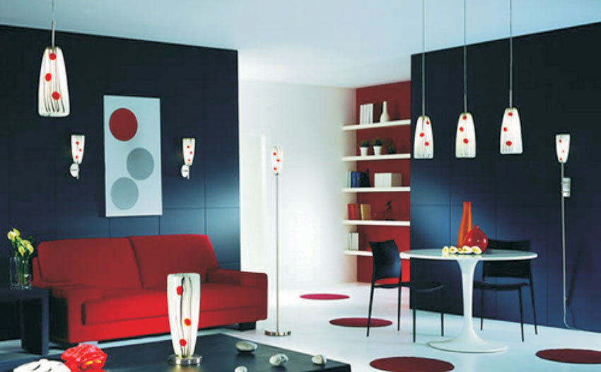
Some colors return as they combine with new shades. For example, blue returns with silver or gold, or maybe with lesser brown in an earthier setting. And others return with a changed name, so terracotta just isn't around now, though the new orange with reddish brown hues is. At home, the conservative buyer may just look to fit with what is already in the house. So let's catch up with the buzz, especially for paint colors.
Game for it
Back to earth
With the growing consciousness for the environment the key words are natural and organic. The color palette is changing from chocolate and mocha to more earthy and mineral tones. The neutral tone choices also tone down luxury and opulence with a desire for simplicity and eco-friendliness.Along the same lines blue is representing stability and calm to families. While the gray blues are going as neutral, the middle ranges will be high on popularity. The Prussian blue will be the upscale, formal look as the new Black.
Browns are the comfort providers. So Rich chocolate for fabrics, dark woods in furniture and cabinets and combine these with shades of blue—the turquoise shades. Brown will show the influence of nature with a slight yellow tint. On a more neutral note would be the coffee cream color, retaining warm while remaining neutral.
Greens, the yellow greens are continuing their popularity. The blue-greens are the neutral base shades while the darker spruce green highlighting the organic trend will gain in popularity.
Royal touch
Purple comes up here and there. It is more burgundy and raspberry toned that goes with gray, chocolate and black. Lighter tones will appeal to the young at heart while the deeper shades are a more eclectic choice.Pot of gold
Yellow as gold in metallic and matte finishes for accessories will continues in its popularity. Strong, bright yellow as a highlight or blended with orange will create the soothing, warm feeling.Overall yellow is expected to be around quite a lot as it would be tinting many colors to introduce the soft warmth, subtly and optimistically.


