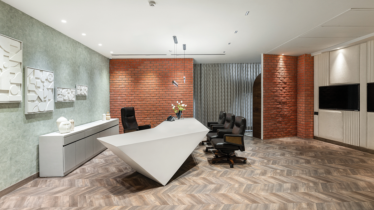
Thoughtful consideration given to maintaining the raw visual feeling with premium luxury finishes, colors, textures, and floor tile placement for enhanced navigation, evoking a connection to vernacular aesthetics.
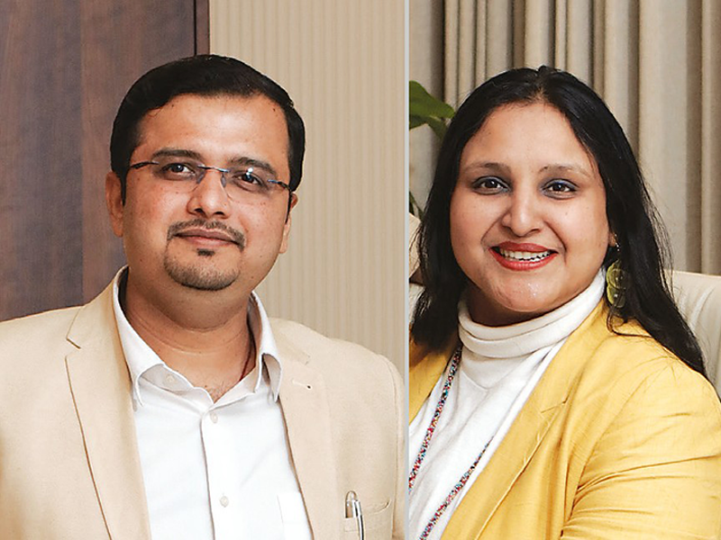
Badrinath Kaleru, Prerna Kaleru
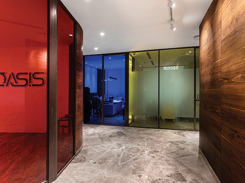
Continuous motion and fluidity symbolize adaptability and the environment’s ever-changing nature. Hence, the primary objective in this project was to enable seamless continuity of interconnectedness within the office to foster a sense of uninterrupted flow. This intention extended beyond the office walls to create a cohesive experience where the fluidity of the design seamlessly connected the indoor and the outdoor environment.
The design process unfolds as a journey in reverse, dictated by the building’s north-facing orientation. Delving into space planning and harnessing natural light becomes paramount. Guided by the delineated lines of spatial division, the design journey navigates a path where cut-outs emerge as strategic elements, seamlessly integrated to enhance the harmony between form and function.
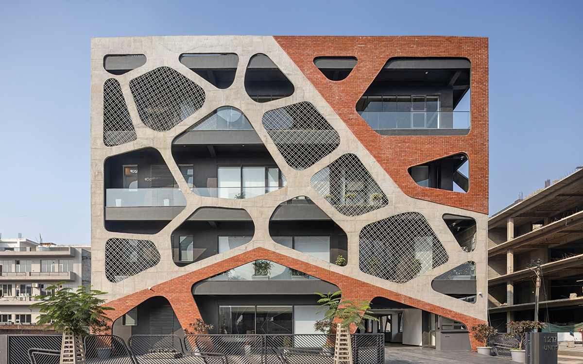
The façade is characterized by intricate and organic forms, which shares a conceptual link with Voronoi structure formations, embracing a network design that mirrors an interconnection, and emphasizes the curve facade, promoting a blend between built environments and the natural world. To ensure a smooth space layout, we positioned the less frequently used areas and services like the lift and staircases on one side, which also optimized natural light. The double height space evokes a sense of grandeur, and the colored glass partition on the upper floor casts a colorful glow that complements the raw tones.
Fact File
Location: Mohali, Punjab
Plot Area: 7200 sqft
Built-up Area: 25,000 sqft
Completion Year: 2024
Photographer: Ar. Purnesh Dev Nikhanj
Construction Management: R.S Builders
Structural: Nagi & Associates
Electrical & Lighting: The Luminars
Electrical & IT Works: KNN Group
Steel: TATA
Concrete: Ultratech
Paints: Asian Paints
Glass: Saint Gobain
Windows: Schuco
The raw essence of bio morphism and brutalism finds its counterpart in materials that evoke a connection, leaning toward vernacular aesthetics. Mud initially embodies this ethos, but its viability diminishes in commercial construction. Brick emerges as a natural alternative, aligning with earthy tones reminiscent of vernacular architecture. Concrete echoes the rawness and the industrial allure of metal while jaali offers an interplay of openness and closeness.


