| At a Glance | |
| Project Name: | Fujitsu Software Consulting Pvt. Ltd. |
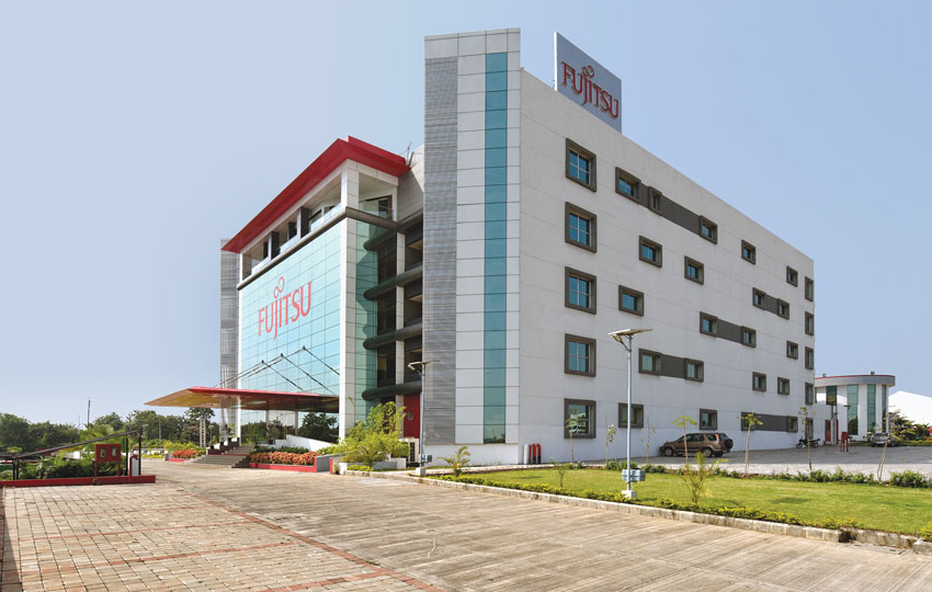
| Location: | A-15, MIDC Technology Park, Talwade, Pune |
| Architect: | Team One Architects (TOA) |
| Other consultants | |
| Structure: | Strudcom Consulting Pvt Ltd |
| MEP: | Elmark Engineers |
| PMC: | AMS Consulting |
Fujitsu, the fourth-largest IT vendor in the world and the third largest for global IT services is the leading Japanese information and communication technology (ICT) company offering a full range of technology products, solutions, and services. The company's office in India is located in Talawde, Pune amidst a well developed infrastructure.
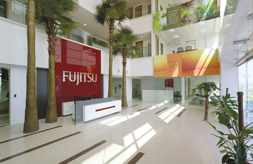
Fujitsu shared with TOA the vision of the company and gave the team a detailed logo study. The corporate logo depicts Fujitsu's infinite possibilities. Further, it expresses expansion into the universe by symbolizing "Earth" and "Sun." Fujitsu Red, the main colour expresses enthusiasm for the future, brightness, and approachability. The above corporate identity and the corporate vision: "Understanding you better – serving you best" needed to be expressed in the design that Team One created.
There was a design competition, held to bag this project and TOA was selected because of its unique theme and design, which was curated for the brand FUJITSU. The design studio bagged the project as the management liked its intelligently placed themes, designs, and facade enhancements styling. TOA also captured the essence of creating a functional floor plate which was specially designed keeping in mind the extra FSI. The plot in which this Corporate office was built up had more FSI due to which horizontal expansion capability was a must. Fujitsu had plans to seat around 1500 employees in the office.
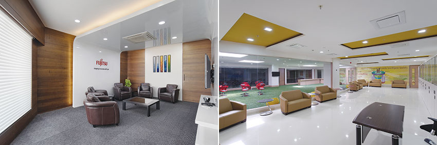
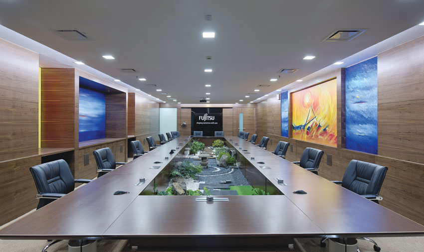
TOA proposed a concept to the client as a master plan along with the brief and many 3D images. The company's expansion plan was studied, and accordingly, multiple usages were determined. Since, client and management areas were designed as per the brief the entire hospitality as well as service aspect were determined well in advance considering foreign delegate visits. Extensive use of recycled materials was used even in premium areas by virtue of recycled marble flooring. The client had briefed to have a Golf Course theme at some office areas. So TOA designed a lush green patch soothing the senses and also created in and around the refreshment areas and lounges. The skylights were well spread enabling gradual but complete replacement of artificial lights. The critical and gruelling rooms such as the conference rooms, library as well as the lounge were all planned to open into this green area which obviously rendered the life to the management area. The sky lights were smartly fabricated with laminated but insulated glass to get the best of light but cut off heat from the hot summer glare. The loose furniture setting on the floor was all handpicked from the International market along with main board room furniture, sofas, cabin tables library tables. All furniture was created from recycled HDF finished with low VOC print and polish finish. The cabins were well established with open sky terraces which overlooked into the adjoining river with a picture perfect view of the horizon.
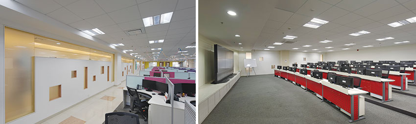
The facility also constructed multiple zones to house individual clusters of well-supported and re-worked teams. Due to the modularity expected to expand the building horizontally, the line of horizontal connect (2 main passages) were strategically kept open to enable future expansion plans, if any. State-of-the-art training rooms, well-defined data centre to suite the most critical demands of the modern day connectivity and networking are designed. The most striking highlight of the building here was the triple height atrium where a full grown palm tree gives it an earthy look.
The entire building has five (5) floors and each floor revolves around the panchbhutas or the five elements of nature – Prithvi, Jal, Vayu, Agni & Akash which have a lot of significance in the ancient scriptures. These are presented in the forms of colours, fabric, and through graphic interpretation.
Earth or Prithvi is the first of the five elements. One can touch and feel the earth element and it is further subdivided into two parts. Earthy colors and graphics are used to depict the earth. The second element is Jal. It refers to the element which resembles the properties like that of water, and also can be seen and felt. It represents the cycle that goes on in nature where water evaporates and comes back to earth in the form of rain and the smaller bodies of water combine into the bigger ocean. This representation is beautifully narrated in the paintings and few graphics in the office. There are fabrics used in specific blue colour to enhance the theme. Vayu, the third and is one of the most significant of the five elements. Like the other two elements mentioned above even this element has a perishable and a non perishable part and can be best compared to air. This again has been portrayed in exclusive graphics. Agni is the fourth element in the list of the five elements and can be most closely related to fire and associated with heat. It is again both perishable and also has a part that cannot be perished. Fire is one of the eight guardians that guard the universe. Red colour is used vehemently in the office as it is also there in the company logo and graphical touch adds to the theme. Aakash is the only element in the five elements that do not have a perishable half. It is the sky or the ether if compared to the most common thing we know around us. It is a carrier of sound energy and when you are into deep meditation you can hear the sounds of the Akash. A dash of blue has been used in the office interiors along with interesting themes related to sky (Aakash) giving it an infinite feel of progress.
The space breathes of positivity and the vision is well crafted through TOA design in Fujitsu office.


