
Convenience & Simplicity

Preset Lighting controls that achieve the perfect lighting levels in a space, at the touch of a button are in vogue. You can remove most of the light switches cluttering up your wall and manage your lights on an elegant touchpad or mobile device. Smart lighting solutions typically use LED lights since they offer more control options, letting you adjust their intensity and color through the user interface.
Motorized shades that allow the home owner to conveniently open or close shades are increasingly considered the norm rather than the exception.
Distribution of Media in the home over low voltage wiring with the help of new compression technologies that can use normal ethernet wiring to distribute AV over IP. This helps keep the TV Wall ‘clean’, and at the same time, helps share video sources among various displays. This is going to be increasingly asked for.
Voice activated commands for Home Automation with the help of Amazon Alexa, and Google Smart Home devices are going to take off in the coming year. Streaming Media content has the potential to replace set top boxes and traditional content providers in homes, provided the internet speeds keep pace with bandwidth requirements.
Fact File
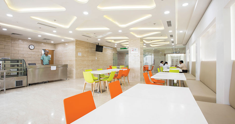
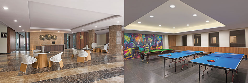
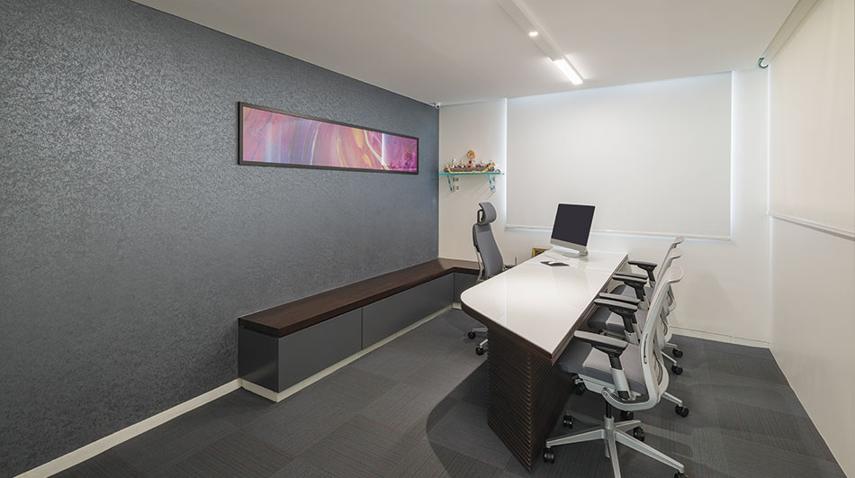
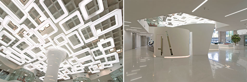
Typology: Commercial
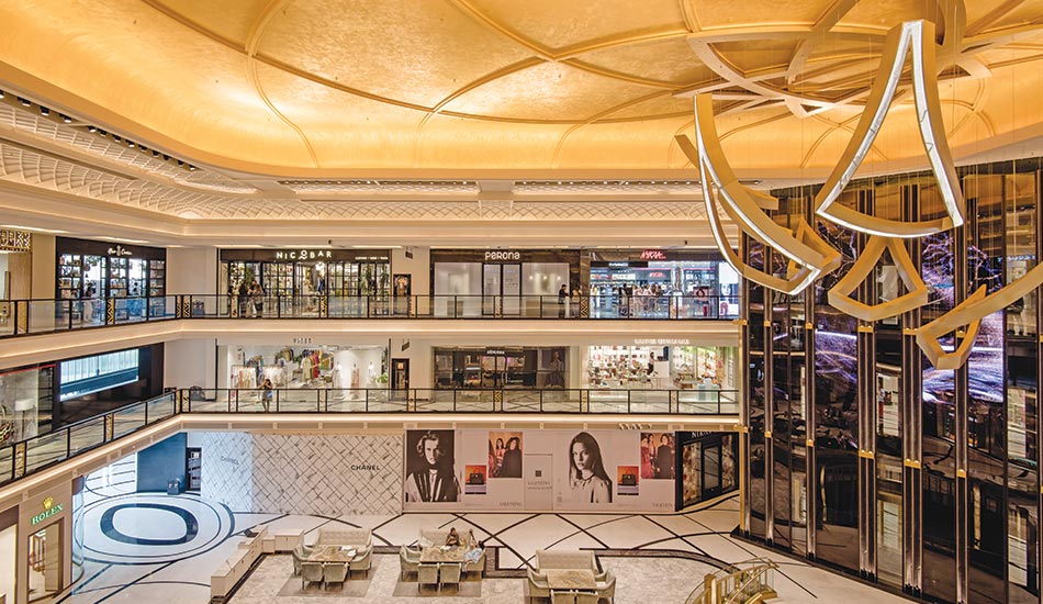
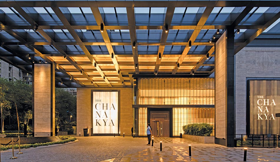
Project: DLF Chanakya
Location: Chanakya Puri, New Delhi
Client: DLF Ltd
Client’s Firm: Riveria Commercial Developers Limited
Principal Architect: Rockwell Group, New York
Design Team: Focus Lighting, KSA Mumbai
System Integration & Automation: ATPL
Lighting control systems: Lutron
Photographer: Akshat Jain
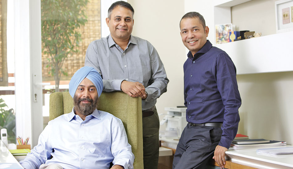
No amount of technological innovation can be fruitful if it does not translate for its intended end-users. ATPL seeks to bridge this gap by creating an immersive environment where homeowners can be familiarized with their options and brought up to speed with how technology can make life easier for them. Thus, home automation can be installed into both new and existing homes, and depending on the complexity and range of the requested functionality and device interoperability can be customized for each home owner. With today’s smart phone and tablet technology, and voice commands now getting increasingly mainstream with Alexa and Google Home, homeowners should have little to no difficulty operating their smart home.
ATPL has been integrating various systems to enable a single point of control to the end-user in homes for the past 15 years.
The Chanakya, New Delhi – A Case Study
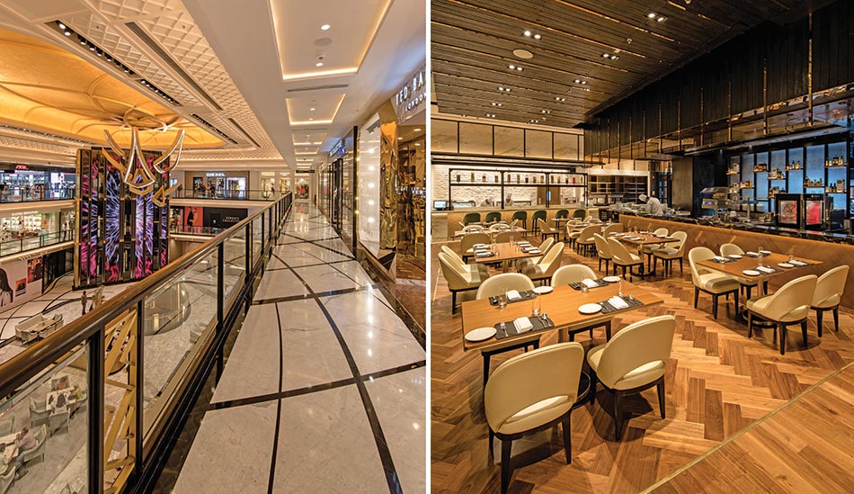
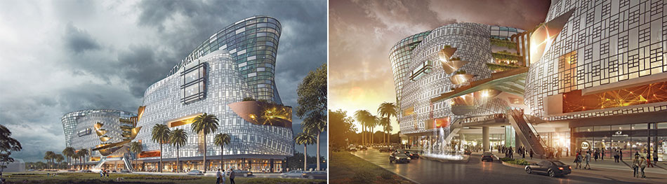
The DLF group has always been a front runner of the retail revolution in the country. The Yashwant Place Shopping and business complex was built more than 40 years ago and the adjoining Chanakya cinema complex is well-known in Delhi. Both the complexes were closed down until DLF decided to convert these into a swanky, new Mall called ‘The Chanakya’. Spread across 2,50,000 sqft, three meticulously designed floors showcase some of the foremost national and international premium luxury brands in upscale stores, a PVR Cinema and a number of high-end restaurants.
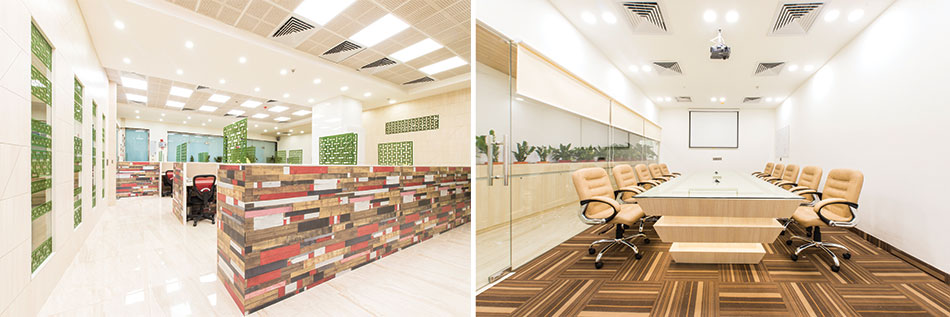
The Lutron Lighting control system for the mall has been supplied and commissioned by Anusha Technovision Pvt. Ltd. (ATPL). Focus Lighting Designers, a well-known NYC-based Lighting design firm, conceptualized and designed the lighting schema of the Mall in collaboration with Kanchan Puri of KSA, Mumbai. The lighting of the building has been designed such that the dynamic lighting accentuates the high-end interiors and the upscale stores.
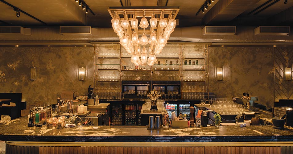
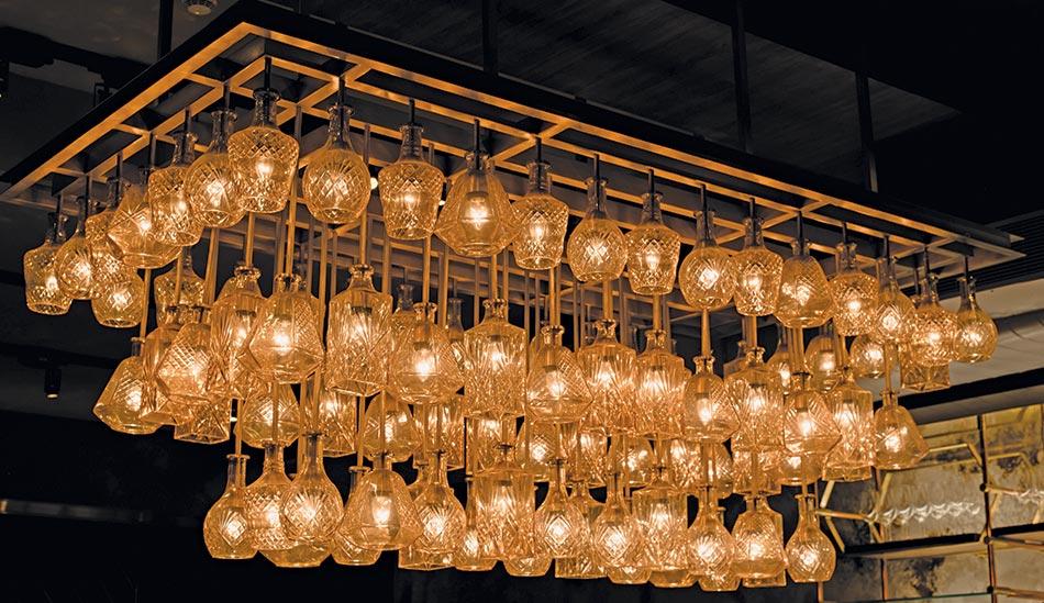
The Mall’s entire lighting control systems have been designed by ATPL, based on the lighting load schedule, in two phases. Phase-1 areas include the Glass Box and Canopy, Main atrium, Ground floor, First Floor and second floor. Phase-2 areas include the MKT restaurant with Asian, Mexican, Italian Restaurant, Grill and Dessert Kitchens, NOI-BAR, the Food Hall entry Atrium, and Food Hall.
Design Intent
The designer’s mandate called for a system that could be easily operated, and more importantly be able to handle the huge lighting loads in the main Atrium area, BAR area, Restaurant, over a long period of time with reliable performance and offer convenience to operations staff, increase lamp life and allow for energy saving.
A lighting control system is an intelligent network of dimming and switching modules, that allows one to have control of the lights in a space. There are various types of lamp load, wattage and the dimming protocol available in this project, and 3 types of Lutron dimming modules which are 230V Direct Dimmable Module, 0-10V dimmable Module and DMX Control (for color changing LEDs) have been provided.
Emergency circuits have been provided in each area to avoid blackout situations in case of power failure. All these have been tied in together as one system and the entire project has been controlled through a network of two processors installed at the Phase-1 Atrium and Phase-2 restaurants.
Simple, yet powerful keypads throughout the space allow for the ability to control lights in various ways. Programming allows one to recall lighting scenes and dim the different groups of lights with the press of a single button.
Features of Lutron HQP6 System
Centralized System: A centralized lighting control system that has all the lighting circuits in a space, running to a central location instead of running to the wall switches throughout the space. The processor is the brain of the system, that allows for additional control and various programming features.
Mood Lighting: Fine Dining is largely dependent upon not just food but the ambience. So, creating the right ambience with lighting specifically “Mood Lighting” plays a very important role.
Scheduling: An Astronomical Time Clock (pre-set setting for dusk & dawn) is used where timers are utilised to turn on and off the outdoor and indoor lights at specific times.
Smart Controls: Controlling the system using smart keypads gives the ability to set one of three pre-programmed scenes with the press of a single button. One can also adjust lighting levels, turn lights on or off and program-specific, timed events all from a smart device app.
Increased Energy Savings: The energy-saving light controls delivered by ATPL provide a comfortable and aesthetically beautiful visual environment. Through its lighting control solutions, better lighting cannot only reduce the energy consumption of a building, but also highlight the interior space to provide an appealing environment.
Increased Efficiency: Life of lamps and ballasts is extended due to dimming, which reduces time spent on maintenance, and lowers overall maintenance expenses.
Green certifications: Advanced control systems can provide valuable points and credits towards LEED and other similar programs, above and beyond the credits that basic controls offer.
Art & Architecture
Fact File
Status: Winning Entry | Under construction
Design Team: Khushbu Davda, Seeja Sudhakaran, Abhijit Patade, Priyanka Itadkar, Sajan Mehta
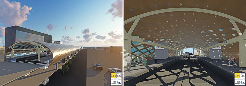
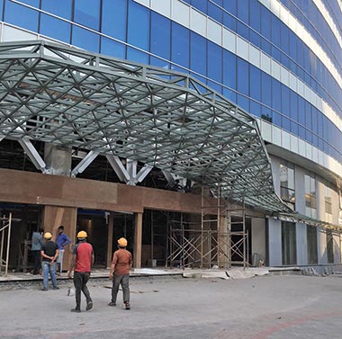
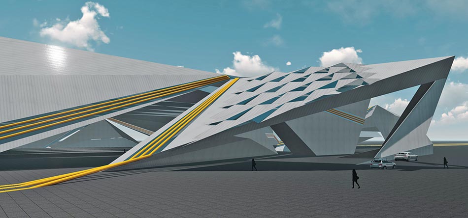
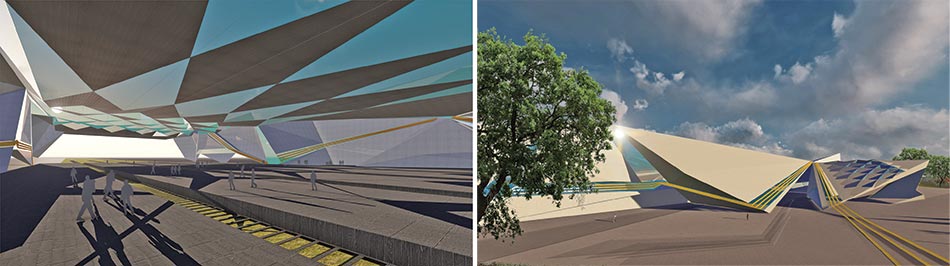
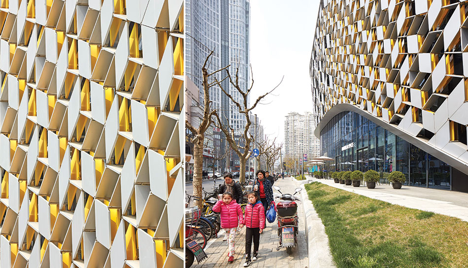
MMRDA Andheri Metro Design for Line7

The structure of the Metro station is a rational response to a series of programmatic requirements and constraints, and the result is a steel-and-glass canopy. The stunning oculus form creates a new structure that is functional, contemporary, and contextual; a new grand civic space for Mumbai. The structural steel is not only super-strong and durable but can be used in innovative ways, turning the ordinary into something quite transformational, even though the main structural system is mainly of steel.
The façade is a parametrically designed jaali with the apertures increasing in size proportional to the distance from a high-rise building next to it and giving privacy to the residents in the vicinity. The result is a rhythmic pattern on the façade, creating dramatic shadows on the platform and concourse level.

The primary structural system consists of (16) steel arch trusses spanning nearly 17m. Though the overall geometry of the metro station is a complex, seemingly free-form series of curves, the realization of this geometry was achieved by using only members curved to one circular radius. This rationalized approach allowed the geometry to be conveyed in simple 2D plans and elevations, without the need for 3D work point schedules. For the terminal’s central spine, field erection was sequenced to utilize the rigidity of the X-girders to minimize movements and the need for extensive temporary bracing.
Additionally, the joints provided improved thermal expansion characteristics for the concourse, which is nearly one quarter of a mile long. Because much of the steel framing was exposed, the design team worked closely to develop details that achieved the architectural vision and were also efficient to fabricate. The fabricators can make extensive use of custom jigs and fixtures to position the members in the shop to minimize welding distortion in the cruciform columns and in the architecturally exposed structural steel curved roof girders.
MMRDA had, for the first time, invited architects from all over India to design the new Metro stations coming up in Line 7 in the western suburbs. After the initial site visits, the architects were given a brief on the scope of work. Studio Emergence was shortlisted amongst the top 10 architects and subsequently bagged the project along with another firm.
The apertures, which create the pattern, are a series of open, opaque and transparent panels to enable the station to be well lit and ventilated. The roof panels have been given openings in the polycarbonate sheet so as to ensure the station is naturally lit. The platform level has ample openings to help ventilate the non-air-conditioned space, whereas, the roof will have lesser openings which will enable light but also prohibit excess heat in the Mumbai weather.
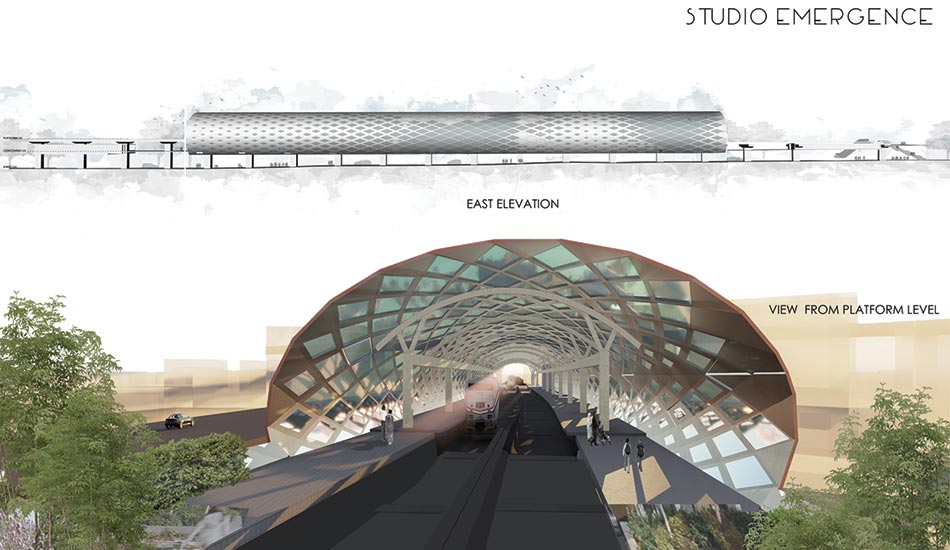
To keep the design within budget, the exposed connections were engineered to use only conventional structural steel fabrication techniques and materials, and great care was taken to shape the connections to be aesthetically minimal and consistent. All exposed structural steel is painted white/grey with a high-performance coating system consisting of a shop-applied zinc-rich primer and a finish coat.
Raheja Platinum, Marol
Fact File
Project: Raheja Platinum, Marol
Type: Commercial complex
Status: Completed
Design Team: Khushbu Davda, Seeja Sudhakaran, Darshana Punjani, Sajan Mehta, Priyanka Itadkar
Collaboration: IAG Consultants
The canopy and portals with their seamless and sleek look are the focal points of the structure. In this commercial complex project, the architects enabled optimization of portals and a canopy by studying the geometry. The exoskeleton of the building was already built. The client’s brief was simple: clean geometry and minimum wastage.
The external portal was designed to be fabricated in steel and cladded with Corian to add to the façade of the building. Corian material gives a seamless appearance to any surface; it can bend in 3 axes and is corrosion-resistant. But since the material is quite expensive, the wastage had to be minimal.
Three types of panel surfaces were designed for the canopy: flat panels, singly curved panels and doubly curved panels. The flat and singly curved panels were built on site whereas the doubly curved panels were digitally fabricated and then transported to the site. Digital fabrication makes the process zero wastage since all the site measurements are taken into consideration and then the fabrication is done.
In the fabrication process, joints can be made nearly invisible by joining the relevant pieces with Corian’s own color-matched two-part acrylic adhesive. The pieces are clamped tightly together in order to express any excess adhesive. After the adhesive dries, the area is sanded and polished to create a near-seamless joint. This seamless appearance is a signature characteristic of the material. Furthermore, staggered panel placement was designed to optimize the canopy and portals and to avoid wastage.
The stairscase windows were given a perforated geometrical pattern to create a seamless geometry with the opaque surface. Computational methods helped achieve the radius of the circles. These can be changed and revised uptil the fabrication day to achieve the optimum sizes according to the site context, without having to remake the drawing set.
Façade design for Bamandogri Railway Station in Navi Mumbai
Fact File
Project: Façade design for Railway Station
Location: Bamandogri, Navi Mumbai
Status: Unbuilt
Gross Built Area: 20 acres
Lead Architects: Seeja Sudhakaran & Khushbu Davda
Collaborators: HSA architects
The upcoming Bamandongri Railway station has been proposed for the new railway track connecting Vashi and the new Navi Mumbai Airport. The site is approximately 20 acres with 5 platforms and a subway connecting all of them. The site has very few built structures around it and it receives very harsh sunlight throughout the day. The primary concept was to use the porosity of the structure to define spaces and maximize solar energy gain. Use of algorithmic design for façade development right from the conceptual stage helped streamline the basic themes into the design and planning of the station.
Vantage points were also taken into consideration. A highway that passed from the front of the site, connects two major towns. This helped in zeroing in the required vantage points for maximizing visibility of the project and, thereby, of the station. Being a public space, it was important to not only make it very user-friendly but also make it a landmark which could help put this upcoming city on the map.
The geometric principle of Delaunay’s Triangulation is used in the façade design to optimize the light filtration. The roof is an origami inspired structure which allows the soft northern light and discourages the heat from the west during the day. The entire roof is made of steel members and clad with glass and fiber cement board composite panels.
The Psyche of Healthcare Design
The ultimate goal in the design of any healthcare facility is, without doubt, 'Patient comfort and care'. Designing for the very instance that a patient enters into a facility and his/her immediate response to the surroundings, is the first imperceptible paradigm that is extremely crucial to healthcare design. This is followed by designing a clear and a straight-forward movement for various end-users such as visitors, doctors, service staff, etc., through all the required departments in order to respond effectively to a setting where each second could be critical for a patient's life.
In the rapidly advancing technology, it is of utmost importance to realise that the hospitals we create are to made flexible to adapt with newer equipment and planning realms by virtue of modularity in construction and flexible MEP design
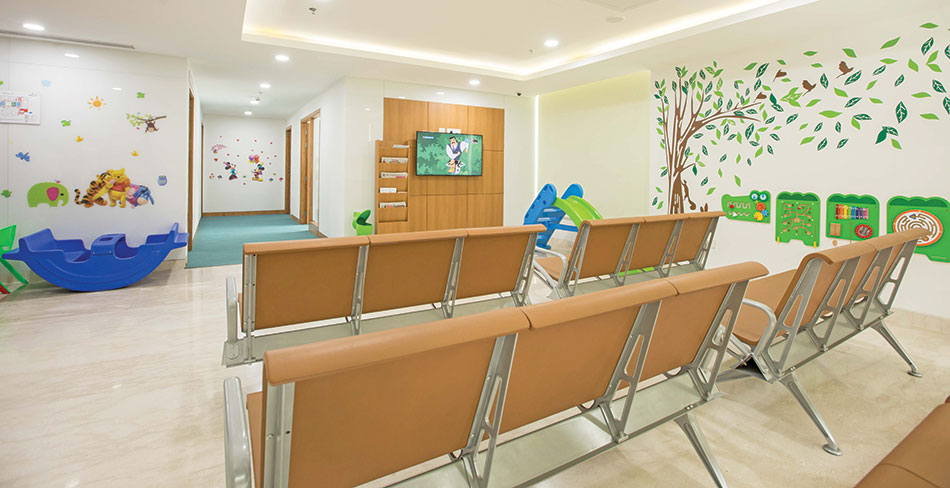
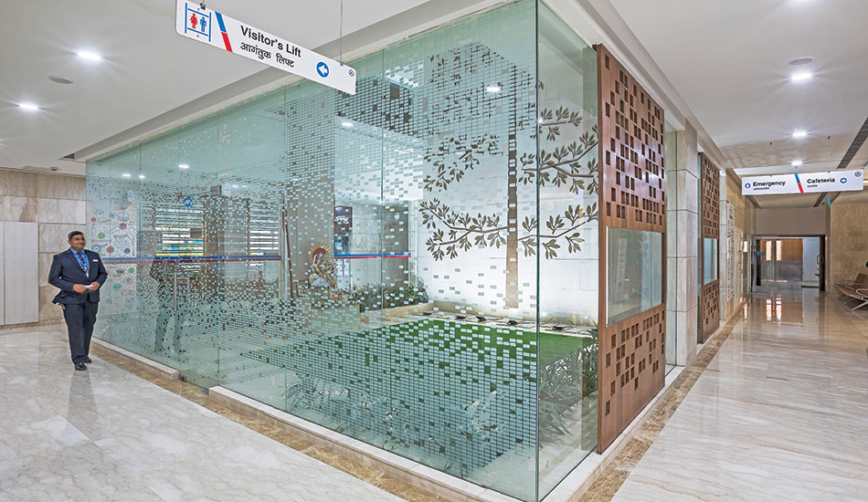
Utmost emphasis is laid on parameters that affect the comfort and well-being of the patients. Apart from a faultless departmental zoning and circulation, it is the aura of the interior, through warm healing colours and plenty of natural light, that coalesces with the psychology of the patients and attempts to elevate their minds. Another area of importance is the selection of finishes that are non-porous, have low VOC content and are easy to maintain, so as to create and maintain a highly protected and sterile healing environment.
Fact File
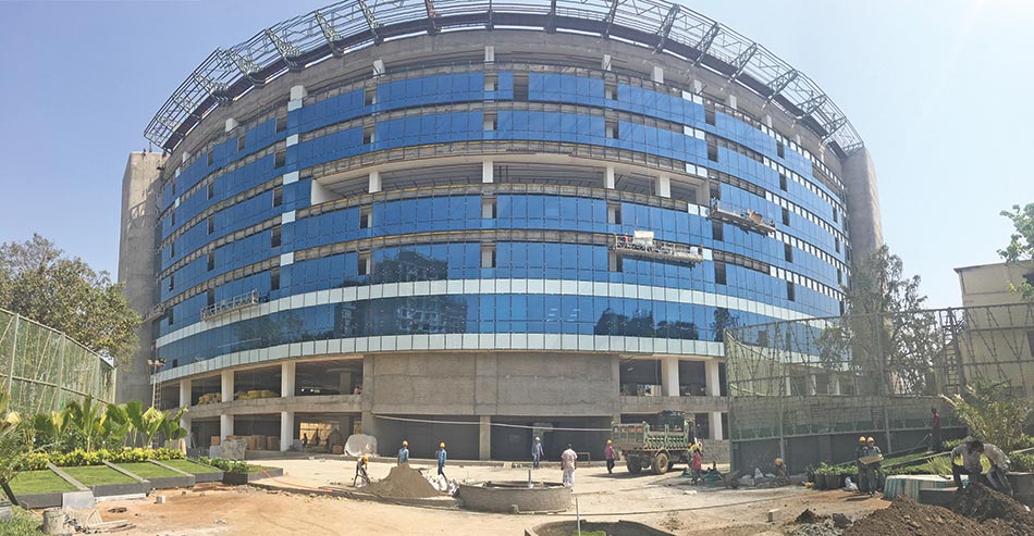
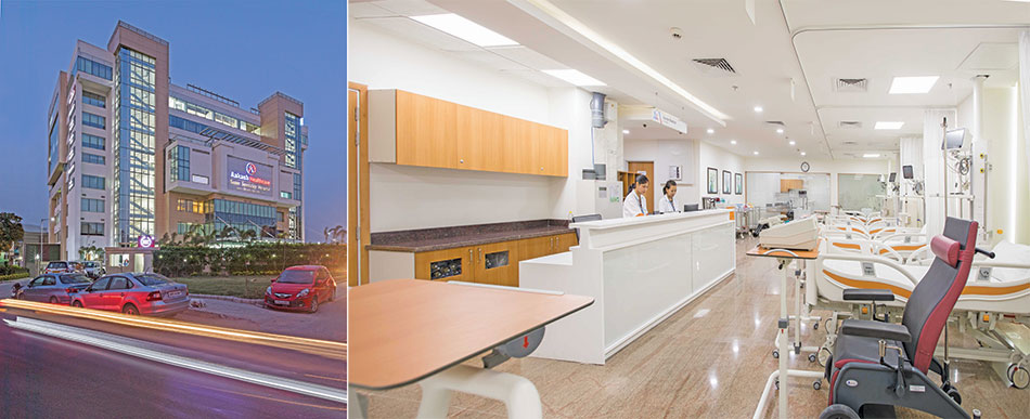
Project name: Aakash Healthcare Super Specialty Hospital
Architect Firm: Creative Designer Architects (CDA)
Lead Architects: Maninder Kaur, Mohanbir Singh, Ravideep Singh
Location: Dwarka, New Delhi
Completion Year: 2017
Gross Built Area: 3,50,200 sqft
Photo credits: Suryan, Dang, Aakash Healthcare
Key Consultants
Mechanical & HVAC Engineers: New Growth Associates
Electrical & Plumbing Engineers: Acrobat Engineers
Structural Consultants: NNC Design International
Landscape Consultants: DIA Landscape
Contractors: NS Constructions, Dhruv Interiors
Material Palette
Glazing: Saint Gobain’s Planitherm
Flooring: Tarket low-VOC Vinyl Flooring/ Homogeneous Vinyl flooring/ Static control flooring ‘linoleum conductive’
Laminates: Greenlam anti-bacterial laminate finishes
Electrical switches: Legrand’s anti-microbial coated
Pneumatic Chute Systems: SNG
Healthcare automation and Anti-Microbial treatment: Legrand
Healthcare LED lights: Philips
Anti- Bacterial Mineral composite ‘Corian Finishes’: DuPont
Air handling Units: Daikan
Films and Wall Graphics: 3M
Acoustic Grid Ceilings: Armstrong
Besides, state of the art equipment that augment efficient functioning of hospitals today, we give total regard to the eminence of medical staff and their well-being. They indeed stand at the ultimate level in the healthcare delivery chain and would perform even effectively if they have substantial infrastructure such as well-equipped rest rooms, kitchens and other recreational facilities that prompt job satisfaction, ultimately enabling them to perform better.
We bestow immense significance to landscape design through 'Therapeutic Healing gardens' and greenery in the interior. These are a part of EBD [Evidence Based Design], that a designed exposure to nature can boost healing significantly. Finally, in the rapidly advancing technology, it is of utmost importance to realise that the hospitals we create are to made flexible to adapt with newer equipment and planning realms by virtue of modularity in construction and flexible MEP design.
Aakash Super-Specialty Hospital: A Beacon of Contemporary Healthcare
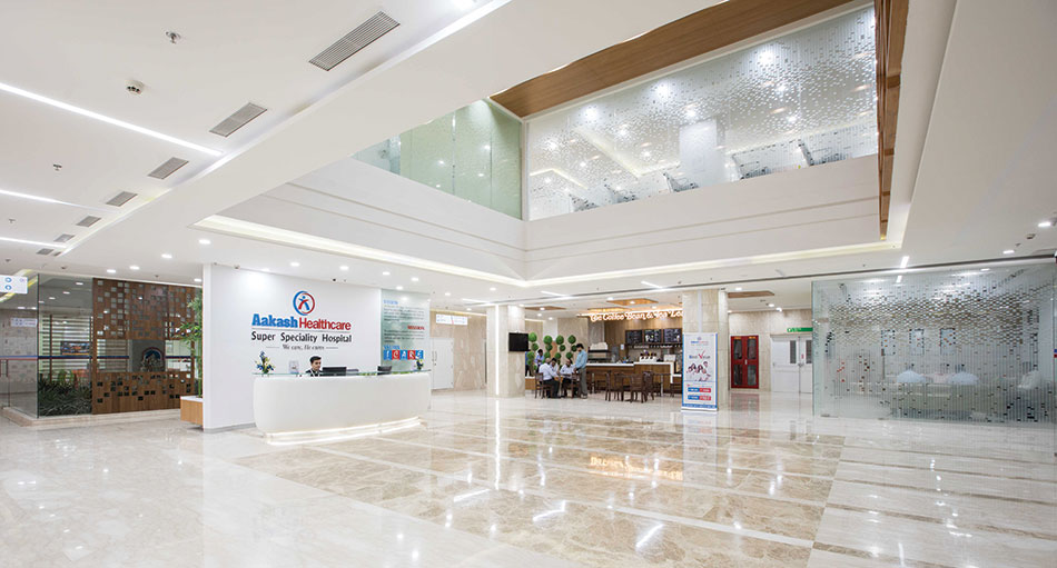
For the design of Aakash Healthcare, a greenfield construction on 4 acres of land in Dwarka, New Delhi, we envisioned it as a beacon of highest quality contemporary healthcare. The project was conceptualised as a concise block with carefully worked out inter-departmental relationships around an open central courtyard.
Curated around the principles of solar passive design, the longer side of the building aligns perfectly along the N-S orientation, ensuring ample amount of natural light during most times of the day. Saint Gobain's highly efficient DGU's (Planitherm) allowed expansive spans of the skin to be glazed, permitting substantial amount of natural light to penetrate in the interior and thereby considerably, saving on the electrical energy use. Simultaneously, the glass's low e-value almost ceases the heat gain, resulting in a substantial slash in the heat load and hence adding to the overall energy savings.
Founder J.C Chaudhry (also founder of educational group Aakash Institute) along with Dr. Ashish Chaudhry, envisioned this hospital as an extension of their philanthropist vision to provide highest level of tertiary healthcare at affordable prices.
Saint Gobain’s highly efficient DGU’s [Planitherm] allowed expansive spans of the skin to be glazed, permitting substantial amount of natural light to penetrate in the interior and thereby considerably, saving on the electrical energy use. Simultaneously, the glass’s low e-value almost ceases the heat gain, resulting in a substantial slash in the heat load and hence adding to the overall energy savings
The design aimed at creating a pleasing multi-height entrance foyer, embellished in warm healing colours. An open 'central courtyard' acts as a green refuge for the patient and the relatives. The ground floor houses the entire out-patient, emergency and the cafeteria, followed by the Dialysis, Specialised day-care and VIP administration on the first floor. The criticality of the functions rises as we transcend higher in the vertical stack, with ICU's on the second and Theatre department on the third floor. This is then sandwiched by a service floor for the augmentation of the AHU's and other services of intensive care facilities, and the dispersion of plumbing and medical stacks of the IPD floors above. The entire vertical circulation is augment by two lift cores, discrete for the visitors and the doctors, and an effortless horizontal circulation through the various departments that enable smoother functioning of the hospital.
Another critical aspect of healthcare design is the extreme precaution laid for the selection of finishes such low VOC Vinyl floorings and anti-bacterial laminate finishes. We sincerely believe that products that have a higher level of exposure are the most important in terms of their selection. Products such as electrical switches were used with an anti-microbial coating that could further add to the protected environment we aimed to create.
Creating a 'green hospital'
Hospitals undoubtedly fall under one of the most energy intensive building types and therefore necessitates to be energy-engineered. Even though, the building qualifies as LEED Gold today, the term sustainability to us means much more than a LEED or a GRIHA certification. Aakash Healthcare has a bio-STP installed within the site with an ETP that has a zero discharge. Almost 75% of its roof area has micro-crystalline solar panels that are connected directly to the grid and contribute significantly to the energy savings. The hospital also utilises a geothermal water heater that substantiates the hot water requirement in the winters.
Art of healing
Aakash healthcare's interior are a holistic consequence of the principle of healing architecture. The airy central courtyard has been designed as a 'Japanese Zen garden' with a play of levels, greenery and a small water body. Similarly, the refuge area at the fifth floor level has been landscaped into a healing garden which fosters well-being amongst the in-patients. Furthermore, a large green patch adjacent to the emergency and the out-patient departments, is designed as a therapeutic healing garden for the patients. The large windows ensure optimum daylight and regulated indoor air quality. Functionally, the hospital has state-of-the-art equipment such as Pneumatic chutes, a fully integrated BMS, and high infection control finishes.
Planning for the future
With the rapid advancement of technology, the equipment and their space requirements are bound to change. Keeping this in mind, most of the services in various departments of the hospital are designed horizontally, dropping from the ceilings rather than vertically within walls so that the layout can be modified in future without significant changes in the MEP design.
Another important aspect for the future of a hospital is the expansion of certain departments such as Radiology, Dialysis etc, which has been mitigated by designing the minimum size of the required department initially and placing certain ancillary areas such as offices etc. around them, which can later be relocated easily, allowing the departments to expand effortlessly.
About CDA
CDA, a New Delhi-based multi-disciplinary practice, specializes in contemporary Healthcare Architecture and design of highly sustainable and efficient environments. CDA's highly versatile portfolio of over 120 projects include residential, commercial and interior works, and an elaborate line up of 65+ healthcare facilities.
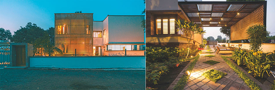
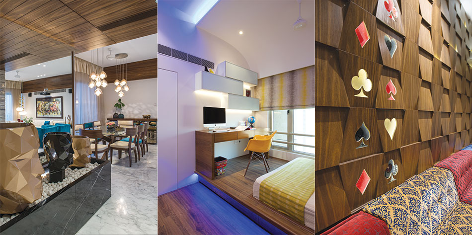
Simplicity & Functionality
Fact File
Client : Vijay Poddar
Architecture, Landscape, Interiors: Parekh Collaborative
Location : Burhanpur, Madhya Pradesh
Site Area : 1860 sqmt
Structural Consultant : S&V Engineers, Surat
Civil Contractor : Ayub Kha
Stone Supplier : Raj Rocks, Jodhpur
Furniture Contractor : Arjun Bhai Suthar, Bhawar Lal Suthar
Horticulture : Palash Associates, Surat
Irrigation : Jain Irrigation
Lighting : XAL, Littoria
Photography : Ar. Nachiket Gujjar
The brief was to build a house with non-air-conditioned spaces. We used techniques like stack ventilation and double envelope to create insulation and the natural protection of the tamarind tree to gain the temperature difference in interiors
Ankit Parekh, Parekh Collaborative

The 720 sqm. villa is set within a precinct where various houses are built belonging to the extended family, set outside the walled city where Mughal architecture and landscape flourished. The dwelling has an ecological vision and is authentic both in terms of context and workmanship with the material palette of sandstone and M.P. Teak providing sensual experiences.
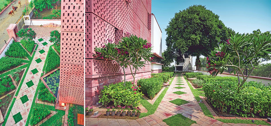
Being located within an extended family precinct, the house needed interactive spaces. A singular lawn area of minimum 300 sq.m, and multiple informal areas integrated with the house. Private living space and dining area sit in between the informal green courts, creating a spatial relationship of in and out. A dialogue between the house and landscape being created using Mughal garden patterns. The stone hand cut Jalli created on site can be opened and closed for privacy and to keep the harsh sun out.
The temperature change of a minimum 6 to 8 degrees could be found round the year. Various techniques like stack ventilation, double envelope to create insulation and natural protection of an existing tamarind tree worked very well for the architects to gain the temperature difference in interiors, which are non-air conditioned, with the green cover within and around the precinct providing a calm environment.
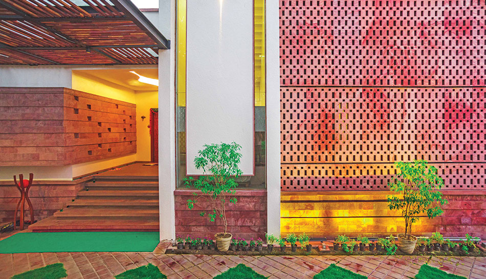
Every element within and outside the house, including landscape patterns, is handcrafted on site with a focus on simplicity and function. A rainwater harvesting tank is being created.
New Age Workspaces
The essence of each space has been given its own identity and designed with utmost flexibility. Remodelling office dynamics...where the nature of work does not dictate the space, rather the space cultivates the nature of work, thereby breaking away from the stereotype office design
Ar. Sharukh Mistry
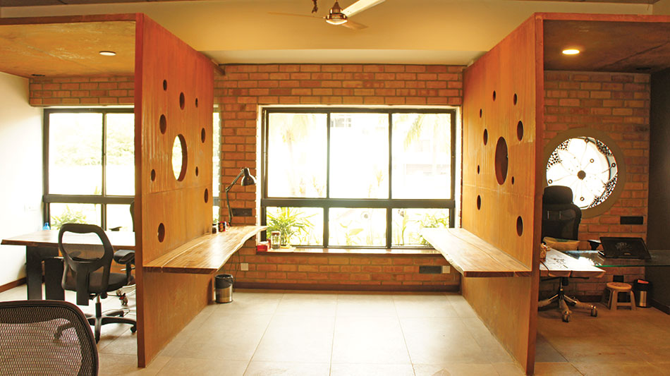
The conference and discussion rooms, alcoves and dispersed interactive pockets both formal/informal and leisure spaces, were efficiently weaved into the fabric of design. The central zone is taken up by the large free-flowing workspace. Ledge seating along the large picture windows makes for creative niches for a laidback reading/workspace. The conference room doubles up as an indoor gaming area, while three partitioned alcoves serve as the only designated work areas in the entire office.
Organically designed workspaces accommodate large clusters for an osmotic work culture. This large porous work space unfurled into an enticing deck space that was formed by simply removing the rear walls of the existing shell. The floor to ceiling sliding glass doors (cleverly hidden behind the doodle wall) when not in use, act as a subtle separation between the indoor and outdoor spaces.
Fact File
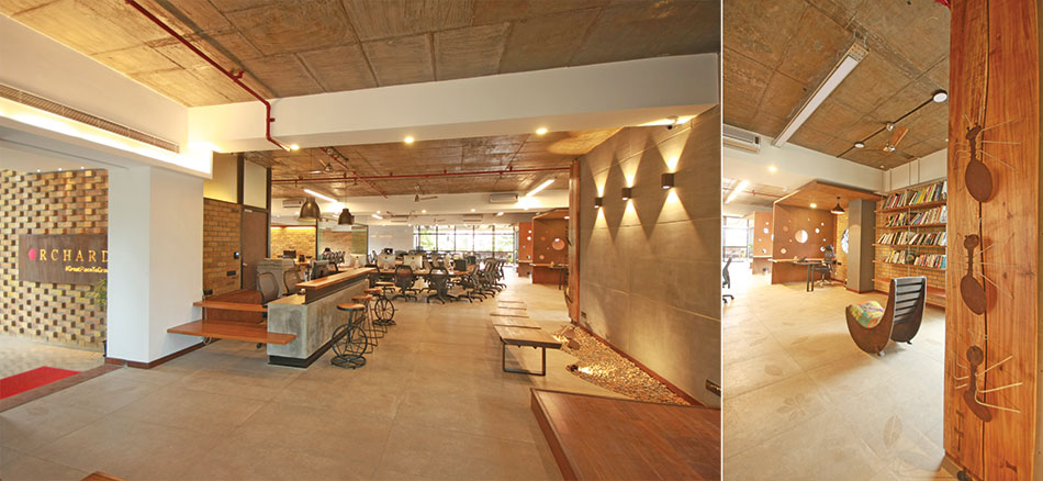
Project name: Orchard Advertising Pvt.Ltd
Location: Ulsoor, Bangalore
Area: 4950 sqft
Project type: Interiors
Architects: Mistry
Design Team: Ar.Sunanda A J R, Ar.Chetana Shekhar
Electrical Consultant: Mecca Consultants
Contractor: Chander, Hemanth Constructions
Photography: Anand.R
Material Palette
Wall Cladding: Fire clay bricks
Partitions: Corten steel
Cement Board: Bison
Tabletop Wood: Prakrit, Auroville
Flooring: Nitco vitrified tiles
Contextual reference The micro climate created by the lake in the vicinity was instrumental in dictating the stripping of walls to maximise the openings, thus increasing not only the depth of view but also the natural light and ventilation. The design took full advantage of the view of the large open space of the Fire Training Academy on the rear side by removing the entire rear wall of the shell to create a covered deck.
The large raintrees in front of the building, detach the space from the busy, bustling Bengaluru roads. Softscape elements on three sides of the periphery aptly tie in with the foliage in front of the building. Green practices Reclaimed wood from cyclone hit areas of Pondicherry used extensively in the design of furniture and interiors. Reuse of existing windows with extensions to fit into the new space vocabulary. Reuse of most materials salvaged from the minimal architectural interventions. Re-purposing of salvaged items.
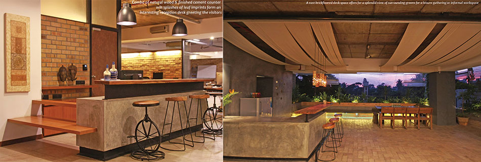
A warm and rustic themed material palette necessitated simple detailing. Crafty use of fire clay bricks for a striking entry with the signage and entrance door in Corten steel, stitched with rivets. Fire clay bricks for cladding within the existing shell, became the muscle of the environment. Cement finishes in plaster, tile flooring and wall panelling complement by contrast the warm hues of the fire clay bricks. Corten steel partitions reinstate a feeling of warmth, contrary to the material itself.
The muted cement coloured tile floor surprises with glimpses of etched leaf patterns throughout the interior space. The existing exposed ceiling with sprinkler lines in red was retained to maintain the purity of the existing space. Furniture was customised to achieve the design intent set out. Wood reclaimed from cyclone hit areas and worked at by Aurovilian, Torkil, adds soul to the space.
Every piece of furniture was crafted to detail by joining and stitching hand sanded mahogany and acacia wood. Old theatre chairs were refurbished for dining, while a reconditioned Atlas cycle supports a bookshelf. Quirky bar stools at the reception, some with butt imprints and some with cycle wheels as supports, make the space fun and lively. Local content
Introduction of several elements of nature used creatively and in multiple ways, for example, leaf motifs on tile flooring and exposed cement finishes, bamboo lights and trellis, ant sculptures, planters along the periphery, graphic representation of trees on some windows, hand-made art pieces such as cement ants (using waste Corten steel) crafted by kids from a rural school, adding rope art to the otherwise blank fenestration for an interesting play of light and shadow, scrap metal, cycle chains, gearwheels for attractive art grills, and so on.
Deceptively Simple Yet Profound
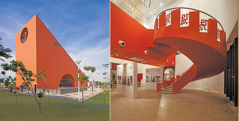
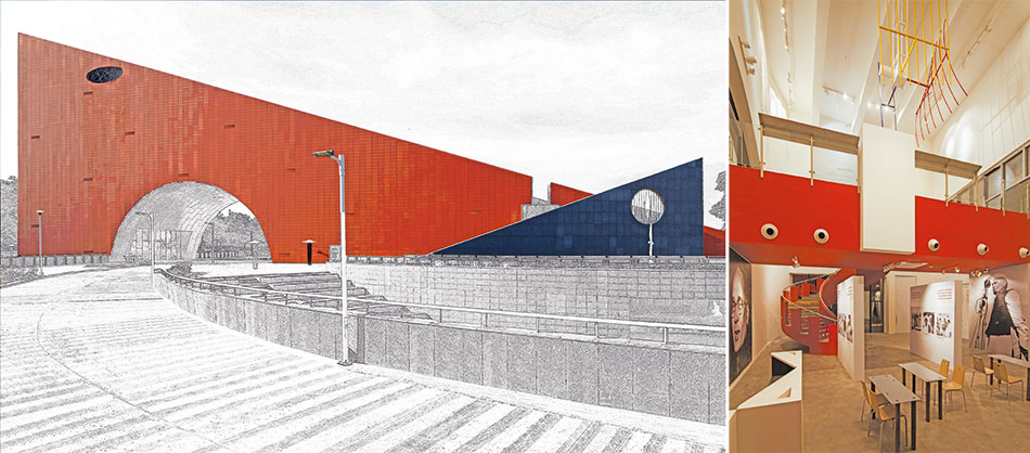
The Jayaprakash Narayan Interpretation Centre (JPNIC) is built on the idea of creating public architecture, whose design vocabulary endows a contemporary value to past events, but stands its ground with its 'new-found' institutional identity, reflecting the polarised views of civic authorities, curators, historians and the general public.
The monolithic and bold form of the building takes a stance, and exudes empowerment. Despite, the scale and the unconventional shape, the building with its clean and clear lines is deceptively simple. The profound depth and complexity is revealed on the inside and it only reinforces the notion of simplicity being rooted in deep-thought and reflection.
The building design communicates the essence of the Interpretation Centre which is about the idea of socialism of the visionary Jayaprakash Narayan; and validates its recognition as an attempt to be an ambassador of the city of Lucknow
Sourabh Gupta

The architecture of the building blurs the boundaries of the role of architecture in space-making. The conception of the institution was a journey that evolved with the project. The architecture merges seamlessly with the museum and exhibition planning, experience design and landscape. The centre serves as a gateway to the Jayaprakash Narayan International Centre and together, they ensure that an international flavour is imparted to the complex, which in turn, validates the recognition of the institution as an attempt to be an ambassador of the city of Lucknow.
Interiors
The experience of the Interpretation Centre is through four thematic zones. The zone of absorption is where information about the life journey and values of JP is imbibed. The more interactive zone of realisation facilitates a closer look at JP. The zone of internalisation allows time and space for introspection on the take-away-how one can take initiatives in their own life. The concluding zone, a congregation place, is meant to influence and inspire collective expression of the learning. The journey both literal and allegoric is all about movement. Physical navigation of space makes exhibits dynamic.
Project Information
Typology: Public Building
Name of Project : JNIC (Museum of Socialism)
Location : Lucknow
Client : Lucknow Development Authority
Principal Architect : Sourabh Gupta, Studio Archohm
Site Area : 18.6 acres (75464 sqm)
Built-Up Area : 3355 sqm
Start Date : October 2013
Completion Date :October 2016
Photographer : Andre Fanthome, Bharat Aggarwal
Project Cost : 35.98 cr
Consultants
Structural : ROARK Consulting
Mechanical : Sunil Nayyar Consultants
Electrical : Archohm Consults
Landscape : Shaheer Associates S.J.A. Consultants
HVAC : Sunil Nayyar Consultants
Plumbing : Sunil Nayyar Consultants
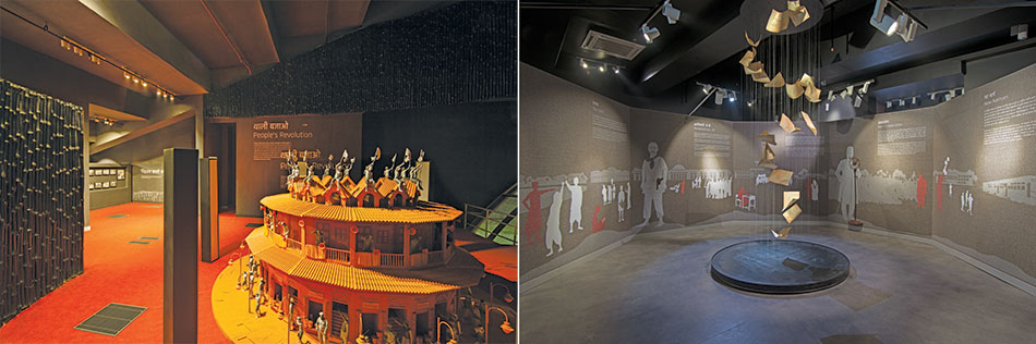
The chronological narrative of JP's journey is depicted in almost all mediums; not merely through a display of artefacts, but through a sequence of static, dynamic, sensorial and experiential moments that include his belongings, furniture, letters, cartoons and illustrations, poems and songs, oral archives, documentaries, info-graphics and many new, automated and technological user interfaces as holograms, projection mapping, kinetic installations and those that make the virtual as real as possible and appealing to wider and universal audiences.
Into The Future
The project has been conceptualized and designed as a 'Chronosynclastic Infitibulum', an infinite vector of experiences in time, and has therefore the vocabulary to reinvent itself over time and in sync with events around it
Ar. Pranav Iyer, Ground 11

The Tor City Mall in Tema, Ghana, is a signature project that is designed to combine retail with a multitude of recreational services, and most importantly, social services that include healthcare and point-of-contact for interaction between the government and citizens.
The project is part of a master plan for Tema City, the main port city of Ghana. It aims to work as the 'living room' of the city. Its overall master plan includes housing, retail, recreation and health services, with some urban insert projects that are to create nodes of growth in the area.
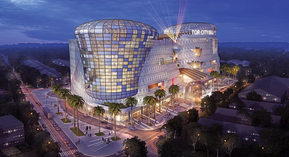
The facade has been designed to respond to significant moments / events through computer-controlled color patterning, borrowing from traditional patterns, colours and symbolism. Several LED screens, a part of the fabric of the facade, flow over and around the building, to be used for advertising, news dissemination and for cultural events
The form is representative of both the industrial and economic identity of Tema, represented by two towers that flow upwards above a common ground floor. It is a 450000 sft super structure with two basements, and an amalgamation of several disparate functions that seek to question the distinction in responses to private and public spaces in close juxtaposition.
As a homage to the context, the architects have incorporated various climactic methods like shading screens and passive cooling. As a cultural response, they incorporated traditional geometries and patterns into the building design. The building has two basements, a large anchor ground floor, with six upper floors, both with central atria that bring natural light into all spaces.
Programmes are stacked bringing both economy and proximity to the design, while bringing the structure to human scale within, while being imposing from the exterior. As the surroundings from the outside are brought in using the breezeway between towers, the dual atriums form a protected atmosphere for these ecologies, while manifesting themselves in the form of balconies and gardens throughout the facade.
Fluidity & Flexibility
The palette of materials was selected for the aesthetics, functionality and easy maintenance over a period of time. The fenestration is a combination of UPVC windows and structural glazing with low emissivity glass for energy conservation. The façade is a combination of stone cladding on the lower floors, while the upper floors are of double plaster and weather-resistant paint. The façade is interspersed with metal louvers and pergolas to break the monotony and create a playful interplay of light and shadow
Ar. Goonmeet Singh Chauhan
Ar. Anand Sharma
Ar. Anoj Tevatia DFI
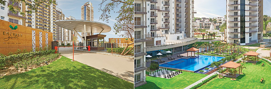
The masterplan of Emerald Garden in Kanpur comprises residential plots, flats, clubhouse, commercial, etc. with 60% of the built volume being designed as a low-rise development. The client brief called for a mix of 3, 4 and 5 BHK units, amidst regular towers and iconic towers with an assortment of units split into regular floors, penthouses, garden apartments and club-side apartments.
Fact File
Project: Emerald Garden township
Location: Swaroop Nagar, Kanpur
Area: approx 40 acres
Master planning: DP Architects of Singapore
Services consultant: AECOM
Structure design consultant: TPC
Landscape consultant: Integral Designs
The planning approach aims to consolidate the central greens, while crafting vista views towards the low-rise development. Breaking away from the traditional 4 units to a box cluster, there is a focus on clubbing two units together into the different arms of the cluster, and enabling the sun, wind and view requirements of the towers.
The cluster of the Iconic tower is the feature element and is conceived as a classical elliptical shape, lending itself to flowing peripheral balconies. Manifesting as a sleek 100-m high cylindrical tower with an expansive view of the Ganges and the Kanpur urban-scape, the resulting form enjoys stunning views of the greenery.
An elevated plinth envelope wraps around the towers and acts as a stilt area. Extending as a multifunctional space at some places, this adds fluidity and flexibility in the design. The patios flow through the clubhouse leading from entrance lobby of individual towers and wind through the club spaces all the way up to the swimming pool.
The landscape is conceptualized as a whole instead of individual patches, thereby wrapping the towers around the central green. Impeccable design, finest global fittings and finishes, fire safety measures, earthquake-resistant construction, disabled-friendly common spaces and bathrooms and advanced security systems are its unique features. Peripheral walls are constructed to prevent water seepage, better insulation and safety. A large vehicle-free podium area adds to the secure environs.
Redefining - High-Rise Typology
Project Name: Prius Vision Towers
Typology: Commercial
Location: Gurgaon
Status: Under Construction
Client: Dignity Buildcon
Built-up Area: 18,00,000 sq.ft
Site area 10.5 acres
Climate: Composite
Photos: Dignity Buildcon
The firm’s approach to develop this new typology was to scrutinize a traditional dwelling plan-lifestyle, prominent usage patterns between the exterior and the interior, and interpret them in the high-rise context. The morphology is an outcome of a stack of cuboidal volumes (each cuboid reflects the bungalow scale) and a series of attached open spaces, translated as a series of cascading voids, forming sky gardens that spiral along the entire height of the building. The cascading sky gardens form celebration spaces and encourage socio-cultural interactions.
The project won the GRIHA Exemplary Practice Recognition, Passive Architectural Features India. GYS Prius focuses on creating a high-rise morphology that addresses the socio-cultural need for proximity to open spaces, and perhaps still retaining a ‘soul space’ approach to this typology Ar. Manit and Ar. Sonali Rastogi

The ground plane is used as a canvas for presentation for urban art, with foundries set up on site and local craftsmen, artists and curators joining hands to create a vibrant expression of traditional and modern craft. The central scooped court is earth sheltered from three sides and is designed to fall in the shadow zone of the tall towers, thus, creating a micro-climate in the heart of the site; despite its size, it is usable in 45ºC (113ºF) in the afternoon as an outdoor public space.
Orientation plays a significant role in this high-rise development. The office blocks are orientated in the N-S direction, allowing for day light to penetrate the built form and reduce dependency on artificial lighting. For the twin towers, the structural cores are brought out to the S-W edges of the built form, to block off harsh solar ingress.
In the parched and dry belt of Gurgaon, this site faced a peculiar situation of an underground water stream, with an up-thrust pressure that imposed a construction challenge. Standard structural solutions would be resource intensive and prone to failure when and if the water levels receded. Thus, an innovative ground water harvesting strategy was planned in detail right from the early stages of construction. As per the design, the under slab drain system is spread across 25000 sq.m and the net water harvested from the underground sumps amounts to 600 liters per day of raw water supply, providing a sustainable potable water solution.
Skyline Architects: Creating Vertical Neighbourhoods
Creating Vertical Neighbourhoods in Urban Cities
It's a challenging situation for Architects to provide socially engaging, and dynamic environment within a tower typology, writes Saurabh Chatterjee, Skyline ArchitectsWith globalisation, the Indian lifestyle has seen a gigantic shift with the intervention of modern routines, which has resulted in cities with lack of public spaces, lack of amenities and lesser transitional spaces. The growth of GDP in Urban City is directly proportional to the growing number of skyscrapers in that city. With restricted availability of land parcels and enormous demand for housing, cities have started witnessing vertical growth.
In the aftermath of cities burdened by lack of infrastructure, the opportunity to design a new architectural style and make a difference in India has become more immense. It's a ringing alarm for all the builders and the authorities to release more incentives to be utilized 'only for social interactive spaces' in vertical neightbourhoods
Saurabh Chatterjee, Skyline Architects
We require large, environment-friendly, multifunctional buildings, as an integral part of neighbourhood culture. These self-sufficient neighbourhoods provide support functions as well as recreational areas for social interactions, within the vicinity. The communities will have the convenience of being able to live, work, eat, and shop - all in the same building as the social and spatial mechanisms would be translated vertically, without it compromising the sense of community on the ground.
The schematic 'section 01' is showcasing corollaries of semi-open spaces by breaking the mass of adjoining towers that serve as connecting sky gardens and become interactional spaces - social micro-scale urban place elevated above ground that allows people to meet, linger and interact. These types of semi-public communal areas afford frequent chance of social interactions and a sense of community among the users.
Magnum Towers located in one of the most populated areas of Mumbai was one such challenging project. With a land parcel of 5 acres and built up area of 15 million sqft, it was a big challenge to accommodate a very high density in the available plot and also corresponding to the current bylaws and environmental factors.
The plot abuts the land which houses the most worshipped and most visited 'Lalbaug cha Raja- Ganesha', which was an additional challenge to maximize the view of this location to most of the apartments. We designed four 43 storied towers with 4 apartments at each floor level, with the recreational areas and social interaction zone being a major part of the neighbourhood. It is a type of urban development that blends residential, commercial, cultural / entertainment uses by vertically stacked amenities such as swimming pool, gymnasium, banquets, conference hall, mini theater, mediation hall, kids play area and clubhouse, with access from all the towers.
The facade has ribbons of outdoor balconies wrapping up together the interior with the exterior of the tower. In future, these terraces could be used for urban farming allowing people to grow their own crops in their own terraces. The vertically interconnected semi private community spaces are enjoyed by the inhabitants of the tower and the open recreational spaces at ground level are a visual treat to the neighbouring societies.
To offer a better living environment to the inhabitants, a sensitive and quality conscious developer was ready to shell out some of this project's construction area (on and above the area permitted by the authorities) for providing maximum social amenities. Hence, it was further possible for us to create an ideal vertical neighbourhood.
Mirror Effect
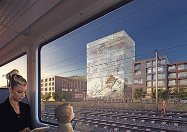
The façade traces the boundaries of Esslingen and the topography of its landscape, which is pushed in through a series of pixels that form an 'Esslinger Room'. A series of stairs, terraces, and platforms emerge and lead to the other side, reaching a viewpoint in the shape of the city centre for public use, where visitors can enjoy the views of the vineyards and surrounding hills.
The façade is designed as partially mirrored, with fritted glass containing PV cells that mirror the environment, the town, its hills and its people. It shows the pixelated map of the area of Esslingen and around. Each pixel carries different information, featuring the stories of the city and its inhabitants. With a smartphone app, one can discover its richness.
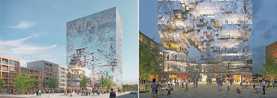
On the ground level, the crystal rock opens up to the public square in front, connecting the city with the building and providing public amenities including a restaurant, café and meeting areas, while the upper levels accommodate modern office spaces.
At night, the building becomes a beacon for Esslingen, illuminated through its façade, creating an extraordinary atmosphere.
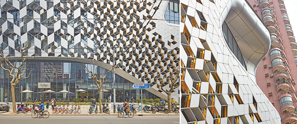
Urban Eyes
Lane 189, located in the Putuo district in central Shanghai - opposite Chang Shou Park and close to the Jade Buddha Temple combines retail, restaurant and office spaces in an organisation that rearranges the typical mall into a vertical city centre. The design incorporates elements of 'old Shanghai' through geometry, pattern and materialization, and combines these with a contemporary urban experience.
Fact File
Project name: Lane 189
Location: Shanghai
Programme: Retail, F&B, office, parking
Site Dimensions: ~90 x 65 m
Building Site Area = 6157 m2
Building Height: 34.9 m
Number of Floors (Below Grade): 4
Number of Floors (Above Grade):7
Client: CITIC Capital
Local Executive Architect: TJAD (Local Design Institute) / UNStudio
Construction Management: CITIC Capital
Consultants
Façade: Inhabit
Lighting: Ag LICHT, LEOX Design
Landscape: TJAD
Completion: December 2016
Photos: Hufton+Crow, Eric Jap
Material Palette
Flooring: Tiles
Glazing: Internal
Ceilings: Knauf gypsum board
Wall finishes: Aluminum wall cladding from JYMQ
Lighting: Jojo, Osram, Opple, Beghelli
Lighting control: e:cue
Bathroom appliances:TOTO
Sustainable feature: low-e coated triple glazing
Contractors
Façade: Boji
ID: Beijing Honggao
Façade
Screened facade areas: 2054 sqm upper facade, 4021sqm lower facade, total: 6075 sqm.
Exterior Materials
Substructure: aluminum, steel, stainless steel
Superstructure: steel reinforced concrete
Envelope
Screened Facade (southwest / northwest facade): Pvdf-coated aluminum panels; stainless steel pin connector elements
Glass Façade: Triple layer curtain wall glazing system (3x 6 mm) Back Facade (northeast / southeast facade) Painted render
Programmed Facade
The facade is designed to support the overall design concept of a programmed facade and to create depth for the building envelope. The use of multi-layered components enables a variety of views towards the surroundings, whilst providing functional transparency in specifically located areas. Based on a hexagonal grid, the facade components follow the articulated geometry of the building and provide constantly changing perspectives.
A gradient transition from bigger to smaller facade components regulates the exposure of the inside to the outside and enhances the main entrance of the building. The facade therefore becomes an integrated active layer that can be programmed as display windows, vista points or balconies.
On the lower façade, a hexagonal grid consists of diamond shaped panels that are tied between pins forming a tensioned cladding system. Here, the arrangement of the components can change across the facade from single layer to triple layer, up to a depth of 400mm. Constructed from different materials and lit by RGB LEDs these panels create different visual effects: transparent or opaque, colourful or monochrome, reflective or matt.
On the upper facade the components are made up of a single layer, of one size and are solid or perforated across the facade and towards the main entrance central to the building - the components change in scale and change from triple scale, from triple layer to single layer. Solid and open single layer panels are used on the rear of the building.
Large double-height facade openings present the interior programme to the outside world. These 'urban eyes' simultaneously create large display platforms for products whilst providing balconies with views to the surroundingsInterior
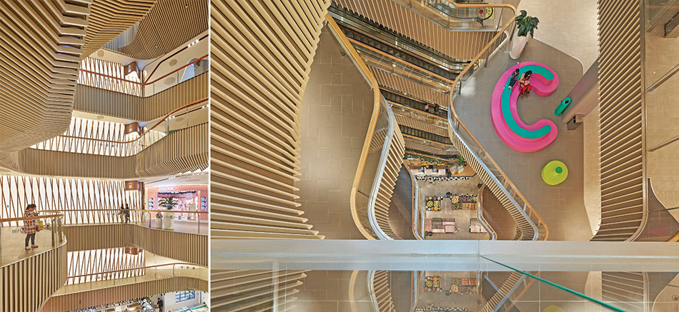
The interior of Lane 189 derives its character from a central void which cuts through the volume from base to top and is punctuated by a series of rounded plateaus. When seen from below the rounded plateaus resemble a cohesive layered organic structure, however when looking down from above the programmes of the plateaus are revealed. These smaller pockets, positioned in a rotational manner, are visually connected to the urban eyes of the facade.
The central void further organises vertical circulation and orientation, creates views across the different levels and facilitates a clear view column from the second basement level up to the skylight art installation. The multi-height spaces of the rounded plateaus accommodate individually themed programmes. The lower plateaus of the basement levels house a market plaza and the food court, while the first and second level plateaus hold an art street and grand balcony.
A Modern Interpretation
515 West, 18th Street, New York, offers a distinctive reinvention of the Chelsea warehouse architectural style, featuring a modern interpretation of the bay window and a custom masonry façade. The 21-story building comprises about 180 one, two, three and four-bedroom apartments, many of which provide uninterrupted views of the cityscape and the Hudson River.
The studio wanted to create a new kind of panoramic visual connection for the building's residents and re-conceived the residential bay window as a three-dimensional sculpted piece of glazing that provides light-filled interiors as well as exciting internal moments. At txhe smallest scale the raw brick exterior, influenced by Chelsea’s heritage of industrial brick buildings, will give a handmade feel and micro texture to the facade. At the largest scale, the use of the three-dimensional windows will add another distinctive layer of textural character to the fabric of the city
Thomas Heatherwick, Founder, Heatherwick Studio
Designed to provide residents a totally integrated lifestyle destination, the residential building is part of a two-tower development that links underneath the High Line. The development is in the heart of the art gallery district, within a short walk of sprawling parks, restaurants, nightlife and several of Manhattan's finest schools.
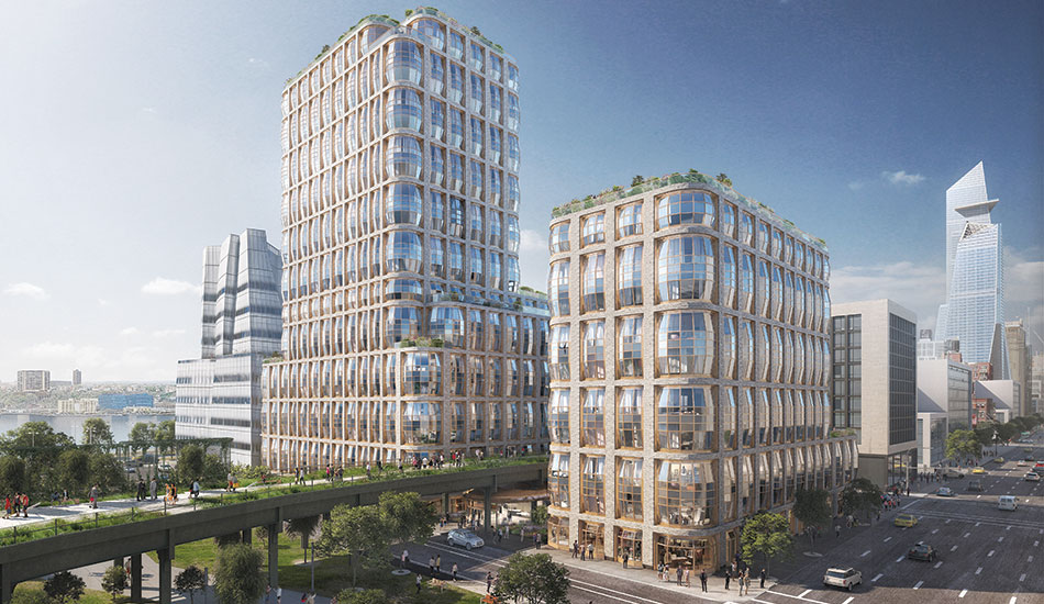
Heatherwick Studio, founded by British designer Thomas Heatherwick in 1994, has come to be hailed for a number of projects in the UK, including the award-winning UK Pavilion at the Shanghai World Expo 2010, Vessel at Hudson Yards, Lincoln Center in Manhattan, a new campus for Google in Silicon Valley (with BIG), and Zeitz MOCAA, a museum in Cape Town, South Africa that makes use of a disused grain silo.
Reclaiming Luxury
Designing the project is UK’s leading designer Martin Kemp for the show apartment and the common areas; JPA Design of Singapore for yet another show apartment; and the world-famous landscape artist Burega Farnell for greening the outdoors.
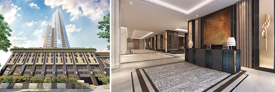
Meticulously designed to luxurious standards, the 49-storey building spreads across a 5.2-acre land parcel with only 20,000 sq.ft of building footprint.
Mumbai attracts thousands of people from across the country, who come seeking the proverbial pot of gold. Given the dearth of land parcels, current projects are often cluttered with living areas becoming extremely congested, affecting the quality of life and proffered luxury. The Maxima City is already overflowing, owing to the influx of professionals. Today, it ranks third in the list of densest cities in the world as per a report by a US-based dermographia, which points out that an average 32,300 people are crammed in a space of one sq km in the city.
As much as the density inside of a project is important, the environs play an equally crucial role in contributing to the true luxe experience
Kishore Bhatija

With the current burgeoning number of high-density luxury projects in Mumbai, if one were to analyze the ground truth of these projects, one would see the high-density concentration levels in lush locations like Worli, Lower Parel, Prabhadevi, etc. Numerous amenities are being offered to the people per square foot, increasing the density of the project and leaving the residents craving for privacy - the very essence of a luxe lifestyle.
As much as the density inside of a project is important, the environs play an equally crucial role in contributing to the true luxe experience. Several luxury sky scrapers are often built under the SRA scheme which sees haphazard development and increasing density levels without improving the infrastructure of the area, leading to a sense of claustrophobia, thereby deteriorating the living experience.
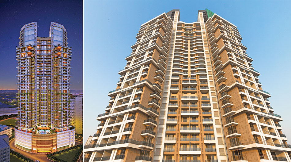
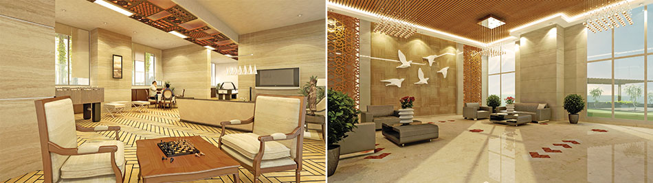
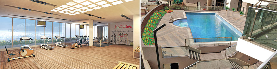
In an endeavor to congregate only 100 of India’s top business families in a dwelling, K Raheja Corp came up with the concept of Artesia. The residential complex is centered on the low-density concept, with a palatial lobby, an enormous landscape podium, open spaces and large green expanses. To enrich the living experience, Artesia’s amenities with cutting-edge aesthetics bring modernism and vibrancy to the project; they include a large-size swimming pool, children’s play area, relaxation areas, a fully equipped gymnasium, and large open spaces. Spread across 5.2 acres, the project has a building footprint of 20,000 sq.feet, with 100 families residing in one tower.
Sinuous Lines of Fluidity
Spread across 4 storeys, this office for a clothing brand, is located in a tight urban setting in south Bengaluru. While the first three floors serve as a storage godown, the fourth floor accommodates a boutique office for the fashion house. A cafeteria and break out zones are housed on the landscaped terrace above. Programmatically, the building is raised on stilts to enable parking on ground. Liberating this space allowed for a thoughtful landscape on site.
Fact File
Project Typology: Commercial Complex
Built up Area: 25350 sq.ft.
Site Area: 4600 sq. ft.
Project Completion: June 2017
Material Palette
- Malleable materials such as concrete and glass are used in the exterior
- Flexible ply in the interiors add lightness and an ephemeral finish, while solid surfaces create fluidity
- All surfaces are finished in a reflective high gloss paint
- Fluidity is augmented by a seamless reflective skin using polished white Italian marble
- Similar strategies are employed in detailing of the false ceiling and the lighting.
Translation of a sculptural notion into a workable design and construction was a serious challenge, that has been bested by the use of Digital Media and physical models as reference prototypes for execution on site
Inclined at creating an environment where people can live and work, the design is thoughtfully steered at influencing human behaviour. The entire workspace adorns white color, to add calmness and tranquillity. Passive design strategies such as day-lit workspaces, natural ventilation and indoor/outdoor interaction using landscaping have been incorporated to eliminate/avoid the Sick Building Syndrome.
Within the corporate office floor, the design articulates various functions segregating public and private spaces. The individual cabins flaunt bespoke furniture, while the common workstations have modular furniture by Feather Lite, to maximize seating. The custom-made furniture in the cabins is subtly sewn in wood, topped with Italian marble for a sophisticated look and feel.
Unlike most contemporary projects that use neoteric techniques, this commercial workplace uses generic materials like concrete brick and glass, effectively used to create complex fluidic forms on the exterior and interior. Drawing from the qualities of the exterior, the interiors aim to accentuate the fluidity of the space by mapping the surfaces in the ceiling and the walls. Subsequently, the interiors and the exteriors form one cohesive whole.
Ambiance & Order
The design approach of Studio An-V-Thot Architects in the office renovation of Borges India has been to serve the best office ambiance keeping the brand identity in mind
Fact File
Borges Head Office, India
Location: New Delhi
Area: 3000 sq.ft.
Builder: Kunj Developers
Design Team: Gaurav Chauhan, Vivek Kotha, Tavleen Kaur
Completion: April 2017
Photo Credits: Avneesh Kumar
Material Palette
Laminates: Greenlam
Office Furniture: Customised with Hettich Fittings & Leatherite Seats
Lacquered Glass: Saint-Gobain
Laminate Shutters: Greenlam
Lighting: Philips
Flooring: Nitco Tiles
The challenge was to address the irregular floor space and give a sense of uniformity and order to office demands. The overall movement pattern is well defined so as to avoid clashes in the interest of working and also to create a sense of hierarchy for better work results
Pratyoosh Chandan, Director

At the workstations materials have been kept simple and elegant with neutral beige and off-white offset by a bit of red and green
While most of the areas have Italian Diana Flooring or wooden laminate flooring, in the conference room the dark carpet flooring adds drama and gives a sense of transition from the rest of the office area
Incorporating green in designs is a crucial point as it is helpful in creating a positive working environment. Lighting has been incorporated not only in the ceiling but also in the main furniture
Ankita Sweety, Director

Partition jaalis create a sense of individuality in the workstations. Uniformity has been achieved by providing white beech laminates on workstations as well as on wall partitions. Use of nautical red laminates on workstations and green acrylic jaalis on wall partitions bring colour to the space.
An interestingly irregularly shaped Reception table composed with a few trapezoidal surfaces and as its backdrop, the logo of the company in bright red
In the kitchen area, a confluence of red lacquered glass as backsplash, beige laminate shutters on overhead storage, bright red fixed leather upholstered seats in the dining area complement each other
Reflected Topography
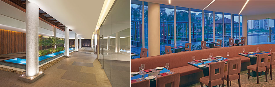
BGRT (Bearys Global Research Triangle) at Whitefields, Bengaluru, is a skillful response by the architects to the client’s rather complex brief to design a multi-functional public cum office space with a variety of programs. The waffle slab system, which is the most dominant part of the space, is left exposed to highlight the structural clarity of the space - one of the earliest design decisions that paid dividends.
The lobby is dominated by a central column, which supports the waffle slab system that spans across 32m x 32m space, with a height of 9m. The front facing sides have structural glazing and the sides on the back are stacked with services and toilets.
The central column anchors the spatial disposition in the vast space and became the axis for spatial orientation. The architectural lighting has been conceived as foliage which stems from this anchoring element. The column has been clad with Corian panels, with special details to have access for maintenance and service.

The aspiration of the client, who is a patron of good designs, made the design process challenging, and pushed the boundaries of innovation, that set a benchmark by its out of the box design and sustainability agenda. The project is Platinum LEED Certified
Ar. Lalita Tharani & Ar. Mujib Ahmed, Collaborative Architecture
Fact File
Project: BGRT, Bangalore
Area: 12,000 sq ft
Client: Bearys Group, Bangalore
Architects: Collaborative Architecture (Mumbai, Kerala)
Architectural Lighting Design: Collaborative Architecture
Design team: Lalita Tharani, Mujib Ahmed, Muneeb
Site Team: Iqbal, Sherif, Anand, Nazir
Electrical Consultants: SAN Design Consultants
Structural Consultants: Mahendra Raj
Photography: Lalita Tharani & Manish Gala
Material Palette
Flooring: Quartz Stone
Walls: Exposed Concrete, Stucco on Masonry
Ceiling: Structural Waffle System left untouched for the main area, Gyp board for the mezzanine
Furniture : Plywood and Veneer /Plywood and Corian
Indoor Tree Vase: Flexi-Plywood and Corian
Custom Designed Lights: Ferrari Fabric in MS Frame with LED Tubes
Waffle Lights: 600 x 600 GE Trilux LED Panel Lights
Mezzanine Lights: 600 / 1200 Linear GE LED Panel Lights + 5W LED Spots
BMS System: Dynalite, Philips
Chairs: Herman Miller
Custom Designed Cluster Seating: MS framework, Plywood, Corian and PU Upholstery
The project is unique in that sense, to make the architectural lighting as the raison d’être, and the space definer, not just in stylistic terms, but in terms of tectonic manipulation of the neutral space.
The pattern of the waffle system acted as the spring board for the design of the customised lighting, which resulted in a highly dynamic space - reflecting the geometry of structural system.
The seating cluster, specially designed for the project, triggers social interactions, and creates an undulating topography of contoured volume at the eye level, in a way complementing the undulating pattern on the ceiling. The Strip light, highlights along the bottom of the sofa clusters, creates a dynamic pattern and goes as an integral part of the overall design.
The lobby functions nearly 18 hours a day. The space has 5 private meeting rooms, with 4 located at the mezzanine level as added cantilevered units projecting into the atrium space.
Lighting System & Design
The project is equipped with BMS with Dali ballasts for Daylight Harvesting. The expansive glazing on two sides allow ample daylight during any season, making the system utilize minimal energy during the day.
LED-based light sources include Customized Fabric lights with 1200 long LED tubes; passage spaces have 600 & 1200 LED panel lights and 5W LED Spots. The waffle has 600 x 600 LED Panel Lights to supplement the customized lighting and to create a pattern in the waffle, which complements the configuration of the fabric lights.
Opening Up Spaces
Apartments in the Hanging Gardens high-rise residential complex, designed by Sunil Patil and Associates for Dilip Jadhav Builders, is an attempt to bring all the facilities enjoyed in a bungalow
Because of the building bylaws, balconies have vanished from high-rise apartments, hence, we have designed the bedrooms with three sides open and with glazed doors and a railing to give a feeling of openeness
Ar. Sunil Patil

The residential building has 6 floors with a 3-bedroom apartment on every floor, covering an area of 1800 sq.ft, including a huge terrace with a garden and a plunge pool. The living, dining, and kitchen have been designed as one space without any partition to visually enhance the space. The terrace too is an extension of the living and dining spaces and a bedroom. Thus, all the primary spaces of the apartment get openings to the terrace.
Fact File
Project Name: Hanging Gardens
Category: Residential Apartment
Plot area: 445.80 sqm
Built up area: 623.80 sqm
Client: Dilip Jadhav Builders
Location: Kolhapur
Architect: Sunil Patil and Associates
Landscape Designers: Sunil Patil and Associates
Consulting Structure Engineer: Prashant Hadkar
Photo Credits: Sanjay Chougule
Material Palette
Terrace: Kajariya wood finished vitrified tiles
Parking & Setback: Pavers
Internal Flooring: Kajaria vitrified tiles
Exterior Paints: Apex Exterior Paints
Interior Paints: Synthetic emulsion of Asian Paints
Railings: M.S. railing with glass
Roofing: RCC Slabs
Sanitaryware: Jaquar
Windows: Jindal powder coated aluminium
Exterior Cladding: Shera Cement Fiber Planks and ACP Panel
Swimming Pool: Finished with glass mosaic tiles
Walls are clad with Shahabad and bathroom dado with rough Kota stones. The building façade is a composite of Shera cladding and rough texture plaster. The columns supporting the terraces are clad with aluminum composite panels that continue to the pergolas on the topmost terrace. Intricate detailing was done to provide drainage for the terrace gardens that are filled with soil to ensure leakage-free soffits.
The building is designed as per the tropical climate. The south walls have been blocked and large openings in the north admit sufficient light. Ample cross ventilation in all the rooms reduces use of air conditioners in the harsh summer months. There are LED lights in all the rooms and wood-like vitrified tiles in the rooms and pool deck.
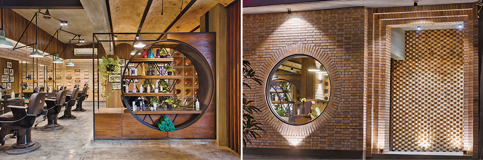
Melange of Materials
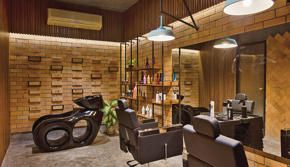
Tucked in the busy urban fabric of Rajkot, the salon is a fusion of contemporary design with natural untreated materials. The salon projects a very rustic, raw look, bringing out the original beauty of bricks and concrete at a very fundamental level. The natural variation of colours in bricks creates a remarkable canvas highlighting other elements of decor.
Fact File
Carpet Area: 1000 sqft.
Cost per sqft: `1800
Location: Rajkot, Gujarat
Lead Designers: Viral Patel & Shabana Sadikot Ghoghari
Design Team: Toral Kamani and Viral Patel
Total Project Cost: approx. `18 lakhs
Photography: Dhrupad Shukla
We have extended the theme not only for the floors but also up to the ceiling. Moving away from the conventional concrete ceiling with false POP plaster, we have used a combination of barrel vaults in cement paint along with fire brick cladding to configure the ceiling. This is a smart solution as it is beautiful and affordable for construction and maintenance
Viral Patel
The direct glare coming from the south facing façade is reduced by a thick exposed brick wall. Dramatized with a circular opening, it allows visitors to have a sneak peek into the interiors. The adjacent perforated screen, built by tactful placing of bricks, allows light and facilitates air circulation.
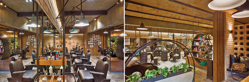
Having created functional zones with strong visual connections within the 1000 sq.ft. area, the project is a delineated effort towards configuring maintenance-free interiors within a modest expense by putting together some skilful materials for a sensorial effect. For instance, one of the circular partitions acts as a planter while the other acts as a display for products. The melange of materials and lighting metamorphose the space into a vernal and fresh one.
Using monotonous material was a decision coming from constraints of time and budget. As designers, we transformed this limitation into an opportunity by adopting a very local, identifiable material and turning it into contemporary interiors, and creating functional elements that also act as space segregators
Shabana Sadikot Ghoghari
The material palette is innovative: the flooring is of exposed concrete with a distilled use of metal scrap, which gives a depth to the visual composition. Plants bring in freshness and a contrasting tone to the overall earthy colour scheme. Instead of expensive artefacts, brand products take centre stage.
A combination of fire blocks, cement boards and mild steel forms the furniture and partitions. The wooden furniture makes the ambiance warm and welcoming. The metal fabrication generates a geometrical composition framing different visuals. Sleek metal pipes bring in simplicity through linearity while squeezing optimal functions from every niche and corner.
Taking forward the rustic theme, the industrial lights have been carefully crafted and placed. The graphical appeal is accentuated with combination of industrial and ceramic lights, custom designed fixtures, and task and mood lighting to uplift the periphery or for highlighting spots.
An Experiment in Textures
Material Palette
Mother’s room & Den: Statuario and wooden flooring, walnut veneer
Living, Dining: Fumed white oak veneer, Silver Travertino cladding (Stone Source)
Den: Fumed white oak veneer
Master bedroom: Distressed Wenge veneer, Fumed white Oak veneer on headboard with gold leafing.
Daughter’s room: Coloured (white) Polyurethene coating, Fumed white oak veneer desk, and coloured (white) back-painted glass storage for study.
Fact File
Location: 22nd floor in a high-rise in Central Mumbai
Area: 3500 sq.ft
Design Team: Tejal Gada, Khushboo & Kunal Khandelwal
Interior Contractor: Zigma Enterprises
Automation: Raylogic
Furniture & Accessories: Poltrona Frau, Vondom, Mozaic, DeFurn (China), Chor Bazaar
Architectural Lighting: Scoop Lighting
Decorative Lighting: Vibhor Sogani, Tom Dickson
Photos: Sebastian Zachariah, PhxIndia
Textured walls, material and light experimentation as standalone design features define each space, giving it an individual character, while simultaneously lending a continuity in visuals through tying elements such as the wooden dropped ceiling forming a wooden band in the living and dining area.

The concept of the house became an experiment with textures wherein the house is an eclectic mix of design features put together sensitively. Each space has a singular point of focus/element in the form of a wall treatment or texture in the sense that various modalities of function and design then revolved around it. At the same time, we had to make sure that the design flowed from one space to another without any in your face or stark contrast while maintaining a unique identity of each space
Khushboo Khandelwal
The highlight of the living room is a silver travertine stone panelled wall (from Stone Source) in the passage leading into the living room, giving a structure to the passage and enveloping the living room. The passage leading to the living room and the bedrooms is dropped down by a wood panelled ceiling forming a tying band element in the living and dining area. This adds scale and defines the spaces, without any visual break or partitions. Vondom planters in the passage add a quirky element against a mirror back wall, leading into the dining area.
All the in-built furniture along and some loose furniture like the bar unit, the dining console, the entrance unit etc were customised by us along with our contracting team. The dining table, armchairs, glass centre and side tables, dining chairs, den sofa (drawing inspiration from Roche Bobois) were customised by Mozaic. Items like the wooden chaise in the living area, bar stools, wooden barrel centre tables etc were sourced from DeFurn. The main white sofa is “Manto” from Poltrona Frau. Artefacts and curios are from Defurn, Mozaic, and Chor Bazaar
Kunal Khandelwal
The dining area extends into a large sundeck, where a simple Corten steel console pulls out to form a concealed bar area. Textured paint on the wall complements it. The den is used primarily to watch movies and for card sessions. Here, a textured “wooden wall” with quirky card symbols becomes the design highlight of the space. The wall is designed as a series of fumed white oak veneer panels, faceted at various angles, along with concealed lighting. The sofa arrangement is a series of individual seats in funky patterns and coloured motif fabrics.
The master bedroom has a distressed finish wenge veneer wall, with a recessed brass strip disguising the wardrobes, the bathroom and the dressing storage. The headboard is a collage of wooden and gold motif panels, and the highlight of the room is an “ornamental relief” wall, giving a sense of understated luxury.
In the mother’s room, the focal point is a slanted textural pattern in walnut veneer, which forms the headboard, and is complemented in the wardrobe handles. The daughter’s room is clutter free, and in varied textures of white, complemented by grey and yellow as soft furnishings. Colored quotes on the wall define the surface treatment and become the focal point, adding a sense of playfulness to the space.
A Visual Dialogue
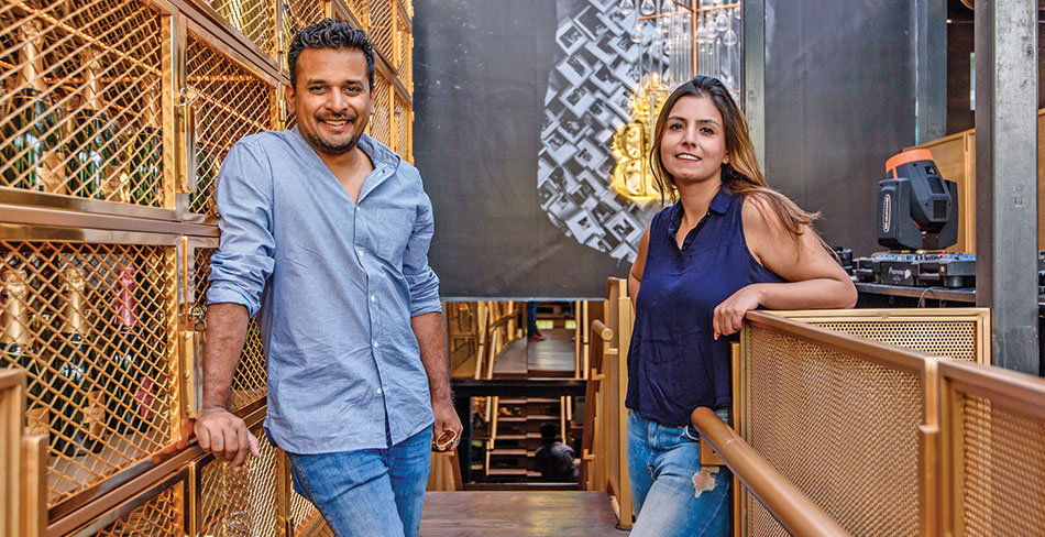
Abhigyan Neogi & Ar. Kanika Suri, Chromed Design Studio
Fact File
Project name:Epic Kitchen N Bar
Location: Hudson Lane, Vijay Nagar, New Delhi
Gross Built Area: 4000 sq.ft
Commencement: May 2017
Completion:February 2018
Architect Firm:Chromed Design Studio
Design Team:Piyusha Upadhyay, Kanika Vohra, Abhigyan Neogi
Photo credits:Arvind Hoon
Text by:Ar. Himani Ahuja (One Digital)
Located in north Delhi, GTB Nagar, Hudson Lane, amidst a street lined with themed cafes, never fails to surprise with its overall cheery ambience. Each cafe here is unique, as is Epic with its artistic decor.
Making a well-deserved comeback from the 1980s is the Memphis design movement, reflected in the vibrant Full Stop Café, alive with loud pop colors, zany patterns, and bright neon lights. Various signs and installations give the place a memorable hallmark. High in graphic design content, the space engages the onlooker in a visual dialogue.
Other highlights are a suspended community table, an acrylic chandelier, long vertical vision panels for natural daylight, different flooring patterns and styles, elements peculiar to the Memphis style such as Laminates and Terrazzo on table tops and on floor finishes, wide gateways in Sesame Street Colours and Squiggle prints, walls adorned in wacky geometric mirrored prints, and simple stippling artworks on black panelled walls.
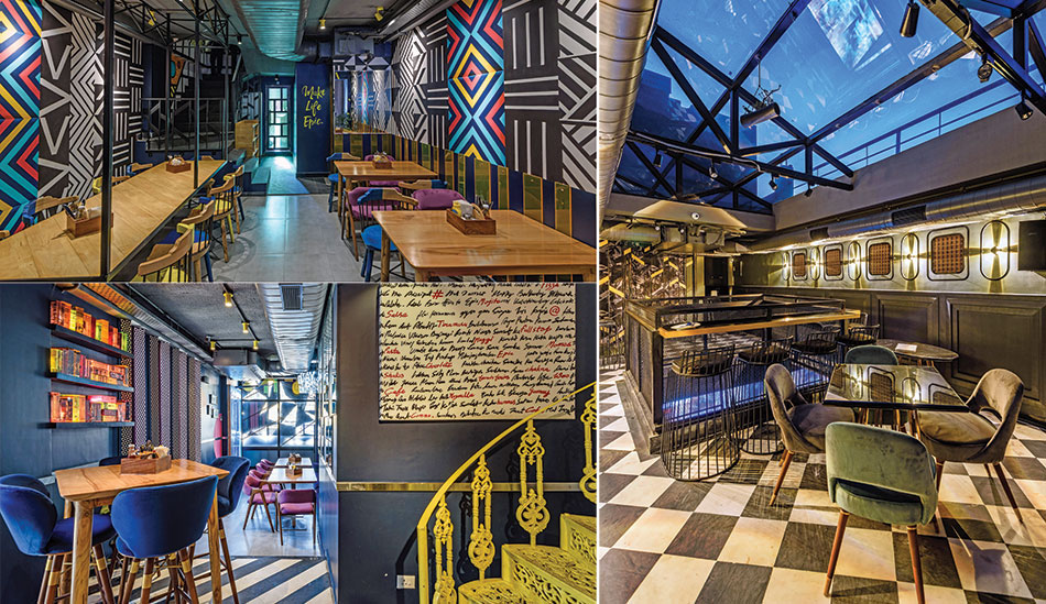
A cleverly designed air conditioning layout is a characteristic of this place, as it runs parallel overhead to the aisle while cooling the area uniformly and without any hot pockets. Vertical circulation points include a canary yellow Helical staircase near the two-way elevator, and a wider staircase with classy black décor for the staff.
There is a visible transformation in the quality of space once the visitor climbs the final flight of stairs. The bright neon and acrylic colours transform into emerald greens and tasteful Eames chairs covered in velvet. There is a cut-out overhead for an added feeling of comfort with a double height space. Indoor plants, black panels lined with green textures, a see-through bar back complimented by a brass monolithic bar, a dark green panelled wall with mounted typewriters and a lit-up crossword, brass sphere installations around the DJ console, and a Kadappa flooring, form the interesting creatives.
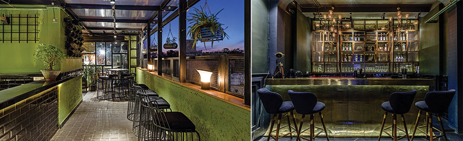
The elevator leads to a terrace where the design sports a partial indoor space complemented by lush outdoors. A truss with glass fitted in the voids at the top and walls, allows one to experience the skies, and at night, the terrace lights up to reveal the wall decor with wall mounted lights and patterned panels.
Getting it Right

Especially in high rise buildings where space is a constraint, modern kitchens are coming up with in-built refrigerators and dishwashers as they look cleaner, and they also fit in the same depth as the kitchen counter that is around 24 to 26 inches as compared to the large refrigerators that project out from the counters by 6 to 8 inches. The in-built fridges have a capacity of around 275 litres, so one may need to select as per the requirement. A variety of brands like Miele, Seimens, Kaff, Elica, Faber etc, are available as per the budget and desire for aesthetics.
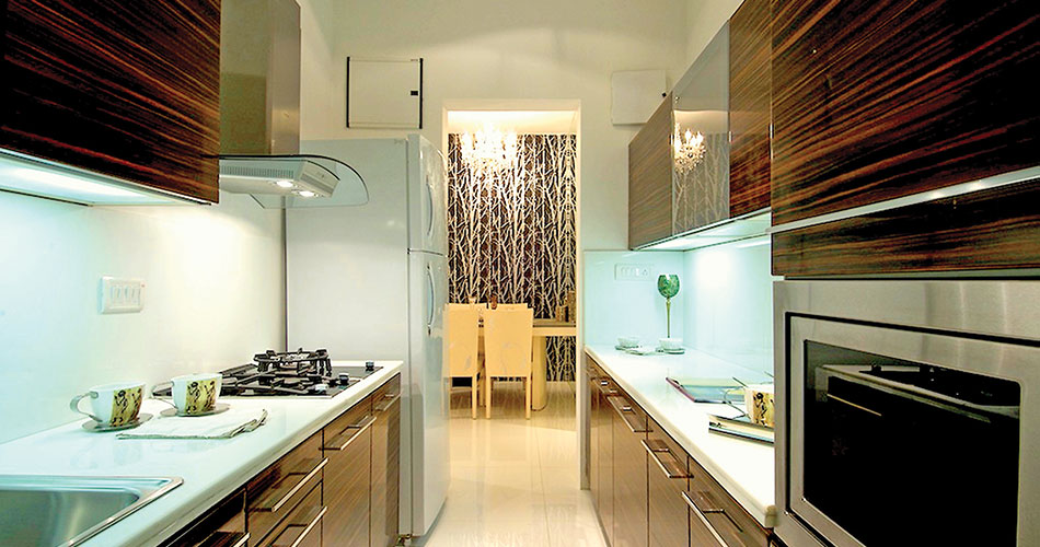
As regards materials for countertops, cabinets etc, it’s best to choose the materials and finishes including the hardware and fittings before the project begins. Finishes are available in glossy, lacquer, matte, and non-reflective glass. For countertops, I have used quartz marble from Kalinga marble from Classic Marble Company (CMC), and for the island counter, orange back painted glass. For cabinets, I have used Marine Ply with lacquer, and the Italian kitchens have MDF/ Particle Board with lacquer or anti-scratch laminate, or Marine Ply with back painted glass and veneer. The backsplash is the same counter quartz turned up.
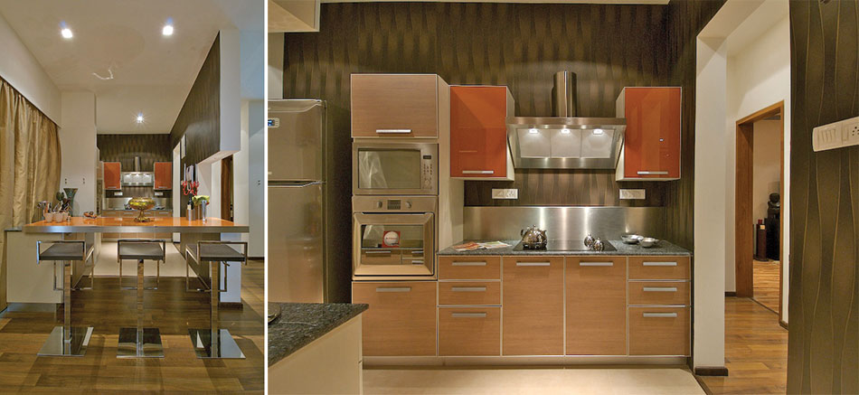
We look for hardware that enables smooth functionality, is long lasting and easy to clean. The kitchen design should consider optimum space utilization, even the corners. Hettich and Blum are some of the brands we use on our sites.
When Craft Becomes the Structure
Name of Project: The Crafted Shell
National Competition: 2nd Runner up
Location: Panjim, Goa
Architects: Design Urban Office Architects
Project Team: Dipal Kothari, Atrey Chhaya
The form resonates with the structure of a Seashell, which is intrinsic to the coastal state of Goa. The form is initiated by the Fibonacci spiral, a series of incremental numbers that define the growth of a shell. With the same rational, the scale of the structure can be adapted to various site conditions.
The craft
Crafted at the edge between land and sea it is a part of Goan culture and identity. The sweeping expansive structure creates possibilities for multiple uses. The efficient design of the Shell allows for maximum habitable volume with minimum material resources. The geometry of the seashell is observed, analyzed and manipulated to derive a habitable space.
A series of wind flow analysis was carried out to create optimal flow thereby maximizing cross ventilation and reducing heat pockets within the structure. Slits in the roof bring in diffused natural light and ensure uniform lighting in the interiors. The slits allow for warm air to rise and escape, thereby naturally ventilating the interior spaces. This would ensure a cross ventilation flow in the structure.
Adaptive plan
The form and structure of the design allows for the space to be used for a variety of possible configurations. An office, a reception and the entrance plaza form the only constants around which various functions can be organized. The pavilion extends into the landscape areas around it creating a seamless indoor-outdoor experience along its periphery. Various hard and soft landscapes are designed to create a tactile experience.
Dual response
The elevations of the structure depict the dual response of the design. The Public front forms the identity of the structure inspired by the shell, however, it prevents direct views into the interior space. The Plaza is the only feature scooped into the closed form creating an inviting entrance. The Private space of the school incrementally increases in volume through sweeping curved surfaces that bring in natural light and ventilation and opens into an outdoor space.
Like the form of a shell, the roof is a complex double curved surface. Though the design has been conceived using advanced digital software, the materials used are traditional thatch bales laid over a bamboo mat. Thatch is a locally sourced and extremely versatile material that can be laid in tied bales to achieve highly complex formations. The supporting structure is half cut bamboo rafters that can be bent to match the shell geometry in a array formation to create a supportive mat spanning between the bamboo trusses. This combination is a structurally efficient net zero carbon structure, that naturally breathes allowing for comfortable, habitable spaces within.
Ar. Dipal Kothari, Ar. Atrey Chhaya
The Learning Areas of the School are completely open to a continuous panoramic view that seamlessly connects with its surrounding.
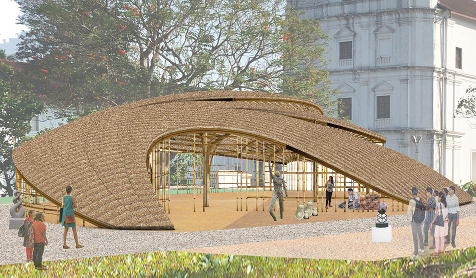
Outer shell
The views of the School emphasize the shell structure and create an intimate shelter for the school within. The property of the Shell Structure is that it is shaped to transmit applied forces by compressive, tensile and shear stresses that act in the plane of the surface. Thereby, it requires minimal thickness for a maximum span. The shell form is achieved by using an innovative stick and mat construction technique.
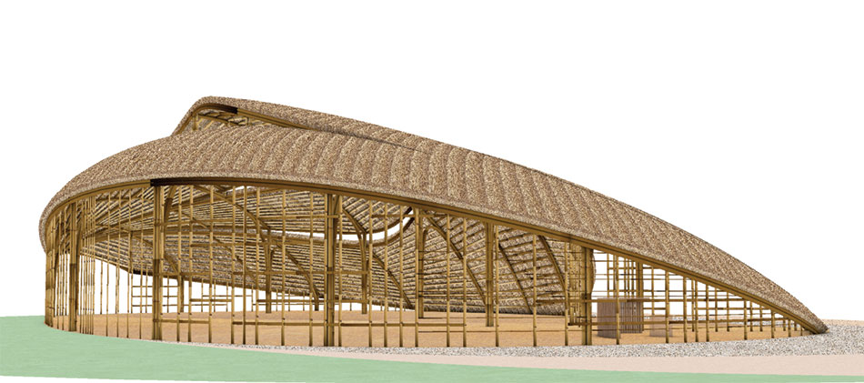
Structural system
The structure is designed with locally available natural material - bamboo. The materials are selected to ensure that the net carbon footprint of the structure will be zero. The span is divided into 6 equal bays by bamboo trusses. The surfaces in between the trusses are spanned with bamboo mats. Thatch bales cover the rafters and follows the curvature of the shell.
Stick & Mat structure
The structure is constructed with bamboo sticks that can be tied and bent into 6 pre-defined curved trusses. Bamboo mats can be tied and assembled on the ground and hoisted to location and tied with trusses. They would adjust to take the shape of the shell form.
Environmentally Sound
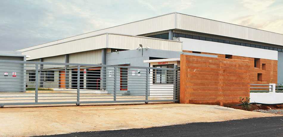
The KGI Garment Factory is a naturally day-lit building, which houses 500 employees. The structure is composed of steel, concrete glass, and a rammed earth wall. It was designed to incorporate sustainability, most importantly in its natural lighting and temperature control, thereby, increasing employee satisfaction and productivity. The design also promotes local architecture and craftsmen.
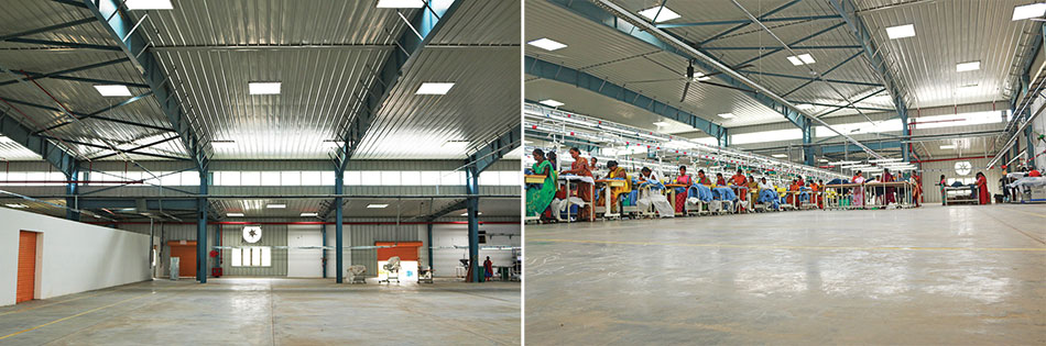
The combination of well-known economic benefits (cost, durability), environmental benefits (recyclable, sustainable), and social benefits (health, safety, local workforce employability) of steel has proven to be the perfect choice for this project. Large span structure PEB was the requirement. Steel supplied by Kirby building systems is used here in making the roof and columns.
Usually steel is the chosen material for any manufacturing and storage facility worldwide due to its versatility, strength and durability. We have used steel supplied by Kirby Building Systems in making the roof and columns.
Ar. Pavitra Sriprakash, Shilpa Architects

The Abodo Rammed Earth Wall made using fly ash blocks of recycled material, funnels the glare-free north light into the Shop Floor. The soil used is organic and a locally available material worked on by local craftsman. Its superior thermal mass ensures appropriate temperature control inside the building. Skylights installed on the roof make way for natural lighting. The design has been created with the best orientation for lighting while reducing heat gain and glare into the building.
30 turbo vents maintain the room temperature within the factory shed, while providing ample ventilation without air conditioning. The combined effect from the ventilation and skylight interventions alone result in energy savings of 48%.


