
Rethinking Traditional Values
Fact File
Architects: András Varsányi, Péter Pozsár, Norbert Vas
Building contractor: Tóth Tibor - carpenter
Year of construction: 2014-2016
Scale of project: 480 m2
Project cost: 500,000 EUR
Photo credit: Tamas Bujnovszky
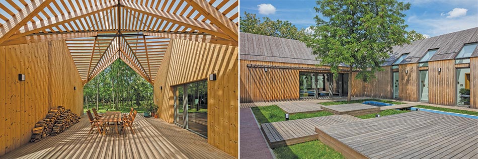
This modern farmstead expresses the contemporary need for smart integration into an environment while extolling the traditional values that come from the building’s folk inspiration. Having won the audience’s vote at the Media Architecture Awards, it’s clear this is a value that modern homeowners are considering.
In the small village of Algyo in the Great Hungarian Plain, the surrounding area became depopulated due to global and national changes in the needs of agriculture. It was important, therefore, that the project maintained the traditional values of such a building but with more contemporary needs.
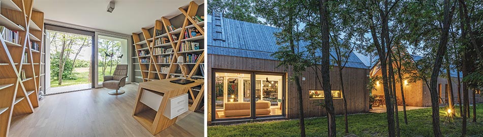
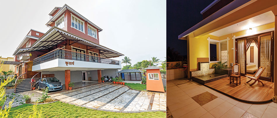
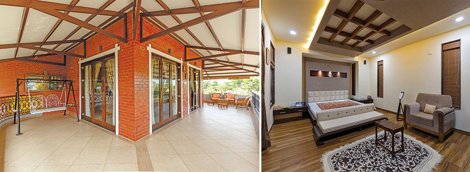
As a result, the most iconic aspect of the project is the central courtyard, enclosed by three sides to create an intimate setting amidst the surrounding acacia forest. The various modernized elements take aspects that were no longer needed from a traditional farmstead and repurposed their use. For instance, what once would have been stalls for animals or maize, are now garages. A corner section was removed as part of the interior structure but the roof was retained to create a quaint, sheltered, outdoor seating area.
The outdoor area encapsulates a pool and a number of terraces of varying heights. A modern library (a white cube) protrudes from the otherwise entirely wooden structure. The secluded spot embeds itself within the forest, intentionally representing urban architectural design but also creating a quiet space to read and relax.
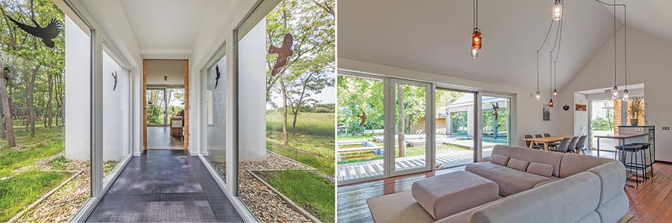
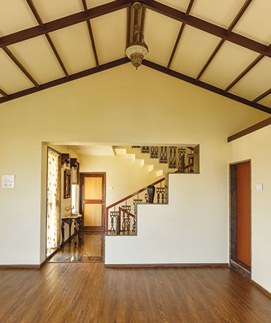
The intention of the architects was to utilize a minimal floor-plan, making use of the traditional roof to create an interior space that was at once open, warm and welcoming. Though the building mimics the orientation of the original farmhouse exactly, its position within the wood was carefully selected to minimize its impact on the forestry and help its habitation within nature to be as seamless as possible.
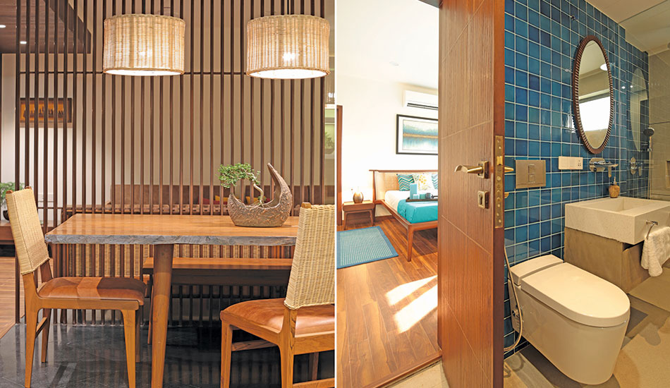
The building is divided into living areas and bedrooms, effectively connected via the outer courtyard and sheltered club space. Windows on either side of the building allow light to seep in from every angle and create a much brighter and more airy space in contrast to the darker rooms of traditional houses, whose functions relied on protection from the elements.
Home of the Future
The Modern Classic
Fact File
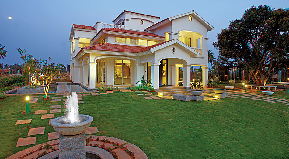
Project: House of Hiranandani, Devanahalli, Bangalore
Architects: Alay Design Collaborators (Bangalore)
Interior Designers: HOH Design Centre, Zareer Mullan Architects (Clubhouse)
Construction: K.S. Arunachala, WSP Cantor Seinuk (India), Chetana Engineering Services Landscaping: CPG Peridian (Singapore)
Developer: House of Hiranandani
Area of project: 78 acres
Material Pallete
RMC concrete
Hollow concrete blocks
Natural marble
Aluminium powder coated window frames
Red Meranti wooden door frames
Ceiling finish: Birla putty
Internal plastering with Gypsum Vermiculate plaster
External plastering with river sand
Vitrified tiles of Kajaria, Simpolo, Regent
Tiles: Nitco, Simpolo, Griffin
Quick Step (imported) laminate wooden flooring
Internal Paint: Acrylic distemper of ICI, Berger, Asian Paints
External Paint: Texture Paint of Renovo
Electric Switches: Schneider Opale, GM
Elevators: Johnson Lifts
Sanitary Fittings: American Standard, Toto
CP Fittings: Grohe
Kitchens: Futura, Akriti
Lighting: Panasonic
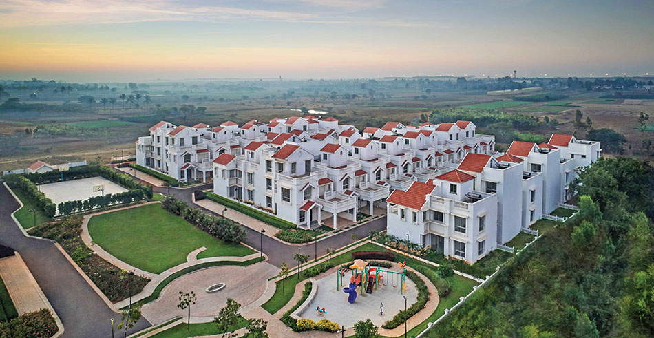
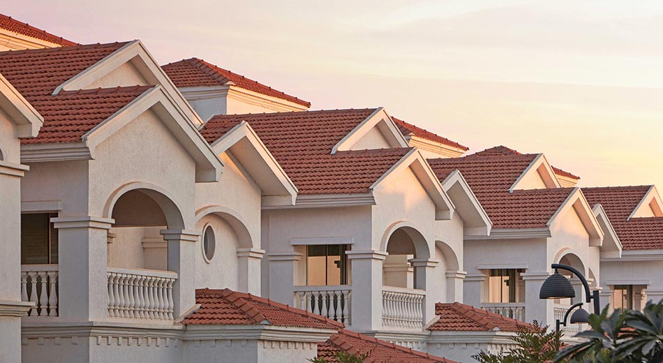
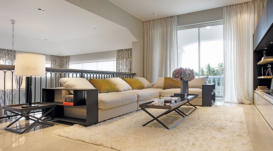
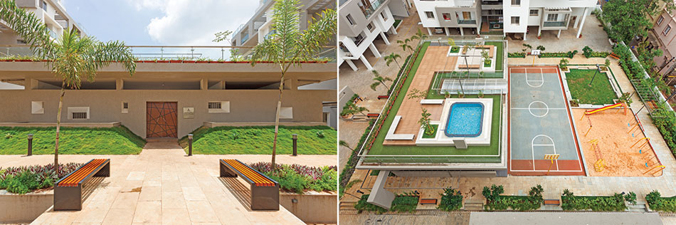
The villas and cottages are part of a cluster in the large township. The scale for apartments of 842-1891 sq.ft carpet area, and their verticality is dealt with intricate detailing of features such as pediments and mouldings with the right height and proportion relative to the villas and cottages.
Design
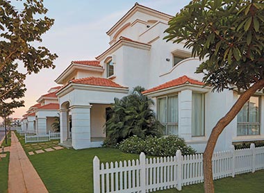
The sense of spaciousness in the large apartments in addition to luxurious amenities like well-appointed club house, a lush herbal park and vast expanses of greenery. Available in various configurations, the villas, cottages and apartments promote community living with a well-appointed clubhouse, nature trails and parks, and close proximity to important commercial and business destinations.
The design captures as much daylight as possible. The openings have been optimized to suit the design element, façade detail and enhance the spatial feel. In the villas that range from 2204 sq.ft to 3487 sq.ft carpet area, the elements are fluid, with an influence of neo-classical detail of a typical Spanish type villa. Certain elements are from the Renaissance period and modified to suit the construction methodology.
The design concept was the outcome of an optimal integration of a township at a macro level and of the villas and cottages at the micro level, all of which have been designed in harmony and to complement each other. House of Hiranandani has pioneered newer technologies, bold designs and precision engineering to create landmark residential townships and commercial complexes with world-class amenities
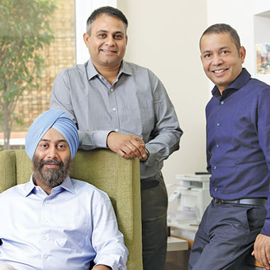
Niranjan Hiranandani
CMD, Hiranandani Group
Proportion, aesthetics and balance have been kept in mind in view of the differences in each type of villa. The detailing in the 3BHK cottages of 1558 sq.ft and 4BHK of 2204 sq.ft carpet area fit the scale of the overall development and the roads.
Roofing
The villas and cottages have RCC sloping roofs with Mangalore Tiles/ Flat/Terrace Slabs, while the apartments are of RCC flat slab construction. The design ensures less or no beam projections within the apartments, and an option of soaring windows/doors with high lintel.
Façade
The façade is of hollow Block Work with Aluminum Sliding windows. It is of lightweight construction, has thermal and sound insulation, and provides ease of electrical conduiting.
Challenges
Black cotton soil was encountered during excavation, due to which, laying of the footpath with granite stones on PCC was getting cracked. Non-availability of river sand, mobilizing labour for such a large project, and utilizing the open wells on the site which were historically used for agriculture, were some other problems.
To overcome the challenges, the following measures were taken: The structural design was made suitable for the soil condition while keeping costs under check. Usage of M-sand bedding for granite in the footpath helped to counter the black cotton soil expansion and contraction, thereby, preventing cracks. Instead of river sand, mixed designs were made with M-sand for construction activities. Addition of mineral admixtures like fly-ash reduced cement consumption. The frame design was replaced with flat slab, which reduced slab cycle and minimized usage of timber. In fact, HOH is the first company to have flat slab introduced in the residential sector in Bangalore. Most of the open wells were retained and converted to recharge pits. A permanent labor hutment with facilities was provided by the contractors to retain laborers at site.
Project’s USP
House of Hiranandani has altered the way living spaces are designed. The architectural lineage of HOH garnered over three decades, is reflected in their world-class landscapes, elegance and contemporary designs. Neo-classical style of arched windows, elaborate pillars adorned with ornamental motifs, lofted arches, unrivalled views of nature, the imposing presence of landmark buildings marked by exquisite Greco-Roman architecture, Florentine domes, Grecian columns and regal pediments give their real estate projects a distinctive sense of space and grandeur.
Building materials
The villas have natural marble in the living, dining and family areas and in the staircase, vitrified tiles in the kitchen, wooden flooring in bedrooms, and ceramic tiles in the sit-outs. The cottages have wooden flooring in the living, dining, family room and bedrooms, natural marble in the staircase, vitrified tiles in the kitchen, ceramic tiles in the sit-outs and vitrified tile dado in the toilets. The fenestration comprises 8mm thick, toughened glass for 8/9 ft high sliding doors and 6mm thick clear annealed glass for other windows. In the apartments, vitrified tiles have been used in the living, dining, passage and kitchen areas, wooden flooring in bedrooms, ceramic tiles in the deck area and vitrified/ceramic tile dado in the toilets.
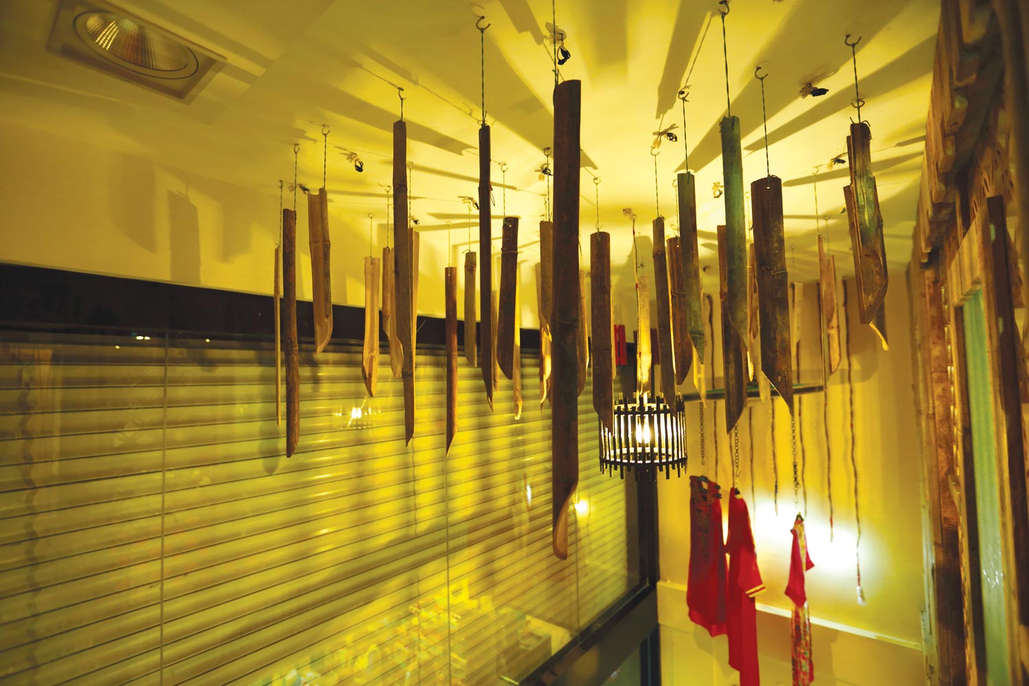
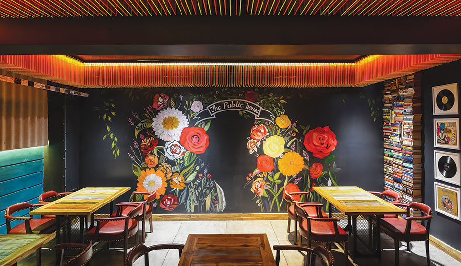
Where Culture Meets Trend
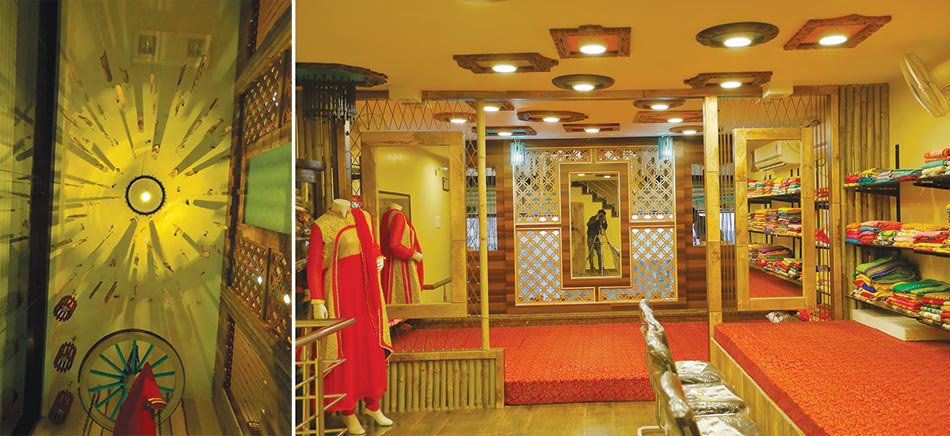
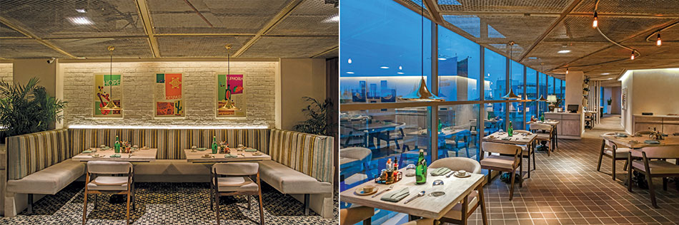
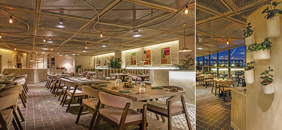
Located amidst the busy streets of Sadarpura, the store has a striking appearance with its interiors, transparent exteriors and display of local materials. The interiors were designed maximizing sustainability, locally available and recyclable materials like jute, bamboo, wooden logs, and hanging light fixtures in their ethnic forms. Use of old cartwheels for hanging displays, wooden logs as lighting fixtures, and rope patterns between display shelves create a sense of continuity and interconnection, transforming the space with a unique ambience of culture mixed with trend.
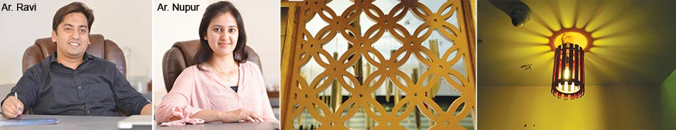
The transparent exterior clubbed with low height ceilings allow natural light to diffuse in the interiors. The ceiling beautified with random frames of different styles and flamboyant color play intensifies the design and creates an enthralling ceiling design.
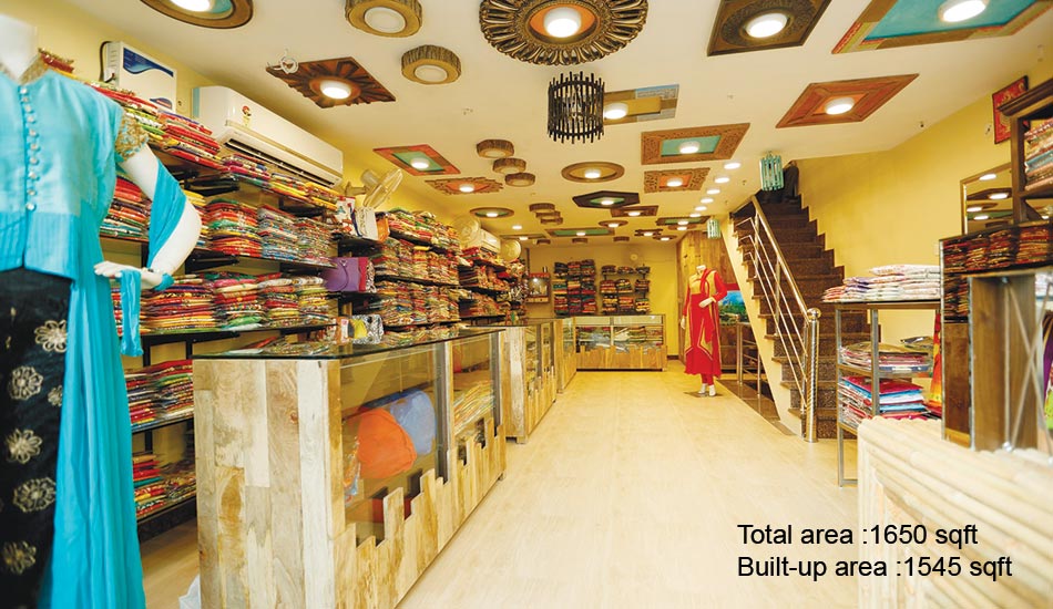
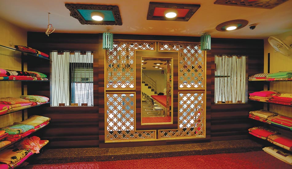
The store has been segregated according to its functionality: the ground floor is welcoming and spacious with display areas and counters, while the basement is the tailoring section. The mezzanine floor is the saree section, beautifully enclosed by mdf jaali patterns, ropes and mirrors.
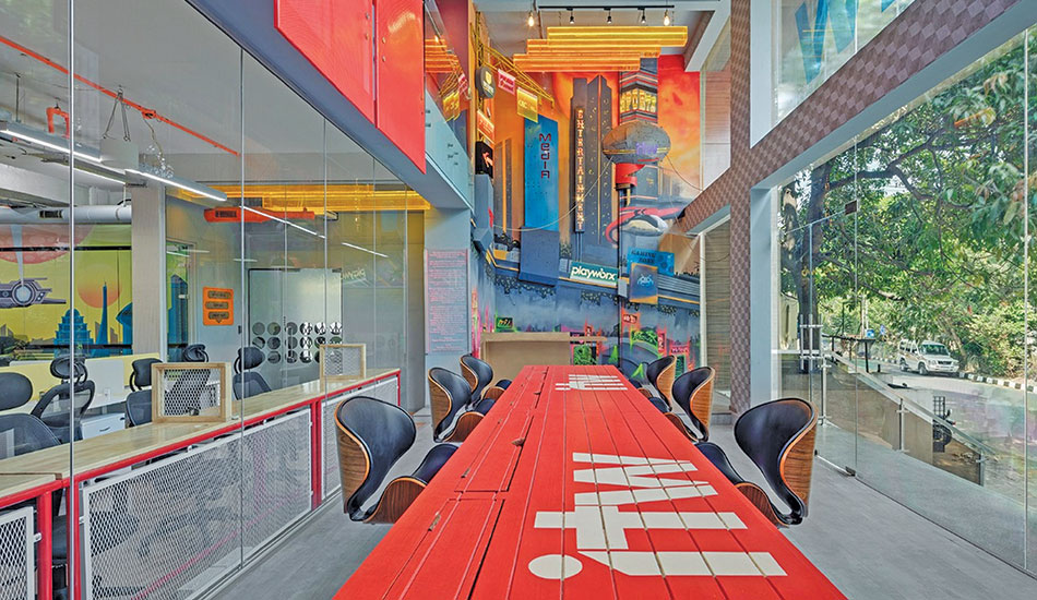
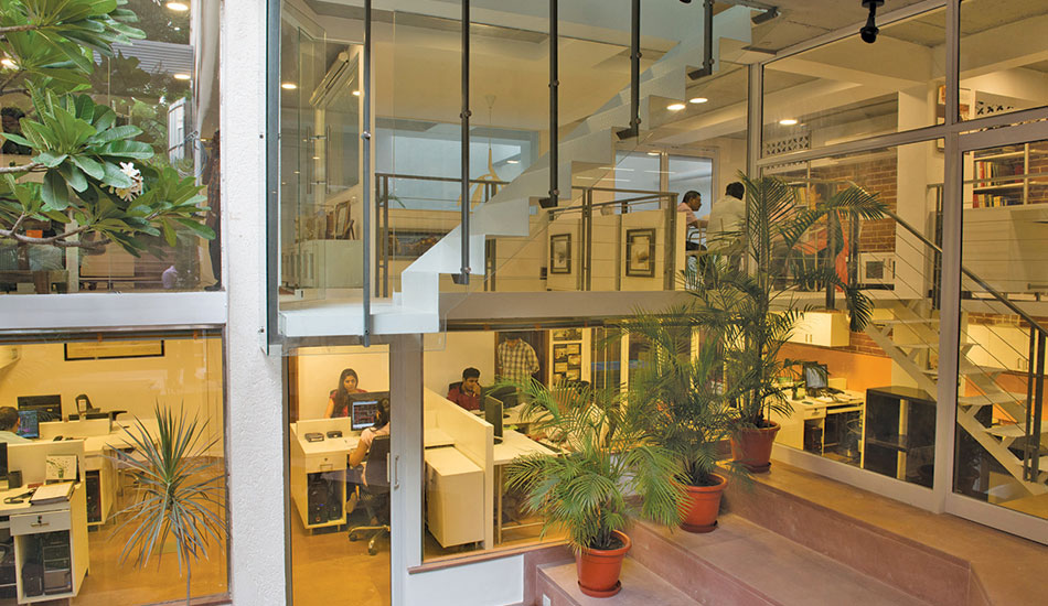
Immersive Work Environment
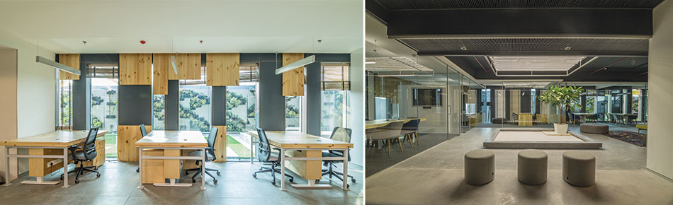
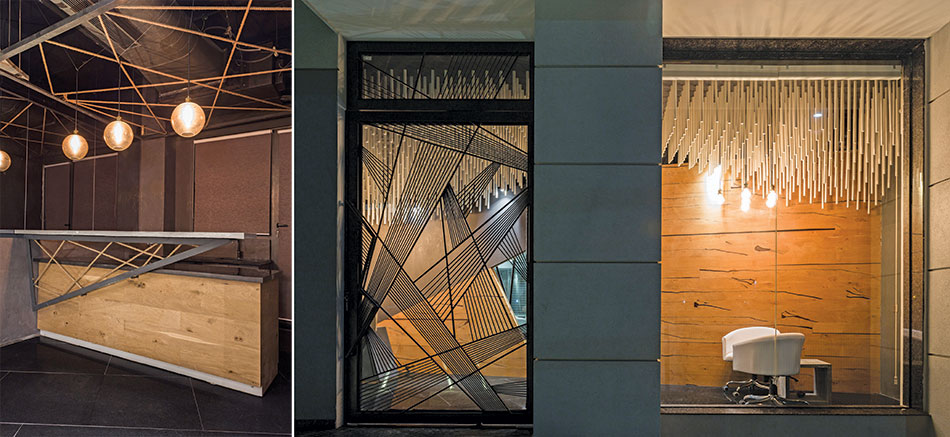
The brief of Bhairav Shanth, MD & Co-Founder, ITW Consulting, was to redesign and transform the public areas of the office and create a high-energy, unconventional workspace, without making any alterations in the existing layout. The world we envisioned was divided into 3 separate futuristic zones, each inspired from a different sci-fi movie: ‘Blade Runner 2049’s unique dystopian future for an impactful and engaging reception area; retro-futuristic sets of movie ‘Her’ for a playful work zone; and luxurious art-deco elements of ‘Passenger’s spaceship bar for a classy, captivating lounge area
Smita Thomas, Multitude of Sins
Fact File
Client: ITW Consulting Pvt Ltd
Location: Vasanth Nagar, Bangalore
Area: 2500 sq.ft
Principal designer: Smita Thomas - Multitude of Sins
Design team: Rahul KP, Rachita Murthy
Graphic Artist: Rahul Chacko
Mural Artist: Shunnal Ligade
Metal Artist: Mechanimal
Custom Furniture: Be Vintage
Canvas, Vinyl, & Glass Prints: Wall Queen Interiors
Electricals: Mohd. Hussain
Light Fixtures: Euro Lighting
Wooden Flooring: Square Foot
Photography: Shamanth Patil
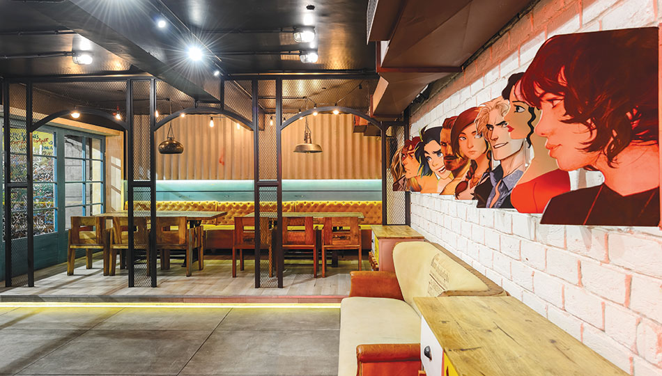
Reception area: With the sheer size, height, and abundant sunlight, the main open-plan reception area that mimics a central courtyard, serves as a waiting area for visitors and an informal work area for employees. It is illuminated by custom-made conduit ceiling lights in a geometric pattern that extend along the length of the space. Pale grey wooden flooring signifying concrete, geometric patterned walls, inverted boxy bay windows, and perforated metal railing, make subtle references to the futuristic theme of the space. The custom communal box tables built from reclaimed hardwood mix are painted in bright red with distressed surface graphics and high seating. Taking a cue from Bladerunner 2049, the team designed a 20 x 22-ft multi-media mural, depicting the different verticals of the company and its affiliates’ logos, and setting the tone for a spanking new identity.
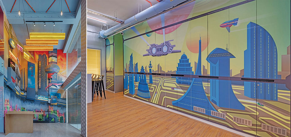
Mural: A larger-than-life mural, generated by artist Shunal Ligade, adds a streak of creative energy and demonstrates that artistic concepts with an engaging narrative can effectively achieve a brand’s communication goals. The mural is created using a variety of techniques and materials including acrylic paints, spray paints, UV paints, multiple metal structures, laser-cut buildings, steel cables, plywood, MDF, a mix of neon, marquee, LED, and acrylic lights. All the metal structures for the murals are created by metal artist Rahul KP as are the ceiling lights in fluorescent Plexiglas boxes that lend an intense fluorescent hue to the mural.
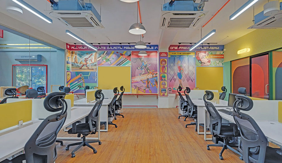
Workstation Area: The mix of private and open-plan workspaces feature an eclectic range of graphic art by artist Rahul Chacko in contrasting pastel and bold tones. Inspired by the retro-futurism of the movie ‘Her’, the work area is updated to a colourful, evocative, and friendly workspace. A canvas mural art features graphic novel-style panels that are embedded into and around the existing wall space. Each panel features future experiences from cyber cricket to space-age holographic concerts, representing the various verticals handled by ITW.
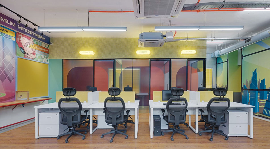
Telepods / Private Booths: The glass-walled telephone booths have been outfitted with custom graphics and organized into 3 separate pods called Decode, Process and Uplink. The signages are acrylic lightboxes and the glass structure is custom gradient films designed by Rahul Chacko. The high gloss wooden cladding in bright orange lends a punch to the interiors.
First Floor Lounge: Inspired by the grand and luxurious art deco-style bar and lounge of the movie ‘Passengers’, the lounge area is set out like a large, open-plan living and dining room, and features an eclectic mix of furnishings of plush leather sofas, a wooden desk and leather chairs. A giant screen and flexible seating allow employees and guests to watch live streams of popular sporting events that the company organizes. The lounge area also houses a formal conference room where the warmth of wood is given a graphic art-deco punch with a geometric wall installation. An old Corian conference table refurbished in polished wooden finish paired with stylish leather and wood finish armchairs create a warm, intimate environment, heightened by vintage wall sconces and filament bulbs that emit a soft glow. The bathroom, with doors designed in the art deco style, has minimalist elements like faucets, hand towel rings and abstract flowing water patterns that reinforce its identity.
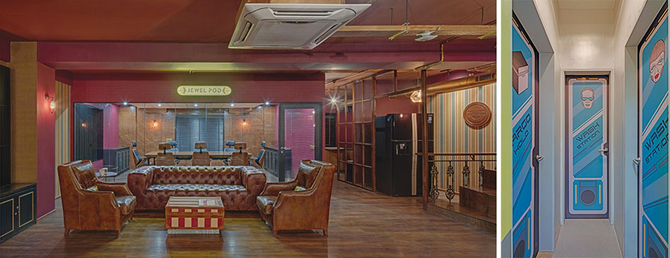
Ground floor Bathroom: In line with the retro-futuristic theme, the distinction between the men and women’s restrooms is depicted through renderings of fashion: the man is decked in a svelte outfit that takes inspiration from Starfleet uniforms, while the women is wearing action-ready power armour.
Stimulating Creativity
Text: Ar. Himani Ahuja
Fact File
Client: Soft Bank Energy
Location: Aerocity, New Delhi
Site Area: 12000 sq. ft.
Built-up Area: 9000 sq. ft.
Architects: Arvind Vivek & Associates
The idea of ergonomics has been efficiently adopted in this modern workplace as it will boost productivity and efficiency in the workforce
Principal Architect
Vivek Gupta
The design stimulates creativity and the space allows for team brainstorming and meetings. At the same time, employees can work individually as the wide range of furniture can be moved and configured into endless setups, as and when required.
A natural palette of concrete and pinewood accentuates the interiors. A bare ceiling with exposed services is a significant feature. Adding aesthetic value are the customized suspended and floor-mounted lamps, and transparent partitions of glass supported by aluminium channels, amidst which a potted Champa tree takes centerstage.
Treated columns with a special film, transformed into writing boards, provide freedom of expression, while a video wall displays important information. Within an eye-catching geometric grid that separates two working regions, sit planters, gussying up the sterile premises.The design is conceptualized on the Japanese principle of ‘Shibumi’ that translates to a particular aesthetic of simple, subtle, and unobtrusive beauty
Associate Architect
Amruta Turkhud
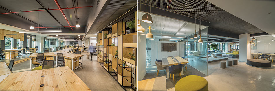
The adjoining double height terrace, once a monstrous black metal plate, is converted into a green wall. Providing ample shade in the linear terrace, are triangular parasols with a cluster of benches. The pergolas cast shadows under the sun, quietly animating the astro turf underfoot. A water body on the terrace contributes in evaporative cooling along with wind movement creating a micro climate and reducing the ambient temperature.
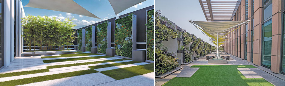
The high point of the office is the indoor and outdoor interconnectivity with the terrace’s mixed use of a recreational cum work space, and the green elements indoors. The overall scheme elevates wood and nature, showcasing the trend of biophilia, which is based on the idea that humans have an innate affinity with Nature.
Studio in the Garden
The basement floor of a 4-storey apartment building situated in a residential neighbourhood facing a community park was designed by the architect as his own workplace. The challenge was to redefine a basement to reflect the company’s firm belief in sustainable design.
The project was conceived with a programme that imbibes all the essential elements of an open workspace but at the same time breaks the mould of conventional design and architecture
Ar. Nilanjan Bhowal
Descon
The idea, to design a creative working space with no boundaries, was achieved with well-lit multilevel spaces that blend into each other at various levels. The free open space image of the office eliminates hierarchy and inculcates free exchange of ideas.
To break the monolithic image of a commercial space, the colour palette, materials and textures remain earthy and yet radical in terms of usage. Natural colours like that of terracotta and burnt amber were incorporated by using Red Agra and Yellow Jaisalmer stones along with marble chips to give the space a striking, organic visual appeal.
The office spaces are designed around a courtyard, and to give visual connection to the greenery, a transparent façade is used. A staircase, finished in red Agra stone and contained by a bio-wall with a water cascade beneath it, leads to the central courtyard. Insulated walls and rainwater harvesting reduce energy and water consumption.
The absence of walls, cabins, or cubicles create a large free flowing space. The minimal skin of the skeleton of the space turns the design inside out, such that the office space is flooded with sunlight.
Transformable & Flexible
The most unique design element is the movable furniture and the partitions. The idea of things flipping, such as the bar, the tables and the lights, and the bold quirky graphics that give an illusion of pop music and culture
Abhigyan Neogi & Kanika Suri
Fact File
Area: 6700 sq.ft
Location: Lower Parel, Mumbai
Budget: 2.5 cr
Completion: August 2017
Project duration: 6 months
Photos: Suryan//Dang
Text: Ar. Himani Ahuja
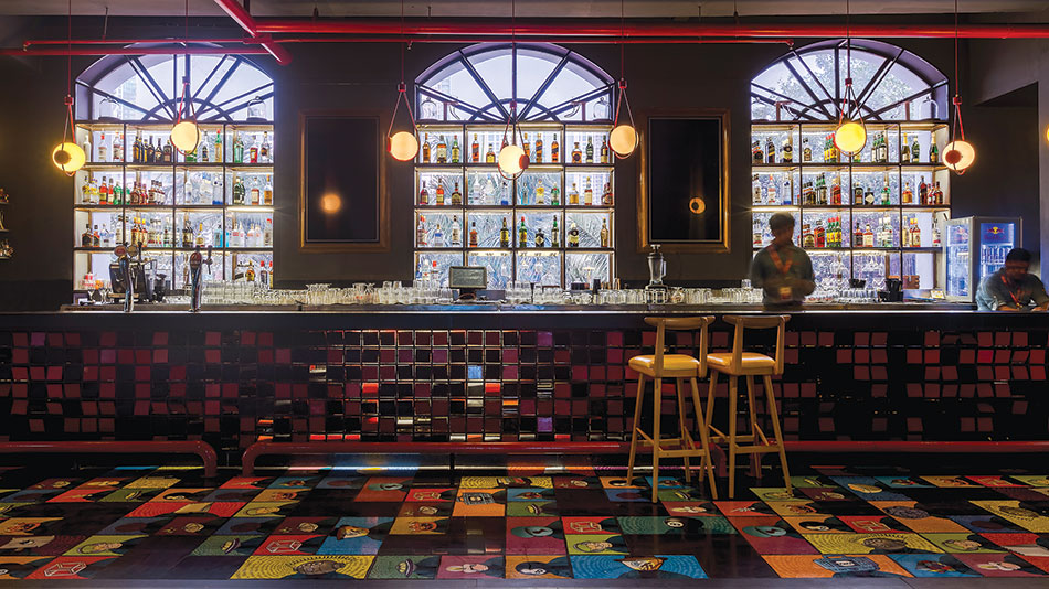
The design creates a space that can easily accommodate and transform the space as per the events and showcase MTV in all its glory. Hence, a café design that literally ‘flips’. The intent was to create a dynamic and ever-changing space. Each of the functional element in the café like lighting, furniture and partitions alter the atmosphere for different times of the day during breakfast, lunch, and dinner or for special occasions.
Since the site did not have any outdoor spaces, the design team receded the indoor area to open a chunk of the site. The indoor area houses a bar, and a multi-functional stage suspended from the ceiling. Movable partitions further create smaller pockets for a variety of seating zones, workspaces, meeting areas and casual dining. These partitions, designed in modules, form various configurations that make the furniture layout dynamic and flexible.
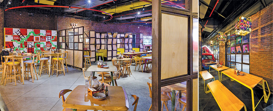
The second zone, separated from the indoor wall with pivoted clear windows, is more casual and laidback, with large, arched windows of the mill building retained to lend a feel of the outdoors. The outdoor area has an ancillary cocktail van in the form of a camper, and wooden benches, hammock chairs and ledges for informal seating.
To create a sense of a bare shell building, the walls have been chiseled, with stained brick and the original concrete. The terrazzo floor was cast in situ and has Kadappa stone in leather finish. The partitions are of mild steel, finished in lacquer polish for a raw look, and there are handmade glazed tiles in the toilets.
.
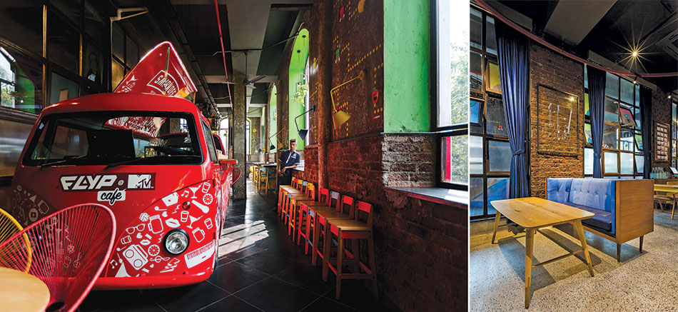
The furniture was designed to be flexible as the café is a workplace during the day and an event space in the night. Quirky elements such as flipping table tops, hammock chairs and piano sofas reflect the brand’s bold style. Art installation using hot wheels, a selfie wall at the entrance with musical instruments, and transformable bar graphic panels, add to the eclectic décor elements.
Of Colors & Textures
Fact File
Name of project: Quattro
Location: Hyderabad
Area: 3000 sqft
Design Team: Interiors Urban Zen
Utility Engineering: D. A. Rao
Material Palette
Stones: StoneLife
Specialty Finishes: Murales
Flooring Tiles: Bharat
Entrance lobby flooring: Tandur stone
Ceiling: MS framing with mesh fixed in frames painted in speciality Italian finish of UCIC
Brick wall cladding: Wire cut brick painted in white paint; rest of the walls painted in special Italian paint UCIC
Lights: Lux Logix
Downlights: Lucent
Air conditioning: Daikin

We have worked with skilled craftsmen and carpenters of India to produce beautiful and comfortable furniture redifining Italy
Rohit Suraj
Principal Designer
Urban Zen creates small niches which aren’t severely ornamented but serve the purpose they were designed for. One such notable feature is the entrance, where the wall is brought to life with a simple pattern of wall-mounted money plants in containers of the same color as the wall, and appearing as if they were sprouting from the wall itself.
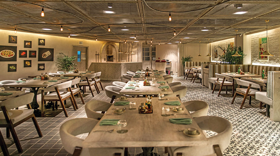
With a theme inspired by the Streets of Italy, Quattro hosts an open plan seating spread over 3000 sq.ft. The interiors are a muted palette of pastel warm earthen colors of brown, cream and blushed neutrals, intermingled with hues of grey, teal, green, and silver, to provide contrast.
Luminaires hidden in alcoves in the ceiling, wash the walls in a warm glow, highlighting the artwork. Edison bulbs dangling from the ceiling are entwined with Tom Dickson pendants, bathing the restaurant in an opulent glow.
The flooring is a changing pattern of colors and textures with cobblestones and printed tiles set along with whitewashed brick wall. Attention to detail is seen in the various finishes of the walls that seep into the tabletops and counters, and even the door panels.
The services have been placed behind metal mesh ceilings, while a string of exposed Edison bulbs snake around the premises to draw attention away from the almost exposed services, and simultaneously making it easier for maintenance. The partitions have a visual texture of soft velvet, placed at an angle such that the visual linkages aren’t completely blocked off, yet a feeling of privacy is maintained.
A wood-fired pizza oven replicates the original Italian, while the menu is a set of deconstructed Italian dishes, with the walls sporting the same theme in unique ways with various types of themed food art, also reflected in the crockery and cutlery. Plants in earthen racks are visible in almost every corner of the restaurant.
Breaking The Monotony
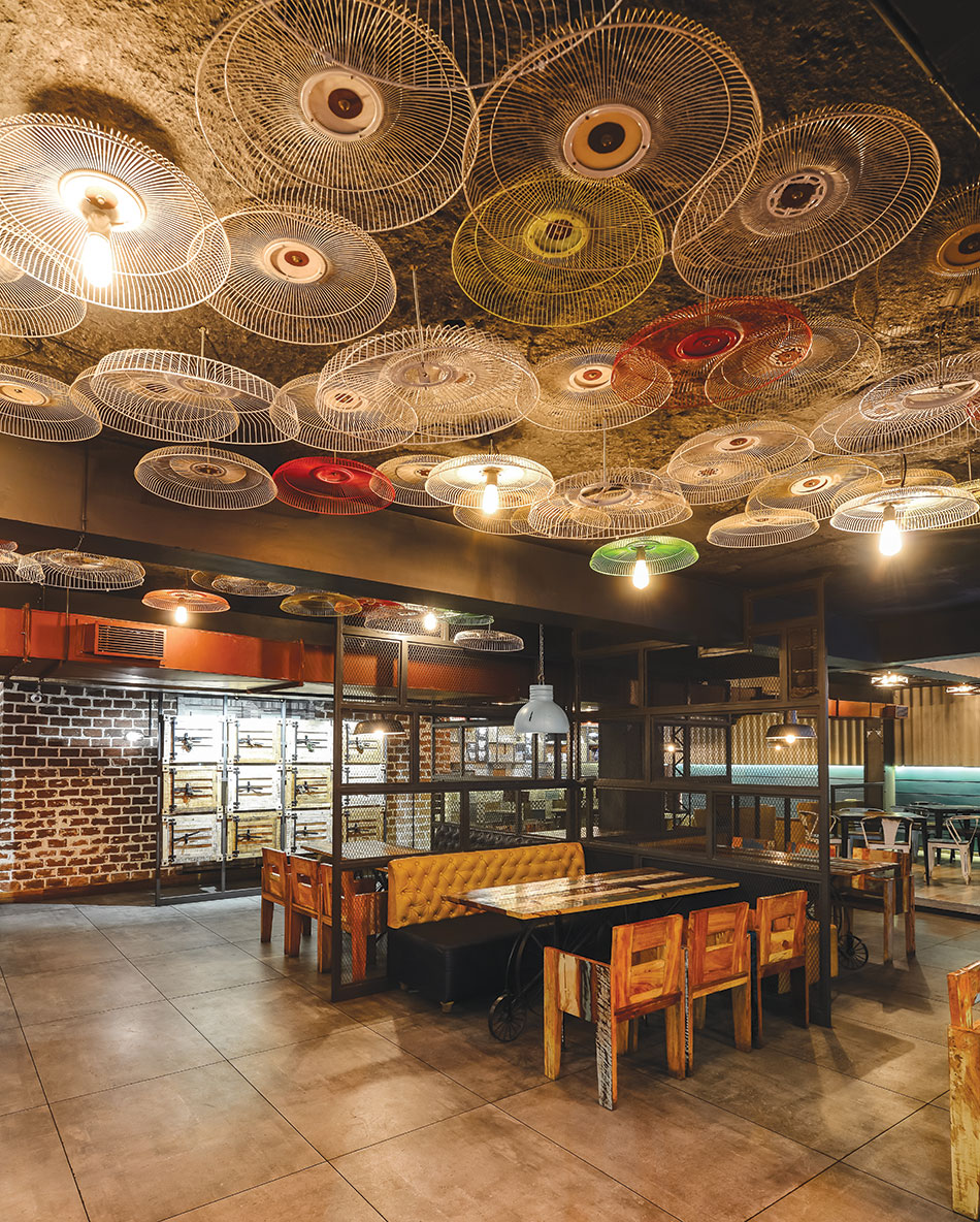
The ceiling lights, when reflected and diffused, form a continuous architectural gesture and are completely intertwined into the structure, offering new interpretations from radiant and graphic to dynamic

Our design efforts were to ensure a different style and plan to avoid monotony. Advanced technology was applied to obtain the best results and minimize cost and time
Ar. Akshay Selukar, H&A Consultants
The entrance is an idiosyncratic idea with its wall of funny faces and graphics. Furnished with a seating place just beside the doorway, people can enjoy the view of the ‘selfie’ wall, while a glass wall brings the surrounding landscape into the adjoining space
The dining area with its wall painted with brightly coloured flowers and a book shelf
The grid of black-painted and upcycled steel bars is a significant design feature
The visual integration between the inside and outside with extensive use of glass, framed by anodized aluminum architraves within sliding doors. The art work installed helps break the monotony of the concrete frame
An Architect’s Home

The 2800 sq.ft duplex penthouse has a living room, kitchen, store, utility, and three bedrooms on the lower level, with a staircase connecting the upper space, which comprises a bedroom, TV room and a terrace. The architects made several changes to the original structure, for instance, the slab above the dining room was punctured to connect the upper space with the lower to achieve a sense of continuity and bring in natural ventilation and light into the lower floor area.
We took a minimalistic design approach to avoid wastage of materials and made a conscious effort to use Indian cotton and linen for furnishings, Indian flooring tiles, and locally crafted furniture pieces, to come up with a very contemporary yet traditional house
Ar. Hitesh Modi & Ar. Amit Srivastava
The original RCC staircase of 5ft and 9 inch was replaced by a staircase made of perforated metal sheet and wooden treads, and suspended stainless steel ropes from the ceiling to give it strength. The staircase showcases minimalism in design and use of very few construction materials. Light transmitting through the perforated risers brings a sense of openness in the narrow space.
The central core duct and common toilet extend on both the floors to create an interesting volume of a central cube that is clad in exposed brick, which along with all the circulation areas, have hardwood flooring and wooden ceiling. The dining room slab was removed and a window added to bring in ample natural light and ventilation.
The bedroom flooring is of Indian mosaic tiles with brass inlay. About 500 sq.ft of terrace area is dramatized by a pergola and handmade terracotta tiles for flooring. The toilets have Mosaic Galatia tiles in dry areas and glass white cladding in the wet.
The cement finish wall and ceiling are made using raw cement and concrete admixture as resin to create a paint-like material and applied like lapi and scrubbed to create a stucco-like effect. The furniture finish is also done directly on the ply with the same technique, giving a concrete look in less than ₹15 per sq.ft. The natural concrete surfaces complement the Indian mosaic flooring and teak wood furniture. All the edges of the walls and ceilings have been rounded to provide a sense of flow.
A collection of art is displayed on planks of wood which hang on suspended SS wires. The wooden planks retain their original texture and edges to give a raw look to the shelves. To create indigenously made furniture, local artisans were brought in to weave the dining chair backs, sofa backs, the bed backs, and other furniture pieces. Toilet accessories like mirror frames and towel rods have been made from leftover wood. Apart from the LED downlights, suspended lamps weaved in cane by local craftsmen have been used.
Split House for Optimal Space
We have achieved environment sustainability with several solutions from the orientation of the house, to use of eco-friendly building materials, solar energy, to the design and size of the fenestration, etc, and all within a very modern, contemporary house
Ar. Umaesh Raje, Space Craftt Architects
Fact File
Project Name: Split House
Location: Kolhapur
Site Area: 492.00 sq.m
Built up Area : 411.310 sq.m
Architect: Space Craftt Architects
Project Team: Ar. Umaesh Raje
Landscape Designer: Amit Patil
Structural Consultant: Dr.A.B. Kulkarni & Associates
Civil Contractor: Rajendra Warnulkar
Photo Credits: Sanjay Chougule
The material palette as per the tropical climate includes bricks coated with PU for their enduring wet look and easy maintenance, and terracotta cladding tiles throughout the house for their thermal insulation, and roofing shingles over the verandah and yoga room with decorative eaves board. A dry pebble landscape on the steps give a Zen garden look. The dining room opens to an extended raised lawn with MS fabricated rafter pergola with clear glass that allows in ample light and protection from the harsh sun.
The kitchen in the S/E corner on the rear side has clay brick cladding on the exterior for thermal cooling of the walls. The master bedroom has a wooden rafter ceiling, and single operated windows to reduce heat from the south- west side and get the early morning sunlight. It opens out to a spacious sit-out with a water body and a raised wooden deck.
Environment sustainability has been achieved with the following solutions:
- 0.23 m AAC blocks for external walls and 0.15 m AAC blocks for internal walls
- Gypsum plaster for internal finishing hence no further curing required
- External wall of 12mm thick terracotta cladding for thermal insulation
- Single component G. I double shutter customized window system with openable shutters
- 100% ventilation through windows
- Rock wool of 50mm thickness used for gypsum false ceiling for thermal comfort
- Vertical window of 1.80m height for maximum light and ventilation
- Strategic window size and placement for maximum cross ventilation
- Rainwater harvesting for bore well recharge and landscape
- Solar panels for hot water.
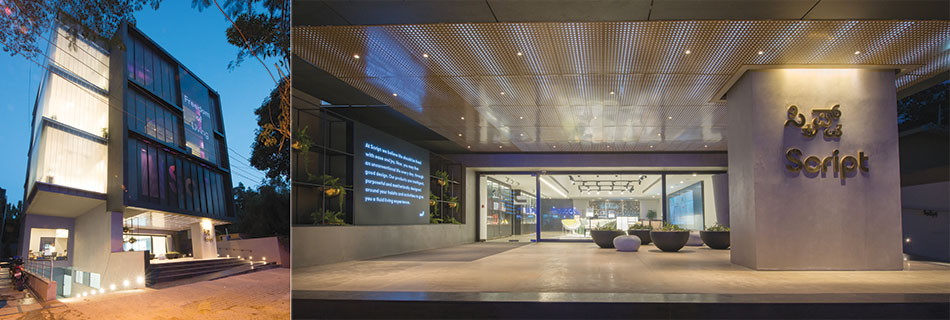
Creating an Iconic Facade
Fact File
Project name: Script
Location: Indiranagar, Bangalore
Client: Godrej
Principal design: Gensler
Architects:FRDC
The amalgamation of design and technology employed throughout the 14000 sq.ft. store creates a distinct niche for the brand in an urban furnishing market. The store is compliant to ADA criteria with universal accessibility from the entry with a ramp, to specially dedicated toilets. In-built tech aids in choosing the right style and piece, while a dedicated demo area allows buyers to assemble and view their selected pieces.
Each zone seamlessly transitions into the other as the general design language denotes flexibility and modularity, with fixtures that adapt to the evolving dynamics of the merchandise
Ar. Sanjay Agarwal FRDC
This west-facing store uses electronically-operated louvres that were perforated to behave like a jali to help cut the sunlight. The perforations varied in diameter create a visual effect that exhibits the mnemonic patterns of the brand, and the concept was carried in the porch ceiling, whose backlit perforated metal panels change patterns and colours with transitional RGB lighting.
The glass behind the louvres is transparent while the other areas use Lambert Profile frosted glass. This helps to diffuse the incoming sunlight during the day and at night it diffuses the interior light to the outside street for a pleasant effect.
The cladding is a seamless finish with powder-coated solid aluminium. A glass box for visual merchandising has a double height atrium which serves as a focal point of the façade. Winch suspension systems were used to hang the merchandise. All these details create a dynamic ever-changing façade.
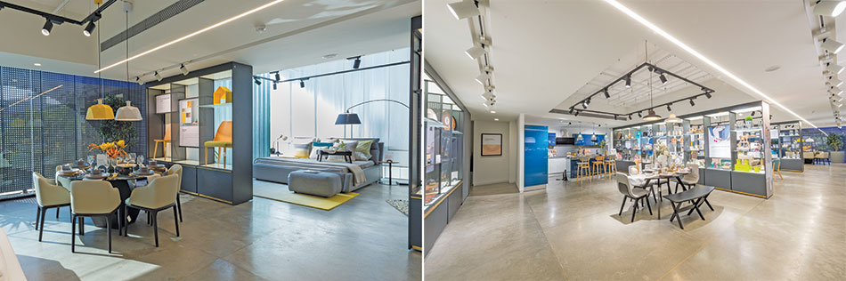
Various zones are separated by modular display fixtures designed as a combination of perforated and solid powder coated metal fins, along with glass shelves and illuminated glass boxes. Metal, a heritage of Godrej, can be observed in various forms; extending from the brass bowl fixtures at the porch, the display fixtures, furniture, to the customised Terrazzo flooring with brass dust, chips and strips.
Energy consumption was optimised with VRV systems of AHU for HVAC. Intensity variable light fixtures, rainwater harvesting pits, passive solar shading for the façade combined with perforated and adjustable louvres help reduce heating of the building. The Script store is Gold LEED certified.
Locally Relevant
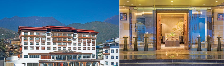
Luxury hotel Le Meridien Thimpu in Bhutan, designed by ARK Reza Kabul Architects, has a façade covered in plaster, keeping in mind the local context
Located in Bhutan, the Le Méridien Thimphu hosts 78 culturally inspired guest rooms and suites. The country has made striving efforts to be an environmental benchmark. It is one of the few in the world to have a negative carbon rating.
While plaster has a great decorative appeal along with the use of POP, it also offers an elegant and a simple, clean look
Ar. Reza Kabul, President, ARK

The façade of Le Meridien Thimpu is designed keeping to the local context. It is covered in plaster. Plaster is used while bricking to strengthen the structure. In comparison to dry walls, plastered walls are stronger and more durable. It also aligns the brick in the process. Apart from being conducive to fostering a sustainable environment, it is non-toxic and unparalleled in quality.
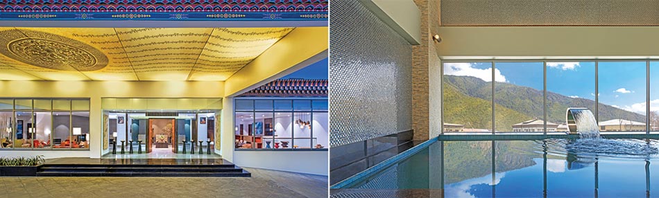
The interiors of the hotel provide guests with the perfect delight to their artistic sensibilities with the regional art of Bhutan adorning the walls. A swimming pool offers a view of the city’s attractive landscape. Other amenities include a restaurant, a lounge bar, outdoor cafe, spa, a fully-equipped business centre and banquet facilities, all of which make Le Méridien Thimphu a compelling choice for both leisure and for hosting business meetings.
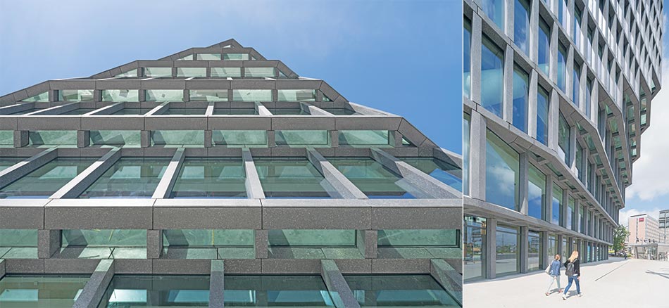
Balancing Old & New Architecture
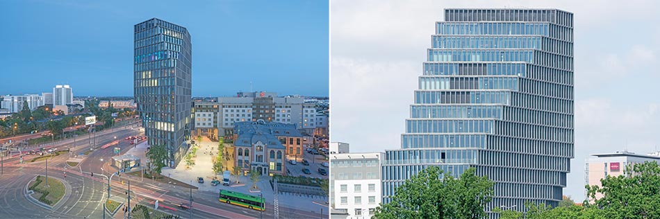
This project by MVRDV is a linear building with a concrete, entirely glass-fronted façade and clearly exposed aggregate grain
Fact File
Project Name: Baltyk
Location: Poznan, Poland
Year: 2011 – 2017
Client: Garvest & Vox Group
Site and Program: 25,000 m2 mixed-use tower divided into 12,000m² office space, 750m² panorama restaurant with a one room hotel and 1350m² retail in the plinth
Façade: Akon S.C.
Greenery: Grupa Krajobrazowa
Mechanical: Termostudio S.C.
Images: Ossip van Duivenbode
Baltyk appears totally different depending on what side it is approached from. Occupying 16 storeys with an irregular arrangement, and towering over the city centre of Poznan, the building changes its shape depending on the viewing angle.
This 25,000m² building is divided into 12,000m² office space, 750m² panorama restaurant with a one room hotel, 1350m² retail in the plinth of the building and three levels of underground parking. The flexible office space is limited to a depth of 7 metres, allowing daylight to generously penetrate the workspaces. Towards the south, a slope of cascading patios offers outdoor spaces to the users of the building.
The façade is a floor-to-ceiling glass with vertical louvres of glass fibre concrete softening the impact of the sun without losing the vistas over the city and zoo
Baltyk is also a multifunctional building with innovative interior solutions, and scenic terraces offering panoramic views of the city. In addition to business-oriented functions, the building will house catering establishments, a fitness club, and an intimate jazz club on the 16th floor.
Visually & Functionally Legible
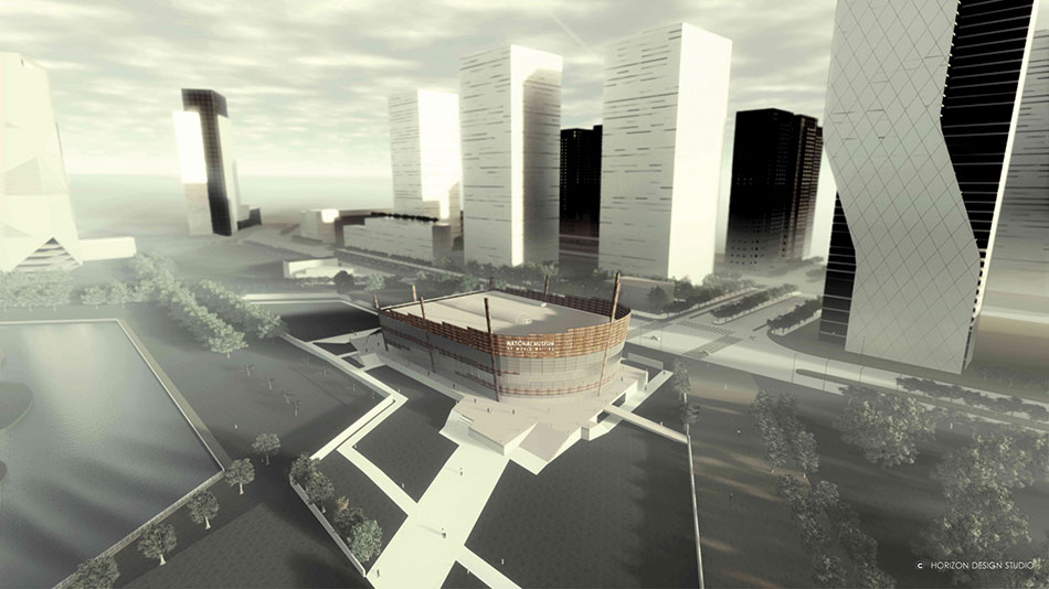
Aerial CGI of Museum of World Writing
Fact File
Project name: National Museum of World Writing
Location: Incheon, South Korea
Status: Concept proposal
Architect Firm: Horizon Design Studio
Architect: Sunil Yadav, ARB (UK)
Design Team Manager: Anil Yadav, COA (India)
Design Team: Sahil Batra, Sanjay Kumar
Illustration: Tikendrajeet Wahengbam Singh, Potsangbam Anandibala
3D Rendering: Rahul Kumar, Josue Romero
The proposed Museum of World Writing is located at Central Park of Songdo International Business District known as ‘Ubiquitous City’. The site is of odd geometry where three geometrical shapes fuse together to form a shape with eight edges. The building form reciprocates these aspects and harmonizes with the whole built environment in the vicinity.
It sits on an elevated plinth/podium that consists of a basement which houses the parking, services, storage, an exhibition gallery, and a central atrium with cafe. Two connecting entries are introduced for visitors to improve connectivity at this level and eventually to the whole building.
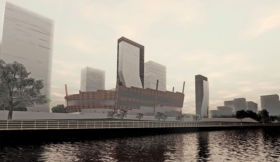
View of Museum from Lake
The building has eight large columns designed to be a little disproportionate to the form. The idea is to represent the ‘known eight directions’ across the globe, to which this museum belongs to. A torchlight from the columns to the sky will represent the infinity and pay tribute to all the lost and undocumented world scripts.
The layout is simple and symmetrical; the architecture is open and raw resulting in a public building that is clean, efficient, visually and functionally legible, and not imposing in terms of shape and size. Its compact ‘zero’ inverted shape and variation in height helps to retain the integrity of the open character of the area around.
Main public functions are easily accessed with a clear separation of private and service spaces. There are no sharp edges, thus retaining the continuity on the external skin of the building - avoiding essentially any rear or front – and thereby, keeping the balance of visitor movement from all sides.
The museum makes best use of its ellipse shape with a continuous ring of translucent and clear glass. At daytime, it creates an atmosphere of transparency and welcome, and at night, the multi-layer glass facade reflects the internal light, making the museum appear as a lamp to the area.
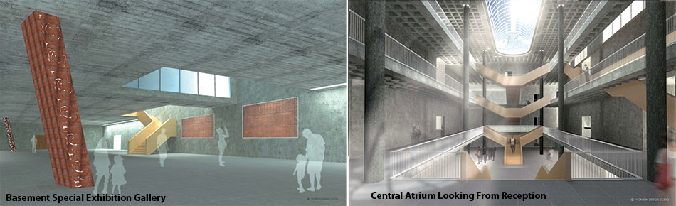
Generous corridors and the projected balconies around the central atrium encourage smooth flow of movement and boost public engagement with the exhibits and the building itself. The central staircase is the primary vertical circulation. It is split on either side of the exhibition galleries and public spaces. A linear straight stair reaches directly to the second floor’s Education area and Library.
The functional spaces are also connected through two ramps - parallel to each other. The internal ramp connects the floors and ascends within the void along with the longitudinal southern side, offering a majestic view of the park, while the external staircase takes visitors to the lower terrace, with a provision for the staff to access the first floor office from here.
Materials
The first metal discovered was copper followed by bronze and then iron. The continuity of this period is displayed by using Corten Steel as the main cladding material. As a facade skin, it will be easy to maintain and with adequate paint coating it will have protection against the sea’s salt wind. The facade will have ancient language symbols and scripts, which will be also engraved in concrete and displayed on translucent glass.
Sense & Sensibility
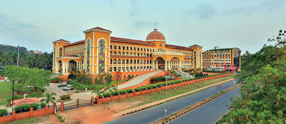
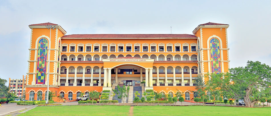
As a vision of grandeur and awe, this seat of power is an iconic building. Keeping in mind the end users - the people of Goa - the building rises in all magnanimity with a humane touch. Its Portuguese character evokes a strong sense of belonging as it is in keeping with the architectural heritage of Goa. The imposing dome, porches, grand steps, colored vertical glazing, and fine detailing are representative of the expressive architecture of the region.
Based on the client brief to create a one-of-its-kind model Collectorate in the country, which each state would want to emulate, and to develop a system of paperless work in a government office by having an I.T.- enabled building, Studio KIA set out to create a state-of-the-art public facility, which is rooted in its past, stands in the present, and is futuristic in its planning. Facilities plugged into the fabric of the building include Power back-up, Audio Visual Technology, UPS back up, I.P.Telephony system, Video Conferencing, Disaster Management, and a National Informatics Centre.

As architects, we understand the sensibilities and sensitivities of creating people-centric spaces, and go beyond mere physical planning to take into account the social, historical, and cultural identities that define the place. Our design process capitalizes on the local community’s assets, aspirations and expectations, which we then convert into a physical manifestation of space and form
Ar. Sabeena Khanna
Form follows function is an old paradigm, and this building stands testimony to this principle. The desired segregation of public movement and staff circulation at the horizontal plane, yet having vertical connectivity, has been beautifully achieved in the created form.
Aligned on the true North-South axis, the access points to the building have been sited on the four cardinal points through the grand porches. The north end of the site has a large Parade ground for formal functions. The four corners are the vertical circulation cores of the building, depicting the bond between earth and the sky. The colored glazing, which is contemporary in design yet vernacular in appeal, is an emulation of the stained-glass windows that are integral to Goan and Portuguese public architecture.
The stately dome is the embodiment of grandeur and symbolic of a blessing. It is the most important area of the building as it encases the V.I.P. lobby and opens onto a grand porch terrace that has a flag hoist. It signifies awe and power.
The building is well lit and airy with ample natural light and cross ventilation. The public areas and those exposed to the vagaries of weather, have non-skid flooring in keeping with the wet, rainy weather of Goa. Also, the public corridors are designed to be deeper with overhangs, so as to avoid rain from coming into the public interaction rooms.
The built mass was planned with internal courtyards to allow wind movement within the building and help reduce humidity levels. These landscaped courtyards are the breathing zones that infuse fresh life into the building.
As a public building, it has been made differently-able-friendly with provision of tactile on the floor (blind paths), handicapped-user-friendly restrooms, ramps with handrails etc. and connectivity through elevators for all floors. All the signage is in English and local Konkani as well as in Braille. Floor maps for guidance have been put up at strategic locations on all floors. Facilities for dining, printing, photocopying, public dealing counters, Citizens Facilitation Centre and Senior Citizens room and other support infrastructure are at the ground level for the convenience of the elderly.
Reimagining a Library’s Architecture in the Digital Age
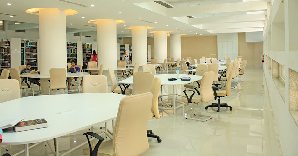
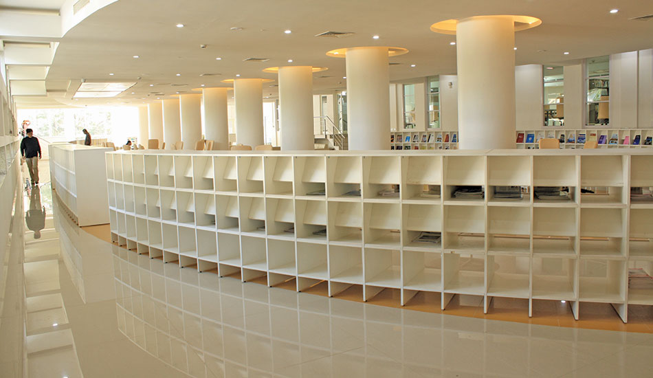
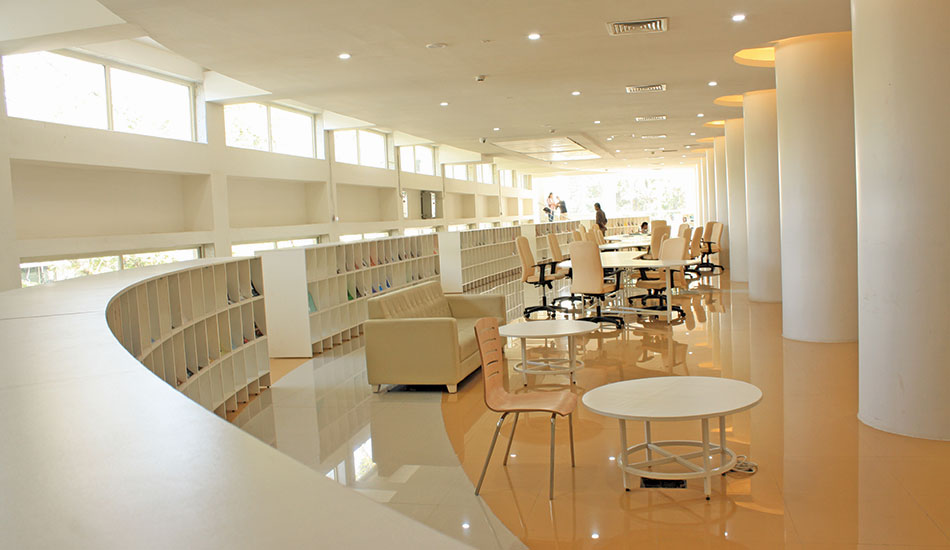
The Central Library of IIT Bombay is one of the India’s largest libraries of Science, Engineering and Technology. Located in the heart of the campus, the 90,000 sq.ft building accommodates over 5,00,000 books, journals etc. All library administrative office functions are brought together, while a digital knowledge lab, a language lab, a 24x7 reading hall, and a new entrance hall have been added, with the additions built around the existing trees.
The building integrates seamlessly with the existing building both externally and internally. Redesigned as an open plan, it offers views across the various spaces and surrounding greens, including the central courtyard which has three large trees with a garden on two levels, and a cafe opening out to the lower level, with informal seating on the steps.
The building’s architecture brings together several ideas from designing with reference to the site and context, to optimising energy-efficiency and sustainability, and making the place a focal point for the students
Ar. Sanjay Udamale
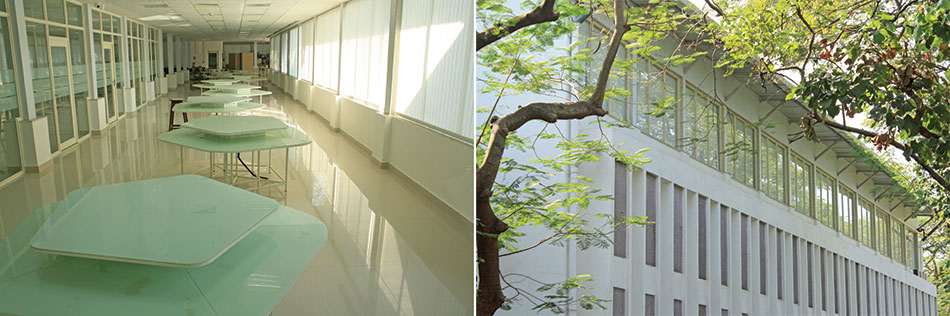
The library is in pristine white and set amidst lush green surroundings with solar protection fins. Care is taken that the site ecology and microclimate is maintained and enhanced. Natural light is used as the main design tool. The green surroundings are preserved to keep microclimate cool and reduce heat loads. Deep shaded windows, large overhangs for sun heat and glare protection reduce heat loads and maximum natural ventilation lower energy consumption throughout the life cycle of the buildings. The south facade of the building is protected from rain and sun with RCC fins. The main entrance is a large RCC canopy above a glass box.
Easy circulation is organized in the floors aligning the movement horizontally as a complete loop around every floor of the building and connected vertically at the four corners by staircases. A staircase in granite leads to the upper level periodical hall.
The vertical expansion at the topmost floor is a lightweight metal frame structure with light metal roof and aluminium cladding. It has external elevations with glazed walls. In fact, ample use of glass has been made for letting in day light and views of the greenery outside. Some of the external areas are clad in metal sheets combining the texture of corrugated metal with sand plaster finishes of solar protection fins. Along with metal for a lightweight structure, roofing and wall cladding, and glass, the materials are easy to work with and maintain.
Fact File
Name of project: Central Library of IIT Bombay
Location: Mumbai
Built-up area: 90,000 sq.ft
Architecture Firm: Sanjay Udamale Architects
Interior Design: Sanjay Udamale Architects
Landscape Design: Sanjay Udamale Architects
Plumbing: Sanjay Udamale Architects
Structural Engineering: Dwijendra Kane & Associates Epicons Consultants
Mechanical & HVAC: Chandar Ramchandani Consulting Engineers
Electrical Engineering: Cutech Consulting Engineers
Security & Fire fighting: Epsilon Design Consultancy Services
Contractors
Structural and Civil: Renjin Constructions
Electrical: Prabhat Powertech
HVAC: Brite Industries
Furniture: Adarsh Infrainterio
Photographs: Ar. Sanjay Udamale, Ramesh Patil, Sandhya Patil
Material Palette
Façade: Aluminium cladding panels, glass
External wall finishes: Sand face plaster, pre-coated zinc
Structure: Galvanised Iron profile sheets, Reinforced concrete, structural steel, mild steel, brickwork
Roofing: Pre-coated zinc galvanised iron profile sheets
Flooring & interior wall cladding: Granite, vitrified tiles, Kota, rectified glazed ceramic tiles
False ceiling: Plain gypsum, gypsum tiles, mineral fibre tiles, perforated pre-coated galvanized steel (metal) tiles, aluminium un-perforated exterior grade panelling, FRP
Doors & Windows: Powder coated aluminium sections, glass, flush doors, FRP
Furniture: Commercial plywood, hollow mild steel sections, laminate, PVC, leatherette fabric, marine plywood, teakwood, polyester yarn fabric
Railing: Stainless steel grade 304
Paint: Premium acrylic exterior and exterior paint, synthetic enamel paint
External floor finishes: Granite, coloured chequered precast cement concrete tiles, cement paver blocks
Brands
Aluminium Cladding Panels: Eurobond
Glass: Saint Gobian
Galvanised Iron sheets: Bhushan
Vitrified & Glazed Ceramic tiles: Johnson
Wallpaper: Marshal
Plain gypsum false ceiling: Saint-Gobain Gyproc
Aluminium exterior grade: Hunter Douglas
Powder coated aluminium sections: Jindal
Hardware: Godrej, Ebco
Commercial Plywood: Greenply
Hollow Mild Steel sections: Tata
Laminates: Formica
PVC: Smartedge, Leatherette
Marine plywood: Greenply
Paint: Asian Paints
Cement concrete tiles & paver blocks: Super Tiles
Plumbing fittings & fixtures: Hindustan Sanitaryware, Jaguar
Electricals & Lighting: Roma-Anchor, Wipro, Polycab, Precision
Sports cum Entertainment
Fact File
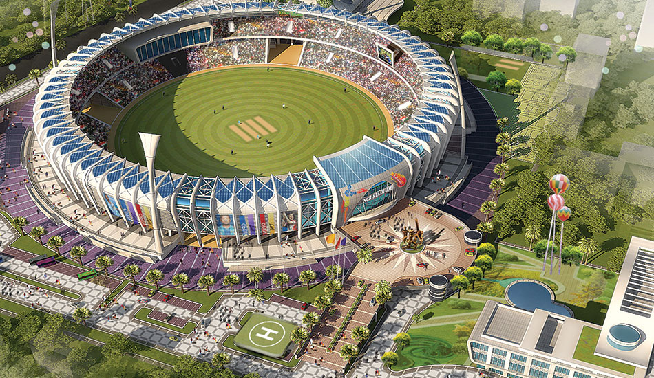
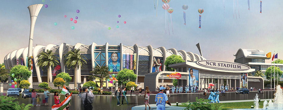
Project: Sports Centre and Cricket Stadium, NCR.
Architects: Prem Nath and Associates
Structural Consultants: SACPL, Mumbai
Building Material Providers: JSW
The requirements were that of a stadium cum sports complex with a holding capacity of 50,000 people, and various structures like a club, guest house, a utility & ancillary block and a sports academy. The emphasis was on safety and security of the visitors and the players. The stadium’s stands consist of viewers’ seating, VIP boxes, and dedicated areas for the team members, administration, security personnel, media rooms, lobbies, food courts, washroom and other amenities.
The entire project planning has been done within an area of approx. 32.6 acres; with the open area spread over 15,000 sqm as per ICC standards. The plan is distributed in four major stands: North, East, West, and South. The Recreation / Club area of 7,000 sqm is spread over ground plus 3 floors consisting of indoor sports such as gymnasium, aerobics, boxing ring, squash, table tennis, and billiards, refreshment areas and common amenities.
The idea is to make an ‘iconic and flexible’ design with use of latest construction technology. More than just a cricket stadium, it will also serve as an ‘entertainment centre’, because it was realised that since stadiums hold matches for a very short and specific time of the year, they could be utilised for other entertainment purposes also
Ar. Prem Nath
The swimming pool is planned in this area as part of outdoor sports facility with changing rooms and amenities within the club building. About 160 guest rooms are planned in a 9-storied annexe with a total construction area of 16,500 sqm, which will include the common spaces, reception, lobby and dining facilities.
As this is a public building, where the visitor profile will include bureaucrats, celebrities, players, the local public and international visitors, the design, therefore, has been conceptualized keeping in mind ‘near zero’ security levels. The circulation pattern also minimizes chances of any chaos in times of higher footfalls.
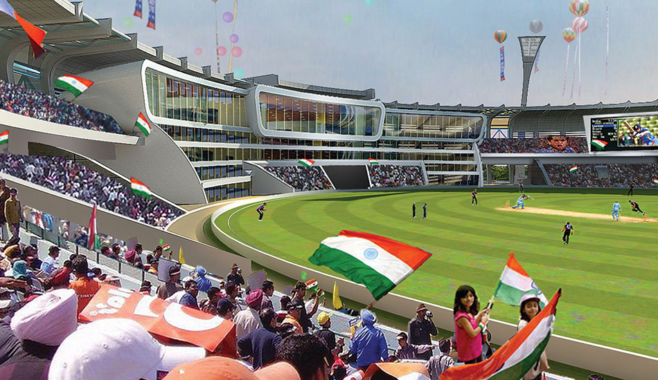
The premises contain an oval shaped stadium complex, along with recreational and hotel blocks. On approaching the stadium, you enter a huge piazza, and the internal road takes you along the entire complex.
The geometry of the stadium is designed to ensure that the view from the spectator stands is maximized and the boundary line visible from all places of seating. It has been observed that in 90% of the stadiums, the spectators can’t see the foresight boundary line. The pitch being the main focal point is aligned keeping in mind the north and south stands. The roof profile ensures that the glare affecting the west and west stand causes minimal disturbance to the viewers.
R.C.C. is used for stadium stands and steel for the roof and outer shell of the stadium. The atrium space is supported by an external steel frame to provide stability to the structure, while covering the entire spectator area. Hence, the supporting steelwork needed to be precisely engineered and executed. Use of solar panels in the roof assembly add to the aesthetics and take advantage of the sun’s energy.
State-of-the-art technology has been used for the sports lighting and public-address systems. Tower lights and track lights on the periphery ensure the required 1000 lux level. Louvers and perforated metal screens in the outer skin provide ventilation and help the building breath.
The ‘Sports Stadium Cum Entertainment Complex’ will be used for both cricket and football and will be the first of its kind in the country.
Functionally & Aesthetically Relevant
Atelier Krikos
Fact File
Client: Ravijeet Singh, R.S Builders
Location: Mohali, Punjab
Total Area: 3054 sqft
Architecture firm: Studio Ardete
Project Management: R.S Builders
Lighting Design: The Luminars
General Contractor: Ravijeet Singh, RS Builders
Material Palette
Furniture: Harmony
Flooring: Indian Granite
Lighting: Osram
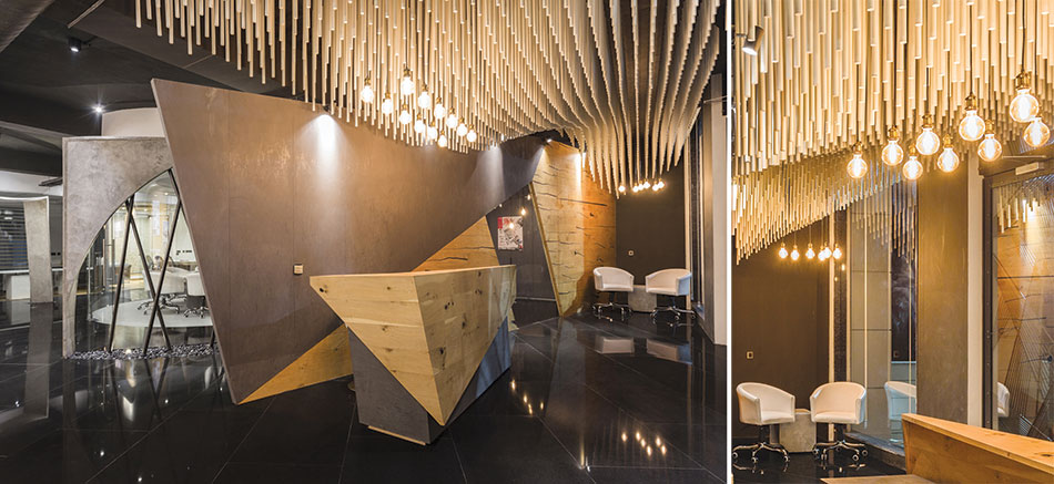
The entrance to the office is defined by a 9 x 6 feet wide pivoted metal door, designed as a composition of tapering metal pipes. An installation designed parametrically using 1500 circular rods hanging in an organic wave structure from the ceiling marks the waiting and reception area. The installation is visualized in white to contrast it against the grey of the walls and the floor.

The interiors are completely dominated by the glass conference room. The concentricity of the conference room is enhanced by backlight stretch ceiling, 9 ft in diameter and use of motorized curtains. The furniture is custom made with micro concrete to generate a raw table top.
Use of digital software and careful planning along with meticulous attention to detail overcomes the challenges the project affords, both in design and ideology. With the aim to bring about a perspective shift in the way office spaces are perceived, Atelier Krikos flirts with the boundary separating art and architecture Ar. Badrinath Kaleru & Ar. Prerna Kaleru
Studio Ardete
The main cabin, staff, work spaces and the cafeteria are placed at the end of the layout so as to bring the circular glass room in focus. The display zones are integrated with the walls, leaving the center clear. The trapezoidal planer surfaces on the wall framing the display allow an easy visual flow and connectivity.
The various elements of the office space are brought together in a cohesive whole by the black mirror granite flooring. Light pippy oak veneers introduce colour to the neutral palette; cracked pippy oak is used in parquet style paneling for the reception backdrop while knotty pippy oak in parquet form is used for the rest of the spaces.
Lighting fixtures and the overall lighting design is carefully done to bring out the contrast between different areas; specific elements are highlighted to enhance their fluid, organic forms. Stretch ceiling forms the main light source in the conference room whereas, LED filament bulbs hanging from the ceilings are used to bring out the texture of the wall finishes. In a step towards sustainability, all the lighting fixtures and sources use solar power.
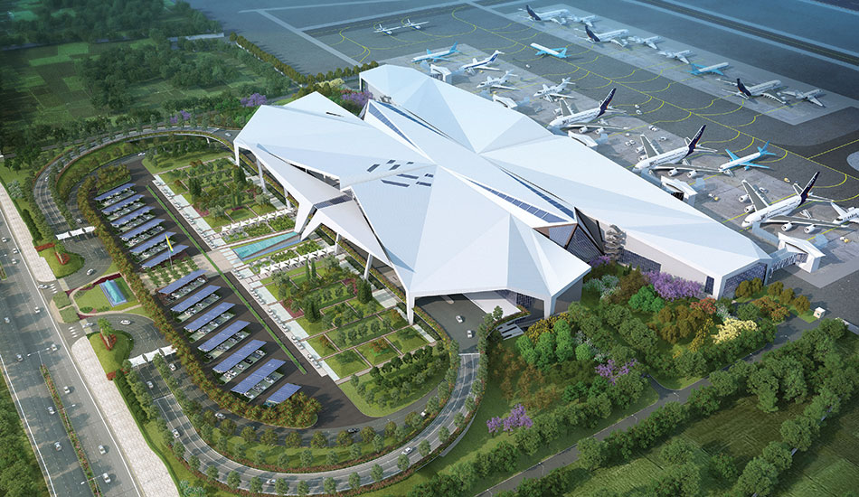
Infused With Flavors of Assam
Fact File
Typology: Transportation Building
Name of Project: Lokpriya Gopinath Bordoloi Intl’ Airport
Location: Guwahati, Assam
Client: Airport Authority of India
Site Area: 50 acres
Built-Up Area: 1.35 million sqft
Commencement Date: Jan 2018
Completion Date: Jan 2021 (Proposed)
Structural/Mechanical/Electrical: Aecom
Landscape: Integral Designs International Studio
HVAC/Plumbing/PMC: Aecom
Façade: Axis Facade Consulting
Signage: Alpana Khare
QS & Design Support: Sparks & Gs
Lighting: Integral Designs
Contractor: Shapoorji Pallonji
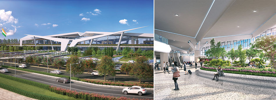
The form of the structure takes inspiration from Icarus – the mythological figure who dared to fly. The majestic centerpiece is symbolic and looms over the departure concourse. The floating form doubles up as the canopy for the drop-off zone.
Designing an airport presents an intriguing challenge as aviation is one of the most complicated industries in the world and runs on incredibly smooth logistics. One has to contend with enormous functional demands and almost military-level precision. However, as architects, we wanted to create spaces that would involve and stimulate, and not just deliver and facilitate
Ar. Goonmeet Singh Chauhan
Ar. Anand Sharma
Ar. Anoj Tevatia DFI
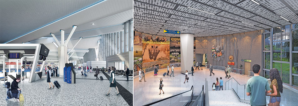
While designing, Origami served as a guide to the architects: it finds expression in the terminal roof, the flooring patterns, the column cladding, the theme walls, and in the signage design. A 90-feet high indoor rainforest that one needs to navigate before reaching the luggage belt, brings forth vistas and wonders at every corner.
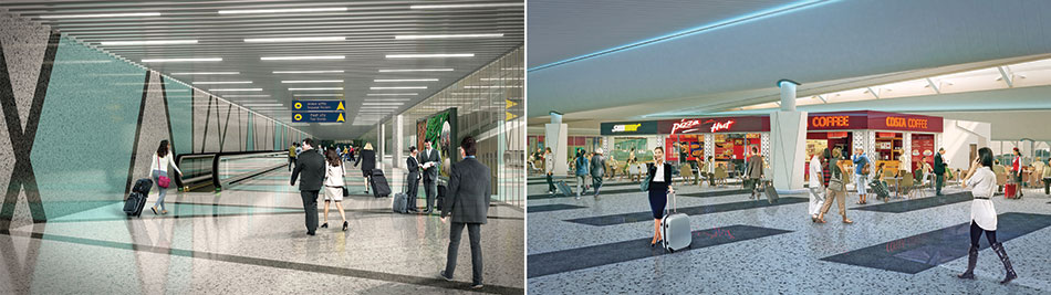
A crafts village augments the retail experience for the traveler. The craft walls display innovative products and artefacts. The Namaskar Atrium is a massive double-heighted space with its walls adorned with the art and craft of Assam. The Baggage Claim hall wall is an exercise in modularity with Origami aluminum panels that derive inspiration from the hilly terrain of the north-eastern states.
Tea-gardens serve as an inspiration for landscape design. They are positioned at the front yard along with a water cascade. The drive up to the departure level is reminiscent of the first climb up a mountain road. The car zooms up as the plains give way to rolling earth-berm greens.
To enrich materiality, glass was selected as the palette of choice for the façade – GFRC wraps around the façade’s tricky and smooth wide expanses, facilitating day-light penetration and visual uniformity. The use of terracotta tiles references the architecture of fort-like citadels and imparts stability. Terrazzo flooring has been employed in the interiors for its versatility and playfulness, whilst the use of granite ensures steadiness. Aluminum origami panels endow relief and sintered stone is used for wall and column cladding.
The Guwahati Airport is designed with 4-Star GRIHA rating parameters. The focus on sustainability was imbibed right at the design inception stage, when a conscious attempt was made to inter-weave the built form with the outdoors. The indoor forest is a physical manifestation of this thought: it is separated by a glass wall from the larger outdoor forest, fitting in like a tongue-in-groove with the terminal building, and becoming an integral part of the built whole. The car park structures are designed to be covered with photovoltaic panels that generate almost 500 KW of solar energy.
The new, integrated Terminal Building at Guwahati International Airport is the collective effort of a team of 15 consulting and design firms, including Aecom, DFI, Integral Designs, Axis Facades, Gaurav Jindal, Alpana Khare Designs and CBRE.
Adaptable For Future Growth
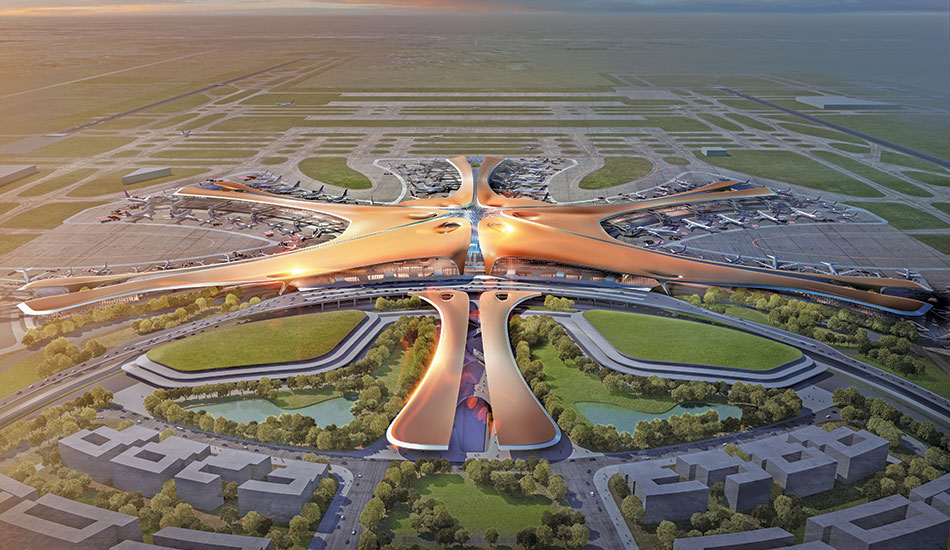
Fact File
Typology: Terminal Building
Client: Beijing New Airport Headquarters (BNAH)
Size Airport Terminal: 700,000m2
Location: Daxing, Beijing, China
Ground Transportation Centre: 80,000m2
Capacity 72 million passengers per year by 2025
630,000 flights/year on 4 runways
Expanding to 100 million passengers annually
Status Under Construction
Architect/Joint Design Team: Zaha Hadid Architects (ZHA) & ADP Ingeniérie (ADPI)
Local Design Institute: BIAD (Beijing Institute of Architecture & Design) + CACC (China Airport Construction Company)
Renderings by Methanoia© Zaha Hadid Architects
The 700,000m² terminal building and 80,000m² ground transportation centre have been designed to be extremely user-focussed, efficient and adaptable for future growth; its 6-pier radial design gives exceptional convenience for passengers and flexibility in operations.
The terminal’s compact design minimises distances between check-in and gate, as well as minimises distances between gates for transferring passengers. Every aircraft pier radiates directly from the terminal’s main central court where all passenger services and amenities are located, enabling passengers to simply walk the short distances to everywhere they need to go.
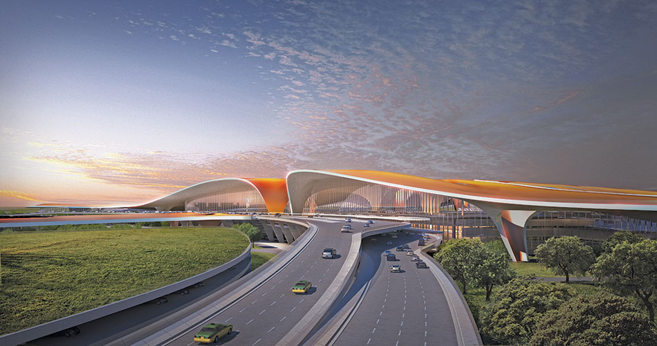
Evolving from principles within traditional Chinese architecture that organise interconnected spaces around a central courtyard, the terminal’s design guides all passengers seamlessly through the departure, arrival or transfer zones towards the grand multi-layered meeting space at the very heart of the terminal.
Flowing parabolic folds within the terminal’s vaulted roof that reach to the ground to support the structure and bring natural light within. Housing many aircraft gates in one terminal with a single passenger handling centre – rather than many smaller terminals and continuous inter-terminal shuttle trains – significantly reduces the carbon footprint of the airport throughout its construction and operational lifetime; helping to achieve the airport’s very high targets of environmental management and sustainability.
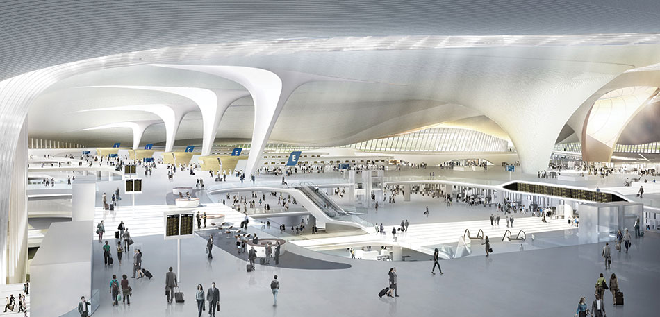
Designed to adapt to operate in many different configurations dependant on varying aircraft and passenger traffic each day, the new airport will include an integrated transport centre offering direct links to Beijing city centre, local rail services and the national high-speed rail network, making the airport an important hub within Beijing’s growing transport network and a catalyst for economic development in Tianjin and Hebei Province.
Following the 2011 international competition, in October 2014 BNAH created a Joint Design Team bringing together ADP Ingeniérie (ADPI) and Zaha Hadid Architects to collaborate on the optimised concept design for the new terminal building. The project is led by the Local Design Institute under the leadership of BNAH.
Spatial Interconnectivity
Fact File
Project Name: Wind Gates
Client: Bhima Mahabharat Builders
Location: Kolhapur
Site Area: 4797 sq.m
Built-up Area: 9003.54 sq.m.
Type: Residential
Architect Firm: Vision Associates
Landscape Designer: Ar. Nila Jirge
Structural Consultant: Dr. A.B. Kulkarni & Associates
Civil Contractor: Bhima Mahabharat Builders
Team: Abhijeet Magadum & Jayesh Kadam
Plumbing Consultant: Sunil Limaye
Photo Credit: Sanjay Chougule
The zoning of plots for placement of common spaces at the Wind Gates residential project is done such that the magnificent New Palace Museum, the erstwhile palace of Chhatrapati Shahu Maharaja, can be viewed from a maximum number of apartments.
A major challenge was creating a view of The New Palace Museum and the amenities, which are centrally placed for all the dwelling units. To get the best benefit of the west wind for each unit, we had to cut down the central open space to get a wider view of the sky
Principal Ar. Prashant Kapadi
Vision Associates
The principal plot is split to get the maximum benefits of F.S.I. The common amenities (rooftop garden, informal seating pockets, kids paddle pool, multipurpose hall, gym and indoor games hall, etc) are placed centrally and on the opposite side of the access road. This helps functional segregation and isolation of the vehicular zone and avoids entry chaos for the pedestrian zone. Though the plot is divided, the clever design clubs the plots as a single campus zone.
Two wings on each plot are connected by bridges through wind pockets at multiple levels so as to achieve core connectivity in-between the wings. At the entrance, two wings on separated plots are connected by means of wire rope pergolas, which help in maintaining the building’s rules and regulation, while building visual connectivity with the spaces and height.

Interconnectivity of spaces is balanced by landscape pockets, flower beds and water bodies. The basic concept of massing and blocking reflects in the water sculptures located at the entrance, while preservation of the existing trees such as mango, flame tree (gulmohar), bur flower tree (kadamba) highlight the landscape.
At the entrance, two wings on separate plots are connected with wire rope pergolas, which help avoid any violation of the building rules and at the same time achieve visual building connectivity, space and height proportions
Abhijeet Magadum, Director, Bhima Mahabharat Builders

Every individual unit is provided with an entrance lobby to segregate the common passages and other units. Dark grey tile flooring for common passages abutting every unit serves as a background for traditional rangoli patterns. This enhances the traditional values as well as breaks the length of passage visually. An attached terrace with glass railing maximizes the space visually and gives a wider view of the campus.
The façade is an asymmetric juxtaposition of blocks in various grids that create amazing masses. Placement of penthouse on the upper floors reduces the floor coverage at the above levels and helps achieve an interesting skyline of the building in a recessive order. These recessing blocks cut the massiveness and verticality of the structure, and also give a wider sky view from the central interaction spaces.
It was technically very challenging to visualize and construct these masses. Cantilevers projecting unit terraces with semi-covered frames over these protruding boxes form an interestingly random façade, which is further enhanced by the fabricated pergolas on the terraces. The combined effect of the cantilever projections, box frames, and the pergolas give an interesting play of shadow natural light, even under artificial illumination.


